High-Contrast Display Serif

Lahgelsio + Marquis - Elegant Modern Serif
Pairs sculptural editorial warmth with Lahgelsio's clean modern geometry.
Inspect Marquis - Elegant Modern Serif specimenDisclosure: MakerFileHub may earn a commission from qualifying purchases via paid links on this page. How our links work.
Flourished formal script paired with a tall contrast serif
Lahgelsio is a duo: an ornate script with tall loops and a mirrored flourish, and a tall high-contrast serif with fine hairlines, made to be stacked on the same card.
Paid link
Get this fontProject & layout blueprintsAt-a-glance maker compatibility
Weld or Unite overlapping script joins into one continuous vector path before sending to the blade.
Visual anatomy & craft review
The script half opens with a large looped capital that rises above the cap line and closes into shaded stems, and the word runs through fine joins into an exit that curls up and back over itself, which is the flourish that defines the face. The lowercase is small and tightly packed beneath that flourish. The serif half is a tall narrow roman with strong vertical contrast, fine unbracketed serifs and wide capitals, and in the sample it carries the alphabet and a small caption so the two halves can be compared side by side. Together they cover the classic pairing a stationery set needs: a script for the names and a serif for the details. The dark ground, the orange and cream inks and the three small feature captions are presentation; the duo is the lettering.
Flourished · Contrasted · Paired
Two-font hierarchy recipes
Tested contrast partners — pairing Lahgelsio with grounded secondary typography.
Lahgelsio + Marquis - Elegant Modern Serif
Pairs sculptural editorial warmth with Lahgelsio's clean modern geometry.
Inspect Marquis - Elegant Modern Serif specimen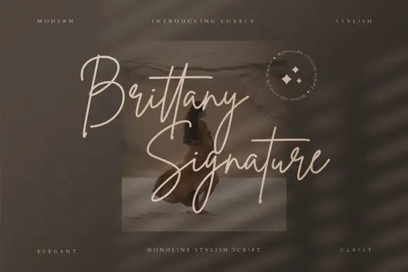
Lahgelsio + Brittany Signature Script
Introduces organic movement on pull-quotes, signatures and gift tags.
Inspect Brittany Signature Script specimenPractical applications
Concrete hierarchy, scale and production guidance tailored to Lahgelsio’s stroke geometry.
The pair lets one label carry a script house name and a serif volume line without mixing sources, and both halves hold up at the small sizes a bottle allows.
Hierarchy & layout recipe
Set the house name in the script at 14 pt on a 40 by 80 mm label, set the volume in the serif at 6 pt, and leave 7 mm of clearance so the exit flourish stays on the label.
Pre-production check
A fine flourish printed on a curved label squeezes at the edges; check a printed label on the actual bottle and increase the side margins first.
The script carries the names and the serif carries the details, which is exactly how a formal invitation is built, and the pair stays coherent because both are contrasted.
Hierarchy & layout recipe
Set both names in the script at 28 pt on a 120 by 180 mm card, set the details in the serif at 8 pt small caps, and hold 18 mm between the names and the details block.
Pre-production check
Two high-contrast faces on one card can look thin; check the proof at final size and keep the serif details at 8 pt or above.
The script works as a door plate and the serif as a key card, so a single purchase covers both of the surfaces a small hotel actually needs.
Hierarchy & layout recipe
Set the hotel name in the script at 18 pt on a 120 by 40 mm plate, set the address in the serif at 6 pt, and leave 12 mm of clearance so the flourish is not cut by the plate edge.
Pre-production check
Etching a flourish needs a minimum stroke; confirm the producer's minimum line and simplify one loop rather than flattening the whole mark.
Technical & licence verification
Confirm included OTF/TTF/WOFF formats, full glyph tables and licence coverage on the live store page before batch production.
Closest visual alternatives
Matched across letterform anatomy, stroke behaviour and craft applications.
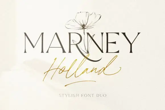
Fine serif and loose signature duo
Marney Holland pairs a tall high-contrast serif capital cut with a loose thin script: the R curls its leg below the serif line, the script runs light through its joins and a long low exit stroke closes the written line.
Ideas for this font
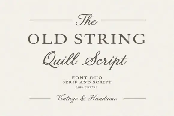
Serif and quill script duo
The Old String is a duo in soft grey-brown on cream: a wide classical serif in caps for the main line, a quill script with fine hairlines and long tails for the second, and small tracked notes between hairline rules, with the script repeated at the foot in a smaller size.
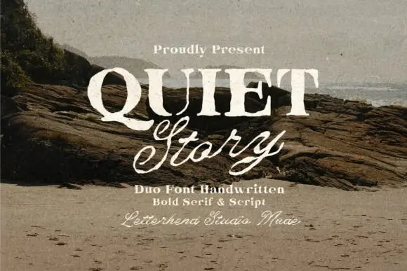
Textured serif capitals and looping script
Quiet Story is a duo on a weathered photograph: heavy serif capitals with a printed texture, and a looping script beneath in the same cream ink, with a small script credit at the foot.
Ideas for this font
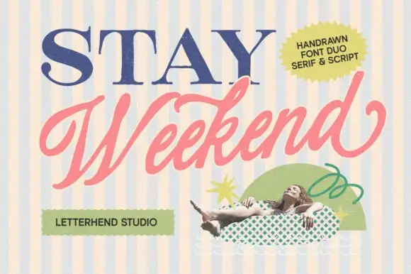
Serif capitals and slanted script
Stay Weekend is a duo on a striped cream and blue ground: wide serif capitals in navy with fine hairline serifs, and a fat slanted script in coral beneath them, with a sticker badge and a photographed figure.
Ideas for this font
Same independent foundry
Allow optional Google Analytics to measure visits and catalogue actions. Your search words and notes are not included. Privacy & storage