Editorial Serif Anchor

Timeless Handwriting + Raffined
Anchors Timeless Handwriting's fluid strokes with crisp Roman proportions on wedding suites, headers and packaging.
Inspect Raffined specimenDisclosure: MakerFileHub may earn a commission from qualifying purchases via paid links on this page. How our links work.
Natural fountain-pen journal & correspondence script
JIM MART's fountain-pen handwriting script pairs airy, fast-flowing ink strokes with natural baseline bounce and crisp lowercase connections.
Paid link
Get this fontProject & layout blueprintsAt-a-glance maker compatibility
Weld or Unite overlapping script joins into one continuous vector path before sending to the blade.
Visual anatomy & craft review
A natural fountain-pen handwriting shown over a sunlit notebook: slender ink-black strokes pair tall crossbar T's with open descending g loops, so the word reads as correspondence written at a desk rather than as a font imitating paper. The even slender weight is what keeps a paragraph readable, and the open loops give the lettering air at small sizes. Slight irregularities in the joins are what sell the hand. The notebook and pen are staging. Uses are addressed envelopes, vow booklets, notes from a founder and any layout where a plotted or printed hand is more honest than a styled script.
Fountain-pen · Airy-slant · Personal-note
Two-font hierarchy recipes
Tested contrast partners — pairing Timeless Handwriting with grounded secondary typography.
Timeless Handwriting + Raffined
Anchors Timeless Handwriting's fluid strokes with crisp Roman proportions on wedding suites, headers and packaging.
Inspect Raffined specimen
Timeless Handwriting + Clyne Sans
Keeps small-scale dates, URLs, nutrition facts and care instructions crisp and legible below script titles.
Inspect Clyne Sans specimenPractical applications
Concrete hierarchy, scale and production guidance tailored to Timeless Handwriting’s stroke geometry.
A slender pen hand is what a plotter or a Cricut pen actually reproduces well, so an addressed envelope looks hand-written without a calligrapher, and the open loops keep a long address readable at postal sizes.
Hierarchy & layout recipe
Print or plot a C5 envelope: the address at 12 pt on 5 mm leading, the return address at 7 pt, and one ink. Keep 20 mm from the left edge, 25 mm from the top, and keep the address block inside the postal clear zone.
Pre-production check
Check the 12 pt line on the envelope, where a thin join can skip in a pen plot; keep the stroke above 0.4 mm. Confirm the address sits inside the postal barcode clear zone and that the ink does not smudge.
A handwritten insert reads as a note from the founder rather than a marketing card, which is the cheapest loyalty device a small shop has, and the even weight keeps a short message legible on a small card.
Hierarchy & layout recipe
Print a 90 by 55 mm insert: the greeting at 14 pt, the message in a 9 pt serif, and one ink on a cream card. Keep 6 mm margins and leave 20 mm at the foot for a real signature.
Pre-production check
Check the 14 pt greeting on the card, where a loop can close; keep the counters open. Confirm the message reads at arm's length and that the foot space is clear for signing in pen.
A natural hand heads a journal or a recipe page as if it were written there, and the tall crossbars give the line a desk-written rhythm that a formal script cannot, which matters in a book that is meant to feel personal.
Hierarchy & layout recipe
A5 page: the header at 22 pt, the body in an 11 pt serif, and one ink on a cream sheet. Keep 18 mm margins, rule a light baseline guide for the header, and keep 8 mm between the header and the body.
Pre-production check
Check the 22 pt header at actual size, where a descending loop can collide with the body; keep 8 mm of clearance. Confirm the body reads in hand and that the header sits level to the margin.
Technical & licence verification
Confirm included OTF/TTF/WOFF formats, full glyph tables and licence coverage on the live store page before batch production.
Closest visual alternatives
Matched across letterform anatomy, stroke behaviour and craft applications.
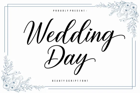
Graceful slanted calligraphy script with sweeping exit tails
Wedding Day is a smooth, romantic modern calligraphy script balancing tall looped ascenders ('d-d') with graceful horizontal exit swashes.
Ideas for this font
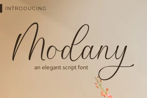
Slender upright fountain-pen cursive script
Modany is a graceful, thin-to-medium handwritten cursive script with tall peaked arches on capitals and long, airy ascenders.
Ideas for this font
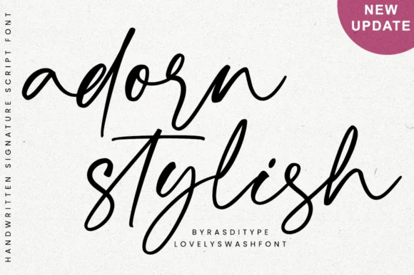
Slanted modern calligraphy script with lowercase end swashes
Adorn Stylish is a fluid, slanted modern handwritten script featuring tall narrow loops and sweeping beginning/ending lowercase swashes.
Ideas for this font
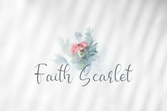
Airy upright fine-pen modern calligraphy script
Faith Scarlet is a delicate, upright fine-pen script with graceful looped capitals ('F', 'S') and light, natural handwritten bounce.
Ideas for this font
Allow optional Google Analytics to measure visits and catalogue actions. Your search words and notes are not included. Privacy & storage