Editorial Serif Anchor

Bachelor Notes + Marquis - Elegant Modern Serif
Anchors Bachelor Notes's fluid strokes with crisp Roman proportions on wedding suites, headers and packaging.
Inspect Marquis - Elegant Modern Serif specimenDisclosure: MakerFileHub may earn a commission from qualifying purchases via paid links on this page. How our links work.
Rough felt-pen notebook & graph-paper handwritten font
Bachelor Notes is an organic, lightly-textured felt-pen handwriting font capturing real ballpoint/marker lecture notes on quad graph paper!
Paid link
Get this fontProject & layout blueprintsAt-a-glance maker compatibility
Fine grain and micro-texture excel in 300 DPI print, sublimation, and screen print rather than small vinyl weeding.
Visual anatomy & craft review
Bachelor Notes is a felt-pen handwriting face with real fibre texture, uneven pressure and a lively baseline, drawn to look like notes taken quickly on quadrille paper. The letters are mixed case, tall and slightly slanted, with the pen's lift points visible, and the texture is baked in so a page reads as photographed rather than typeset. It needs roughly 9 mm to look like legible handwriting and holds up to 40 mm before the fibre starts to look like dirt. It is a prop, journal and heading face, and it should not be set as long body copy.
Graph-paper-notes · Textured-felt-pen · Study-journal
Two-font hierarchy recipes
Tested contrast partners — pairing Bachelor Notes with grounded secondary typography.
Bachelor Notes + Marquis - Elegant Modern Serif
Anchors Bachelor Notes's fluid strokes with crisp Roman proportions on wedding suites, headers and packaging.
Inspect Marquis - Elegant Modern Serif specimen
Bachelor Notes + Clyne Sans
Keeps small-scale dates, URLs, nutrition facts and care instructions crisp and legible below script titles.
Inspect Clyne Sans specimenPractical applications
Concrete hierarchy, scale and production guidance tailored to Bachelor Notes’s stroke geometry.
Felt-pen texture reads as notes taken in class, which is what a study template is imitating, and the mixed case holds at 10 mm on a printable page. The grid-friendly baseline lets it sit on ruled paper.
Hierarchy & layout recipe
Template A4, body 10/16 pt on a 5 mm grid, 20 mm margins, headings 16 mm. Cover 210 x 297 mm, title 34 pt. Whiteboard print 900 x 600 mm, word 120 mm.
Pre-production check
A textured face printed at 10 pt on 80 gsm shows through from the reverse side and the page reads as noise. Print one duplex proof, and if it ghosts, raise the stock to 90 gsm rather than lightening the face.
A real felt-pen texture reads as a reproduced notebook rather than a styled page, which is what a personal zine is doing. The uneven baseline keeps a short paragraph human at 11 pt.
Hierarchy & layout recipe
Zine A5, body 10.5/16 pt on a 78 mm measure, 15 mm margins, page numbers 8 pt. Insert 105 x 148 mm, heading 14 mm, body 9.5/14 pt. Opener 22 pt on a 12 mm baseline with 8 mm above the first line.
Pre-production check
Zines are photocopied and a fibre texture turns into grey speckle that competes with the text. Print one test spread on the actual copier, and if the texture muddies, reserve the felt-pen face for headings.
Felt-pen writing reads as a note left on a counter, which is warmer than a printed card at the same size. The texture gives weight to a short message without needing decoration.
Hierarchy & layout recipe
Note 105 x 148 mm, message 10/15 pt, 18 mm margins. Recipe card 105 x 148 mm, title 14 mm, method 9/13 pt. Tag 50 x 90 mm, name 9 mm, hole 5 mm clear.
Pre-production check
Note cards are printed on textured stock and a felt-pen texture on top of paper grain looks dirty at 10 pt. Print one card on the intended paper, and step the body to 11 pt if the two textures fight.
Technical & licence verification
Confirm included OTF/TTF/WOFF formats, full glyph tables and licence coverage on the live store page before batch production.
Closest visual alternatives
Matched across letterform anatomy, stroke behaviour and craft applications.
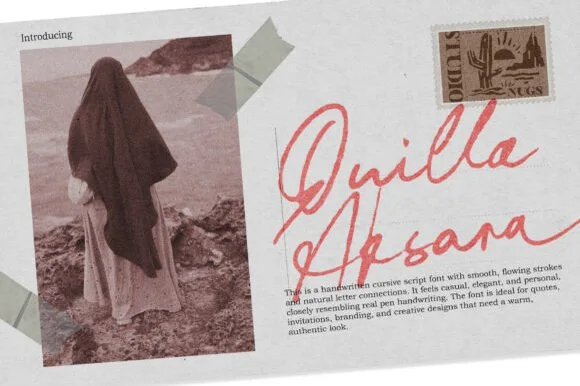
Handwritten cursive signature script
Quilla Aksara is a handwritten cursive script in coral on a scrapbook layout: a thin connected stroke with long diagonal entries, tall looping capitals, and a baseline that rises across the phrase, so the two words read as a signature written across a postcard.
Ideas for this font
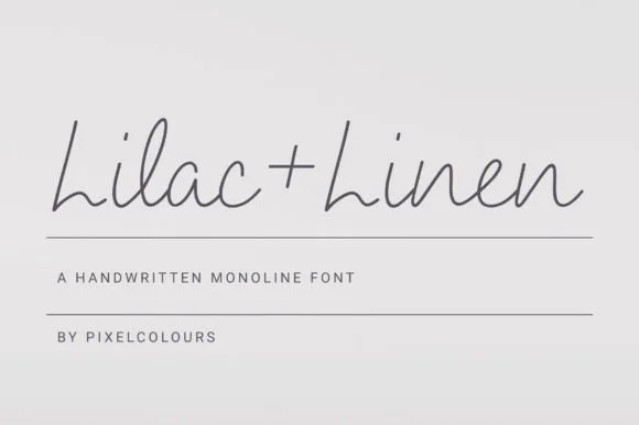
Airy fine-pen architectural monoline handwritten font
Lilac and Linen is an ultra-clean, slender monoline handwritten font blending tall open capitals with airy semi-connected pen lowercase.
Ideas for this font
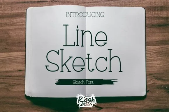
Thin monoline sketch serif
Line Sketch is a thin monoline serif in black on paper: tall narrow letterforms, hairlines of even weight, slab-ish serifs drawn with a slight wobble, and a hand-ruled feel that makes the two words look drawn with a fine pen rather than set from a font.
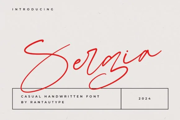
Fast slanted ballpoint signature cursive
Sergia is an expressive, fast-moving handwritten signature script with oversized sweeping initials and airy, minimalist pen curves.
Ideas for this font
Same independent foundry
Allow optional Google Analytics to measure visits and catalogue actions. Your search words and notes are not included. Privacy & storage