High-Contrast Display Serif

Cheerful Scribble + Medvilea Editorial
Pairs sculptural editorial warmth with Cheerful Scribble's clean modern geometry.
Inspect Medvilea Editorial specimenDisclosure: MakerFileHub may earn a commission from qualifying purchases via paid links on this page. How our links work.
Solid informal capitals paired with a fine scribbled loop font
Cheerful Scribble pairs heavy informal capitals with a fine scribble font, so a design can set a loud word and a thin looping second layer that reads as a pencil draft over the top.
Paid link
Get this fontProject & layout blueprintsAt-a-glance maker compatibility
Sturdy stroke walls and open counters weed cleanly on adhesive vinyl, HTV apparel film, and cut cardstock.
Visual anatomy & craft review
The cap half is an uneven block alphabet: the C closes a narrow crescent, the H holds two stems of different widths and the E carries three arms, all at a heavy weight with slightly wobbly edges, which is what keeps it informal rather than corporate. The scribble half is a fine single-line hand drawn as loops rather than letterforms in the sample, and it is used as a texture layer behind or across the caps. That combination is the point of the pairing: one cut carries the message and the other adds a drawn background at almost no visual weight. The caps hold at 30 pt on a print, and the scribble is a texture that should stay above 40 pt or be dropped. The photograph, the yellow ink, the sketch marks and the two caption lines are presentation; the duo is the two layers.
Informal · Scribbled · Paired
Two-font hierarchy recipes
Tested contrast partners — pairing Cheerful Scribble with grounded secondary typography.
Cheerful Scribble + Medvilea Editorial
Pairs sculptural editorial warmth with Cheerful Scribble's clean modern geometry.
Inspect Medvilea Editorial specimen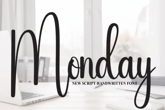
Cheerful Scribble + Monday
Introduces organic movement on pull-quotes, signatures and gift tags.
Inspect Monday specimenPractical applications
Concrete hierarchy, scale and production guidance tailored to Cheerful Scribble’s stroke geometry.
The loud caps pull attention across a corridor while the scribble layer adds drawn energy behind them, which suits a club that is selling making rather than order.
Hierarchy & layout recipe
Print an A3 poster: set the club name in the caps at 120 pt, lay the scribble at 60 pt behind it as an open texture, and keep 20 mm of margin so neither layer reaches the trim.
Pre-production check
A scribble layer behind heavy caps can read as a smudge from a metre away; check the poster at distance and lighten the scribble rather than the caps.
The informal caps hold at 14 pt on a sticker while the scribble adds a hand-made texture, which is what a drop-in workshop wants on its packaging.
Hierarchy & layout recipe
Print a 45 mm round sticker: set the workshop name in the caps at 14 pt, keep the scribble layer inside the die at 30 percent tint, and leave 5 mm of margin so the wobbling edges are not cut by the circle.
Pre-production check
A low tint behind small type lowers contrast; check the printed sticker and drop the scribble entirely below 14 pt.
The uneven caps give a feature header energy while the fine scribble fills the empty column beside it, so the page reads as drawn rather than laid out.
Hierarchy & layout recipe
Print an A4 spread: set the header in the caps at 72 pt across the left column, lay the scribble at 34 pt in the right margin, and keep 15 mm between the two so the texture never sits under a word.
Pre-production check
A scribble in a margin can look like a printer's mark; check the spread and keep it clearly separated from the header.
Technical & licence verification
Confirm included OTF/TTF/WOFF formats, full glyph tables and licence coverage on the live store page before batch production.
Closest visual alternatives
Matched across letterform anatomy, stroke behaviour and craft applications.
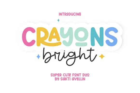
Rounded display paired with fine flowing handwriting
Crayons Bright pairs a heavy rounded display line with a fine connected handwriting below, where the display word mixes cap-like forms with a lowercase-looking y, an extended R leg and a short lower o stroke.
Ideas for this font
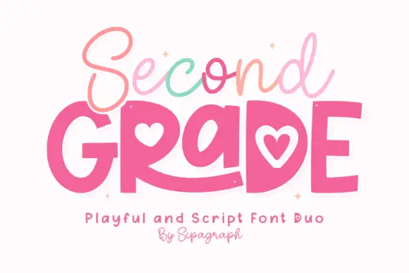
Fine script over playful heart-counter blocks
Second Grade Duo is a pair on white: a thin cursive script in pastel colours for the upper word and fat rounded capitals with heart counters for the lower, each with a soft white outline.
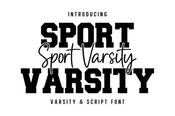
Varsity blocks with fine script
Sport Varsity pairs heavy clipped-corner slab capitals with a much thinner flowing script, where the block O has a tall angular counter and the script crosses the centre with long t bars, a deep y loop and a sweeping entry stroke from the left.
Ideas for this font
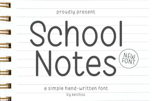
Open rounded notebook print
School Notes is a simple hand-written print in dark grey on ruled notebook paper: tall open letters, thin even strokes and round counters, drawn large enough to fill the page.
Ideas for this font
Same independent foundry
Allow optional Google Analytics to measure visits and catalogue actions. Your search words and notes are not included. Privacy & storage