Neutral Sans Workhorse

Back to School + Lemon Milk Pro FTR
Lets Back to School own the focal silhouette while handling secondary copy, sizing and subheads cleanly.
Inspect Lemon Milk Pro FTR specimenDisclosure: MakerFileHub may earn a commission from qualifying purchases via paid links on this page. How our links work.
Tall playful rainbow-crayon & chalk-hatched school display
Back to School is a tall, lively classroom display font outlining narrow hand-drawn capitals filled with multi-angle colored-pencil/chalk hatching.
Paid link
Get this fontProject & layout blueprintsAt-a-glance maker compatibility
Fine grain and micro-texture excel in 300 DPI print, sublimation, and screen print rather than small vinyl weeding.
Visual anatomy & craft review
Back to School is a tall display in narrow hand-drawn capitals, each filled with multi-angle pencil or chalk hatching in a different colour, so a word reads as a row of shaded blocks rather than a set of letterforms. The hatching runs at varying angles, which keeps the pattern lively, and the narrow proportions let a long heading stand in a column. Detail is fine, so the face needs roughly 25 mm before the hatch reads as pencil work, and it is at its best on white with a dark outline holding each letter together.
Rainbow-chalk · Tall-playful · Back-to-School
Two-font hierarchy recipes
Tested contrast partners — pairing Back to School with grounded secondary typography.
Back to School + Lemon Milk Pro FTR
Lets Back to School own the focal silhouette while handling secondary copy, sizing and subheads cleanly.
Inspect Lemon Milk Pro FTR specimen
Back to School + Augler
Grounds bold display lettering with classic typographic authority on posters, badges and apparel.
Inspect Augler specimenPractical applications
Concrete hierarchy, scale and production guidance tailored to Back to School’s stroke geometry.
Pencil-hatched letters read as a teacher's hand-shaded sign, which is the tone of a primary corridor. Narrow caps fit a long subject heading into one wall band.
Hierarchy & layout recipe
Display letters 100 mm on 160 gsm, 30 mm margins, 50 mm pitch. Divider 210 x 297 mm, heading 24 mm, list 9/13 pt. Board 1200 x 900 mm, heading 90 mm, 60 mm margins.
Pre-production check
Fine hatch lines under 0.3 mm disappear on a school copier and the letters read as flat fills. Print one test sheet on the machine the school owns, and simplify the hatch if it greys out.
Shaded pencil letters give a first-day photo a made-by-hand look that a parent can print at home. The narrow forms keep a name plus a grade on one line.
Hierarchy & layout recipe
Sign 300 x 200 mm, line 25 mm, 12 mm between lines, 25 mm margins. Note 90 x 60 mm, text 6/9 pt on 8 mm ruled pitch. Tag 60 x 90 mm, name 10 mm, hole 5 mm clear.
Pre-production check
Home-printed signs on 200 gsm curl against a wall, and a hatched fill shows the curl as a shadow. Back the sign with foamex or mount it flat, and check one print under indoor light before the photo.
Bright hatched letters read as fresh term decoration, and the tall forms give a header presence on a narrow board. Thick outlines hold the pattern at 20 mm.
Hierarchy & layout recipe
Board 900 x 600 mm, heading 80 mm, 40 mm margins. Chart header 400 x 100 mm, word 40 mm, 25 mm margins. Name tags 80 x 30 mm, name 8 mm, 3 mm border with a 4 mm rounded corner.
Pre-production check
Name tags are handled daily and paper corners fray first, taking the outline with them. Laminate the sheet before cutting, and round the corners to 4 mm so a child cannot pick at an edge.
Technical & licence verification
Confirm included OTF/TTF/WOFF formats, full glyph tables and licence coverage on the live store page before batch production.
Closest visual alternatives
Matched across letterform anatomy, stroke behaviour and craft applications.
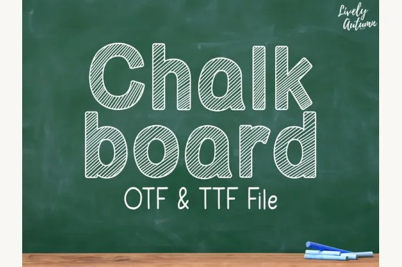
Neat rounded mixed-case font striped with parallel sketch lines (OTF & TTF)
Chalkboard (by LivelyAutumn 11.11) is a tidy, rounded mixed-case classroom font filled inside clean outlines with even diagonal sketch stripes (OTF & TTF).
Ideas for this font
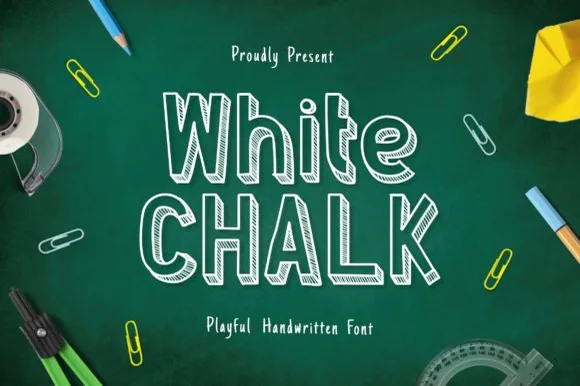
Tall slab-serifed chalkboard font shaded with diagonal chalk hatch
Whitechalk is a tall, structured chalkboard display font pairing crisp slab-serifed outlines with diagonal white-chalk interior shading.
Ideas for this font
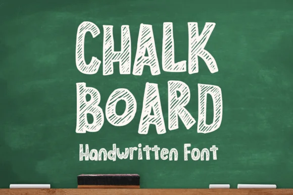
Hollow-outlined cartoon block font hatched with diagonal chalk lines
Chalkboard (by MVMET) is a cheerful classroom display font outlining bouncy uppercase/lowercase blocks filled with diagonal chalk-sketch stripes.
Ideas for this font
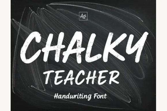
Streaky dust-textured blackboard chalk marker font
Chalky Teacher is an authentic blackboard handwritten font streaked internally with realistic dry-chalk grain across bold slanted strokes.
Ideas for this font
Same independent foundry
Allow optional Google Analytics to measure visits and catalogue actions. Your search words and notes are not included. Privacy & storage