Modern Grotesque Body

Tippy Tappy Type + Nyxar
Creates crisp high-hierarchy contrast beneath Tippy Tappy Type headlines across menus, websites and labels.
Inspect Nyxar specimenDisclosure: MakerFileHub may earn a commission from qualifying purchases via paid links on this page. How our links work.
Light irregular typewriter-style slabs with rounded feet and a curled flourish
Tippy Tappy Type shows yellow mixed-case lettering on blue in three stacked rows, where broad round bowls and uneven little feet give the line a handwritten rhythm and the final row carries a long curled underline-like flourish beneath it.
Paid link
Get this fontProject & layout blueprintsAt-a-glance maker compatibility
Fine grain and micro-texture excel in 300 DPI print, sublimation, and screen print rather than small vinyl weeding.
Visual anatomy & craft review
The strokes stay slab-ended, the bowls stay round, the feet wobble from letter to letter and the baseline drifts slightly. That wobble is the character: the sample reads as typing rather than typesetting, which is why the three rows stack tightly. The typewriter photograph, the weather doodles and the bonus-vector caption belong to the cover, and neither monospacing nor a doodle count is shown. Keep 30 pt so the feet stay distinct, check that your file has the flourish and set the rows tight only on a plain ground.
Light irregular typewriter-style slabs with rounded feet and a curled flourish
Two-font hierarchy recipes
Tested contrast partners — pairing Tippy Tappy Type with grounded secondary typography.
Tippy Tappy Type + Nyxar
Creates crisp high-hierarchy contrast beneath Tippy Tappy Type headlines across menus, websites and labels.
Inspect Nyxar specimen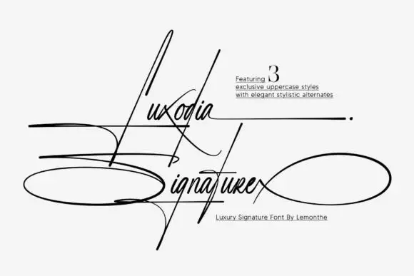
Tippy Tappy Type + Luxodia Signature
Adds a warm human signature touch for 1-to-3-word callouts without competing against structured serif capitals.
Inspect Luxodia Signature specimenPractical applications
Concrete hierarchy, scale and production guidance tailored to Tippy Tappy Type’s stroke geometry.
The typed rhythm suits a page of reader letters, and the uneven feet keep the heading from looking like a corporate subhead.
Hierarchy & layout recipe
Print a 210 mm page: set the heading at 30 pt across two rows with 10 mm between baselines, keep 14 mm of clear ground beneath before the body at 10 pt, and keep 18 mm of margin.
Pre-production check
The flourish may be an extra graphic; check your file before promising it under a heading.
The typewriter feel gives a note card a letter rather than a greeting-card voice, which suits a thank you sent after an interview.
Hierarchy & layout recipe
Print a 105 by 148 mm card: set the greeting at 22 pt on one row, keep 16 mm of clear ground beneath for the handwritten message, and keep 18 mm of margin at each side.
Pre-production check
Monospacing is not confirmed; check the spacing of a full typed line before setting a list.
The typing rhythm suits a workbook cover about writing, and the round bowls stay friendly at a size children read easily.
Hierarchy & layout recipe
Print an A4 cover: set the title at 40 pt across two rows with 12 mm between baselines, keep 20 mm of clear ground beneath before the subtitle at 11 pt, and keep 20 mm of margin all round.
Pre-production check
Doodle counts are advertised, not shown; check the download before planning illustrations.
Technical & licence verification
Confirm included OTF/TTF/WOFF formats, full glyph tables and licence coverage on the live store page before batch production.
Closest visual alternatives
Matched across letterform anatomy, stroke behaviour and craft applications.
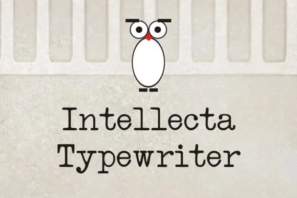
Evenly spaced typewriter-like letters with rounded slab feet
Intellecta Typewriter shows black title-case words in two lines on a pale wall-like background, where the letters carry relatively even stroke weight, broad horizontal feet and a y that drops below the second word with a short bent ending while the r finishes in a small rounded shoulder.
Ideas for this font
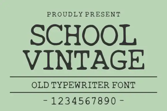
Old typewriter serif with a numeral row
School Vintage is an old typewriter serif in dark ink on sage green: slab serifs with slightly rounded feet, a moderate even stroke, wide spacing, shown with a ruled caption and a full numeral row.
Ideas for this font
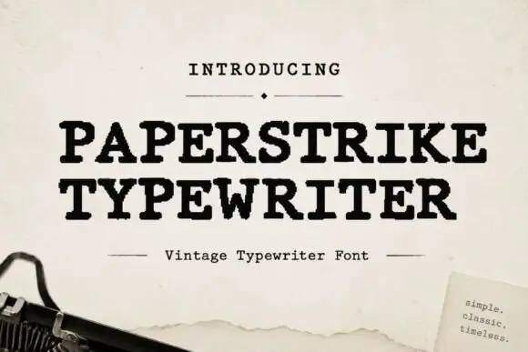
Distressed typewriter serif with worn edges
Paperstrike Typewriter is a vintage typewriter serif in black on cream paper: heavy slabs, a bold even stroke and edges worn away in small flakes, set with a ruled caption and a small note card in the corner.
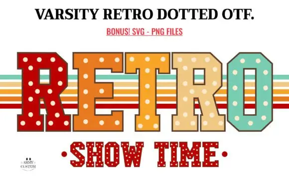
Retro dotted varsity slab
Varsity Retro Dotted is an angular varsity slab in four warm colours on white: heavy caps with chamfered corners and cream dots set into every fill, one letter per colour, with retro stripe bands behind the word and a second dotted line beneath in red.
Same independent foundry
Allow optional Google Analytics to measure visits and catalogue actions. Your search words and notes are not included. Privacy & storage