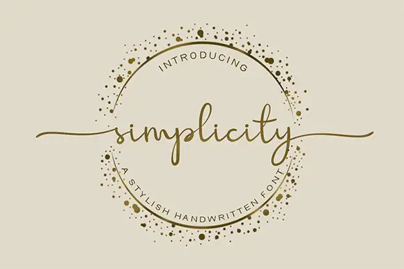
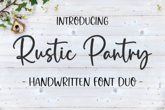
Editorial Serif Anchor

Ainsley + Marquis - Elegant Modern Serif
Anchors Ainsley's fluid strokes with crisp Roman proportions on wedding suites, headers and packaging.
Inspect Marquis - Elegant Modern Serif specimenDisclosure: MakerFileHub may earn a commission from qualifying purchases via paid links on this page. How our links work.
Solid marker-weight print with rounded joins and open counters
Ainsley is a solid marker-weight print in which the strokes keep an even thickness, the corners round off and the counters stay open, so a name reads as lettering written with a felt tip and then cleaned up for cutting.
Paid link
Get this fontProject & layout blueprintsAt-a-glance maker compatibility
Fine grain and micro-texture excel in 300 DPI print, sublimation, and screen print rather than small vinyl weeding.
Visual anatomy & craft review
The A carries a rounded apex over a wide base, the i dots a solid square-ish block, the n turns two even arches and the s closes a smooth spine, all at a single marker weight with no taper and no chalk texture. The evenness is the character: nothing frays, which is why the sample sets a name inside a circle badge and a supply label beside it. The face weeds cleanly from three quarters of an inch of cap height on adhesive vinyl and holds from 18 pt in print. The soft pastel ground, the pencil and the small caption lines are presentation; the solid dark name and labels are the face.
Marker · Rounded · Cut-ready
Two-font hierarchy recipes
Tested contrast partners — pairing Ainsley with grounded secondary typography.
Ainsley + Marquis - Elegant Modern Serif
Anchors Ainsley's fluid strokes with crisp Roman proportions on wedding suites, headers and packaging.
Inspect Marquis - Elegant Modern Serif specimen
Ainsley + Kohilo
Keeps small-scale dates, URLs, nutrition facts and care instructions crisp and legible below script titles.
Inspect Kohilo specimenPractical applications
Concrete hierarchy, scale and production guidance tailored to Ainsley’s stroke geometry.
The solid strokes survive lamination and small cuts, and the open counters keep a first name readable at 22 pt on a 90 mm strip.
Hierarchy & layout recipe
Print a 90 by 35 mm strip: set the first name at 22 pt, keep 5 mm of clear border, and laminate with a matte pouch so the plastic does not glare under classroom lights.
Pre-production check
A marker face printed at 14 pt closes its counters; check the strip and keep the name at 20 pt or above.
The even weight weeds from small vinyl, and the rounded joins hold a room label at one inch of cap height on a curved bottle.
Hierarchy & layout recipe
Cut a 60 mm decal: set the label at one inch of cap height, weld the letters into one path, and apply on a flat band of the bottle rather than across a taper.
Pre-production check
Vinyl applied over a bottle taper lifts at the ends; check the placement and keep the decal on the straight section.
The friendly print suits a small kraft tag, and the solid strokes stay sharp at 26 pt on 50 mm so a thank-you reads at arm's length across a table.
Hierarchy & layout recipe
Print a 50 by 90 mm tag: set the word at 26 pt near the head, punch a 4 mm hole 10 mm from the top, and keep 8 mm between the hole and the first letter.
Pre-production check
A hole punched close to a letter tears the tag; check the die and move the hole 4 mm further from the word.
Technical & licence verification
Confirm included OTF/TTF/WOFF formats, full glyph tables and licence coverage on the live store page before batch production.
Closest visual alternatives
Matched across letterform anatomy, stroke behaviour and craft applications.
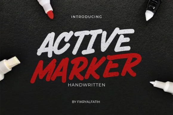
Slanted chisel-tip whiteboard & chalkboard marker sans
Active Marker captures brisk, slanted broad-tip marker lettering with organic stroke tapers and natural double-letter ligatures.
Ideas for this font
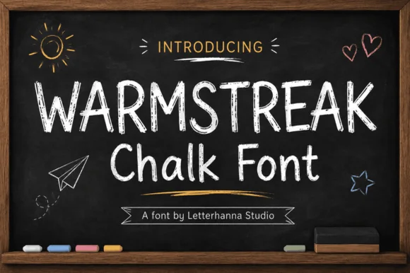
Authentic dusty-chalkboard café & classroom print sans
Warmstreak is an authentic, chalk-textured upright print font capturing real dusty calcium-chalk grain on café menus and school boards!
Ideas for this font
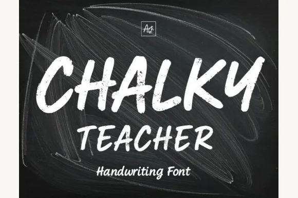
Streaky dust-textured blackboard chalk marker font
Chalky Teacher is an authentic blackboard handwritten font streaked internally with realistic dry-chalk grain across bold slanted strokes.
Ideas for this font
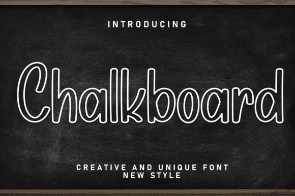
Hollow outlined school print with rounded counters and even strokes
Chalkboard is a clean hollow-outline print in which every letter is drawn as a double contour, so a word reads as chalk lettering on a board without the texture of real chalk.
Ideas for this font
Same independent foundry
Allow optional Google Analytics to measure visits and catalogue actions. Your search words and notes are not included. Privacy & storage