High-Contrast Display Serif

Varsity Famous + Svara
Pairs sculptural editorial warmth with Varsity Famous's clean modern geometry.
Inspect Svara specimenDisclosure: MakerFileHub may earn a commission from qualifying purchases via paid links on this page. How our links work.
Rounded varsity slabs on an arc paired with a loose connected script
Varsity Famous pairs rounded varsity slab capitals set on an arc against a loose connected script that runs flat beneath them and slightly overlaps.
Paid link
Get this fontProject & layout blueprintsAt-a-glance maker compatibility
Weld or Unite overlapping script joins into one continuous vector path before sending to the blade.
Visual anatomy & craft review
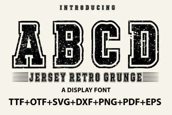
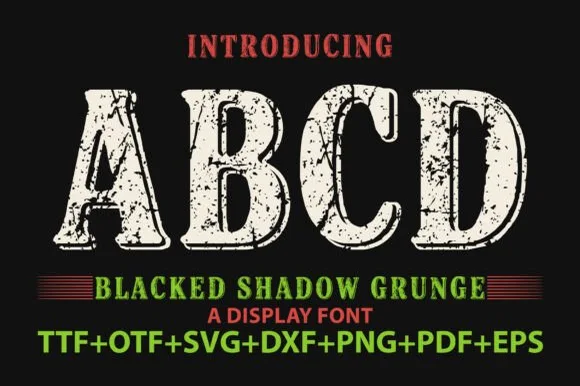
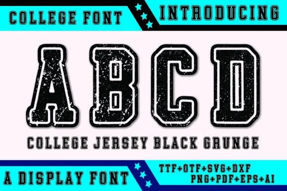
The caps half is drawn on a curve: the letters rotate individually so the baseline of the arch holds, the slabs are rounded rather than square, and the weight is uniform enough that the arc reads as one band. Each cap carries a thin inner line and a light outline, which gives the word a two-colour look from a single fill. The script half is a loose connected hand with tall narrow loops, its baseline level and its exit running out to the right, and it overlaps the lower edge of the caps so the two lines feel printed together rather than stacked. The navy ground, the orange band with the type count and the small tracked captions are presentation; the duo is the two words.
Rounded · Arched · Paired
Two-font hierarchy recipes
Tested contrast partners — pairing Varsity Famous with grounded secondary typography.
Varsity Famous + Svara
Pairs sculptural editorial warmth with Varsity Famous's clean modern geometry.
Inspect Svara specimen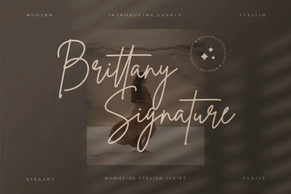
Varsity Famous + Brittany Signature Script
Introduces organic movement on pull-quotes, signatures and gift tags.
Inspect Brittany Signature Script specimenPractical applications
Concrete hierarchy, scale and production guidance tailored to Varsity Famous’s stroke geometry.
The arc fits a chest print better than a straight line, and the rounded slabs stay soft on fabric while the script gives the design a second voice at no extra cost.
Hierarchy & layout recipe
Set the caps at 70 mm along a 280 mm arc, set the script at 45 mm beneath and overlapping by 4 mm, and keep 25 mm from the collar seam so the arc is not distorted.
Pre-production check
Pressing a curved line onto a soft garment stretches the arc; check a sample print on the actual hoodie and adjust the arc depth before the run.
The arc gives a poster header a shape at the top of the sheet, and the rounded slabs keep a school name friendly rather than severe.
Hierarchy & layout recipe
Set the caps at 90 pt along a 200 mm arc at the head of an A3 poster, set the event details in a plain 14 pt sans, and hold 30 mm between the arc and the first detail line.
Pre-production check
Arched caps at 90 pt on A3 can run off the sheet; check the artwork at full size and reduce the arc depth rather than the cap height.
The pair lets a stall display the school name formally and a thank-you warmly, and both read at hand height on a trestle table.
Hierarchy & layout recipe
Set the school name in the caps at 40 mm on a 400 by 300 mm board, set the thanks in the script at 25 mm beneath, and leave 20 mm of margin so the script's exit stays on the board.
Pre-production check
Boards propped on a table catch light; check the sign under the hall lights and keep the inner line open at 3 mm minimum.
Technical & licence verification
Confirm included OTF/TTF/WOFF formats, full glyph tables and licence coverage on the live store page before batch production.
Closest visual alternatives
Matched across letterform anatomy, stroke behaviour and craft applications.
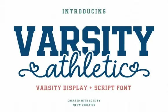
Solid varsity slab caps paired with a looping script with heart ends
Varsity Athletic pairs a solid collegiate slab capital alphabet with a looping script whose ends curl into small hearts, so a two-line design can carry both a team voice and a friendly one.
Ideas for this font
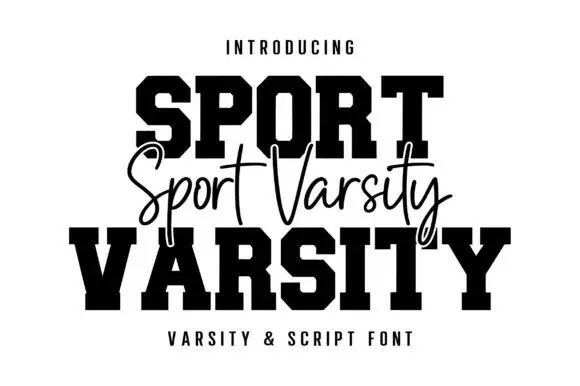
Varsity blocks with fine script
Sport Varsity pairs heavy clipped-corner slab capitals with a much thinner flowing script, where the block O has a tall angular counter and the script crosses the centre with long t bars, a deep y loop and a sweeping entry stroke from the left.
Ideas for this font
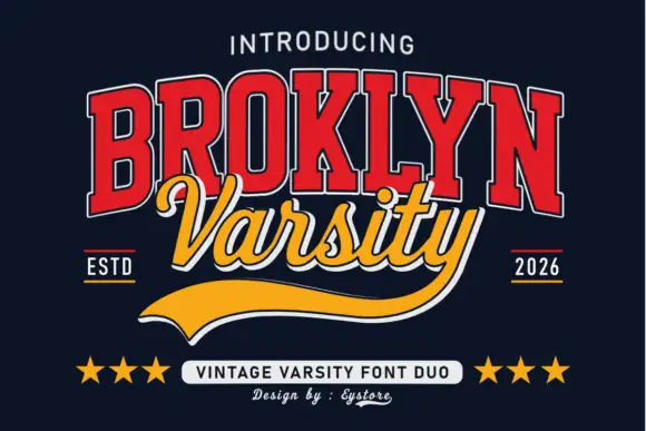
Tall varsity slabs with an inline outline, paired with a sweeping script and a tail
Broklyn Varsity pairs tall collegiate slab capitals drawn with an inline outline against a sweeping script that sits between them and drops a heavy sport tail below the baseline.
Ideas for this font
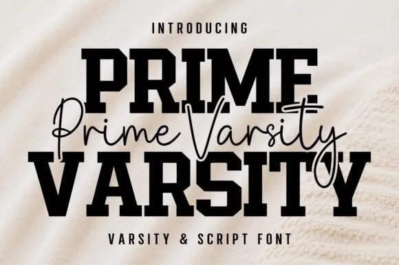
Varsity slab crossed by a thin script
Prime Varsity is a varsity and script pair in black on cream: heavy condensed slab capitals for the two big words and a thin monoline script written across them in a single flowing line, sold together as one duo.
Same independent foundry
Allow optional Google Analytics to measure visits and catalogue actions. Your search words and notes are not included. Privacy & storage