Editorial Serif Anchor

Sweetbell + Askinо
Anchors Sweetbell's fluid strokes with crisp Roman proportions on wedding suites, headers and packaging.
Inspect Askinо specimenDisclosure: MakerFileHub may earn a commission from qualifying purchases via paid links on this page. How our links work.
Neat upright notebook print with even strokes and generous counters
Sweetbell is a neat upright print in which the letters stand apart, the strokes stay even and the counters stay generous, so a word reads as careful handwriting rather than as a printed face.
Paid link
Get this fontProject & layout blueprintsAt-a-glance maker compatibility
Weld or Unite overlapping script joins into one continuous vector path before sending to the blade.
Visual anatomy & craft review
The capital S reverses through two even curves and the w follows with three shallow valleys, then the letters settle into a regular rhythm: the e loops back through a wide counter, the double l keeps two plain stems and the b closes a round bowl against a thick stem. Nothing is connected, nothing is slanted and the weight is a consistent medium with rounded terminals, which is what makes the face read as something written with a good pen at a sensible pace. The x-height is tall, so at 12 pt it behaves like a rounded sans and stays legible on a price card. The ruled paper ground, the paper clip, the small arrows and the three caption lines are presentation; the lettering is the word.
Neat · Upright · Friendly
Two-font hierarchy recipes
Tested contrast partners — pairing Sweetbell with grounded secondary typography.
Sweetbell + Askinо
Anchors Sweetbell's fluid strokes with crisp Roman proportions on wedding suites, headers and packaging.
Inspect Askinо specimen
Sweetbell + Bargain Condensed
Keeps small-scale dates, URLs, nutrition facts and care instructions crisp and legible below script titles.
Inspect Bargain Condensed specimenPractical applications
Concrete hierarchy, scale and production guidance tailored to Sweetbell’s stroke geometry.
The upright lettering stays legible on a small card at 16 pt and reads as handwriting, which suits a table run by volunteers.
Hierarchy & layout recipe
Print on 70 by 100 mm tent cards: set the item at 16 pt in the hand, set the price at 20 pt beneath it, and leave 8 mm of margin so the tall x-height is not cut when the card is folded.
Pre-production check
Folded tent cards crease across the middle; check the fold against the artwork and keep both lines in the upper half so the crease falls on blank paper.
The neat handwriting suits a printed paper bag and holds at 20 pt against kraft, where a finer hand would disappear into the texture of the paper.
Hierarchy & layout recipe
Print on a 250 by 320 mm kraft bag: set the shop name at 20 pt on the front face, set the city in a 7 pt caps sans beneath, and keep 40 mm from the top edge so the print clears the folded lip.
Pre-production check
Kraft soaks ink and closes small counters; print one bag on the actual stock and open the e if it starts to fill in.
The friendly hand carries a short note on a small insert, and the even stroke keeps the message readable at 11 pt where a lighter hand thins out.
Hierarchy & layout recipe
Print on a 85 by 55 mm insert: set the message at 11 pt in the hand, set the order reference in a 6 pt sans along the foot, and leave 7 mm of margin on all sides so the sender's line stays inside the trim.
Pre-production check
A tall x-height at 11 pt fills an insert quickly; check the proof at final size and tighten the message rather than the leading.
Technical & licence verification
Confirm included OTF/TTF/WOFF formats, full glyph tables and licence coverage on the live store page before batch production.
Closest visual alternatives
Matched across letterform anatomy, stroke behaviour and craft applications.
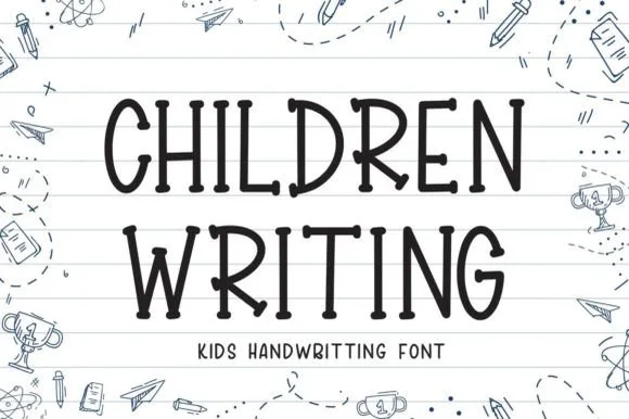
Neat elementary notebook-lined classroom print
Children Writing is a tidy, cheerful uppercase/print handwritten font with soft marker-dot terminals built for school and kid crafts.
Ideas for this font
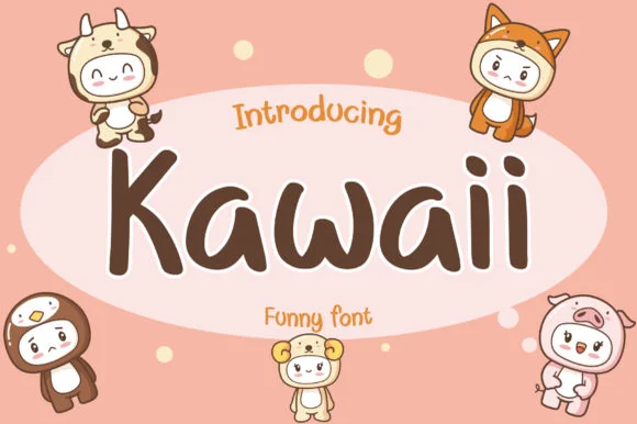
Neat disconnected rounded kawaii marker print sans
Kawaii (by AquariiD) is a clean, friendly disconnected marker print sans (compare with connected #1099!) built for cute stickers, comics, and kid labels.
Ideas for this font
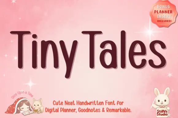
Narrow rounded upright lettering
Tiny Tales is a narrow rounded upright hand in deep plum on pink: compact letters with a high x-height, a light monoline stroke and short ascenders, sold for digital planners and long notes.
Ideas for this font
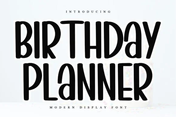
Tall rounded marker all-caps planner font
Birthday Planner is a tidy, tall hand-lettered marker display font with softly rounded stem tips and friendly vertical rhythm.
Ideas for this font
Same independent foundry
Allow optional Google Analytics to measure visits and catalogue actions. Your search words and notes are not included. Privacy & storage