High-Contrast Display Serif

Varsity Athletic + Svara
Pairs sculptural editorial warmth with Varsity Athletic's clean modern geometry.
Inspect Svara specimenDisclosure: MakerFileHub may earn a commission from qualifying purchases via paid links on this page. How our links work.
Solid varsity slab caps paired with a looping script with heart ends
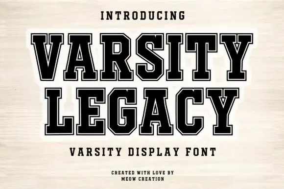
Varsity Athletic pairs a solid collegiate slab capital alphabet with a looping script whose ends curl into small hearts, so a two-line design can carry both a team voice and a friendly one.
Paid link
Get this fontProject & layout blueprintsAt-a-glance maker compatibility
Weld or Unite overlapping script joins into one continuous vector path before sending to the blade.
Visual anatomy & craft review
The caps half is heavy and squared: the V and the A meet in sharp vertices, the R carries a straight leg, the S keeps its curves and the T holds a wide flat bar, with unbracketed slabs at every stem and a tight fit across the word. The script half is light and looping, with tall ascenders and a heart worked into the entry and exit strokes at both ends, which softens the pairing considerably. Together they cover the two registers a school or club design usually needs: a name that reads at distance and a subtitle that feels personal. The blue ink, the cream ground and the three small caption lines are presentation; the duo is the two words.
Varsity · Paired · Playful
Two-font hierarchy recipes
Tested contrast partners — pairing Varsity Athletic with grounded secondary typography.
Varsity Athletic + Svara
Pairs sculptural editorial warmth with Varsity Athletic's clean modern geometry.
Inspect Svara specimen
Varsity Athletic + Easy Handwriting
Introduces organic movement on pull-quotes, signatures and gift tags.
Inspect Easy Handwriting specimenPractical applications
Concrete hierarchy, scale and production guidance tailored to Varsity Athletic’s stroke geometry.
The slab caps read across a gym and the looping script carries the season or the team name beneath, so one banner covers both without a second typeface.
Hierarchy & layout recipe
Set the team name in the caps at 100 mm on a 1.5 m banner, set the subtitle in the script at 55 mm, and leave 40 mm at each end so the heart terminals stay inside the hem.
Pre-production check
Screen printing a light script over a solid slab line needs a clear gap; check a pull at final size and keep 15 mm between the two lines.
The duo gives a school club a formal team line and a friendlier second line, and both hold up in a one-colour print on a dark garment.
Hierarchy & layout recipe
Set the club name in the caps at 80 mm across a 260 mm chest width, set the year in the script at 40 mm beneath, and keep 20 mm between the two lines.
Pre-production check
Light ink on a dark shirt spreads and fills the script's hearts; check a pull on the actual garment and thicken the heart terminals before the run.
The pair lets a printed thank-you carry the club's formal name and a warm closing line, and both remain legible on a small card.
Hierarchy & layout recipe
Set the club name in the caps at 18 pt at the head of a 105 by 148 mm card, set the thanks in the script at 14 pt, and hold 10 mm between the two blocks.
Pre-production check
Cards that go home in a kit bag get bent; print on a heavier stock and check that the light script still reads after creasing.
Technical & licence verification
Confirm included OTF/TTF/WOFF formats, full glyph tables and licence coverage on the live store page before batch production.
Closest visual alternatives
Matched across letterform anatomy, stroke behaviour and craft applications.
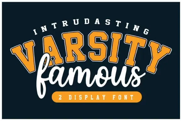
Rounded varsity slabs on an arc paired with a loose connected script
Varsity Famous pairs rounded varsity slab capitals set on an arc against a loose connected script that runs flat beneath them and slightly overlaps.
Ideas for this font
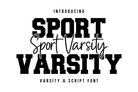
Varsity blocks with fine script
Sport Varsity pairs heavy clipped-corner slab capitals with a much thinner flowing script, where the block O has a tall angular counter and the script crosses the centre with long t bars, a deep y loop and a sweeping entry stroke from the left.
Ideas for this font
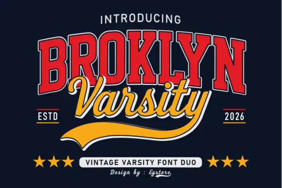
Tall varsity slabs with an inline outline, paired with a sweeping script and a tail
Broklyn Varsity pairs tall collegiate slab capitals drawn with an inline outline against a sweeping script that sits between them and drops a heavy sport tail below the baseline.
Ideas for this font
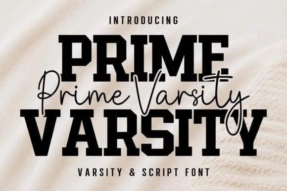
Varsity slab crossed by a thin script
Prime Varsity is a varsity and script pair in black on cream: heavy condensed slab capitals for the two big words and a thin monoline script written across them in a single flowing line, sold together as one duo.
Same independent foundry
Allow optional Google Analytics to measure visits and catalogue actions. Your search words and notes are not included. Privacy & storage