Modern Grotesque Body

Abcd Sports + Mansory
Creates crisp high-hierarchy contrast beneath Abcd Sports headlines across menus, websites and labels.
Inspect Mansory specimenDisclosure: MakerFileHub may earn a commission from qualifying purchases via paid links on this page. How our links work.
Softly rounded vintage collegiate fleece slab serif
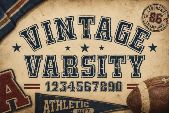
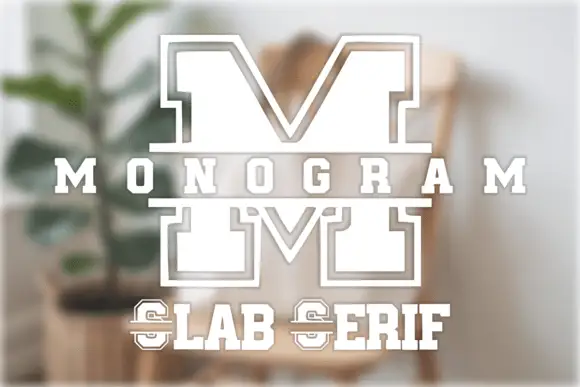
Abcd Sports is a clean, softly rounded athletic slab serif channeling 1980s Russell/Champion reverse-weave sweatshirt lettering.
Paid link
Get this fontProject & layout blueprintsAt-a-glance maker compatibility
Sturdy stroke walls and open counters weed cleanly on adhesive vinyl, HTV apparel film, and cut cardstock.
Visual anatomy & craft review
Abcd Sports is a softly rounded athletic slab built on the 1980s reverse-weave sweatshirt lettering that university bookstores printed for decades, with heavy block capitals, blunt slabs and outer corners rounded so the letters read as felt rather than as a hard sports block. The weight is uniform and the counters are large, which lets the face hold at 12 mm on a cap and at 200 mm on a stadium banner. It is an all-caps face, pairs with a plain sans for names and numbers, and looks wrong in sentence case.
Vintage-fleece · Rounded-slab · Clean-athletic
Two-font hierarchy recipes
Tested contrast partners — pairing Abcd Sports with grounded secondary typography.
Abcd Sports + Mansory
Creates crisp high-hierarchy contrast beneath Abcd Sports headlines across menus, websites and labels.
Inspect Mansory specimen
Abcd Sports + Autography
Adds a warm human signature touch for 1-to-3-word callouts without competing against structured serif capitals.
Inspect Autography specimenPractical applications
Concrete hierarchy, scale and production guidance tailored to Abcd Sports’s stroke geometry.
Rounded slabs read as a fleece appliqué without the cost of actual appliqué, which is the look small athletic clubs want. Large counters keep a club name legible on a cap at 12 mm.
Hierarchy & layout recipe
Crewneck print 260 x 140 mm, name 45 mm, 60 mm from the collar. Tote panel 280 x 280 mm, name 50 mm. Cap embroidery 100 x 45 mm, name 20 mm, 3 mm stitch border.
Pre-production check
Cap embroidery on a curved crown distorts letters at the ends of the line, and a rounded slab at 20 mm will look uneven. Request a sew-out on the actual cap, and shorten the name or reduce to initials if the ends pull.
The face is the native lettering of school sportswear, so a PE shirt reads as belonging to a school rather than to a brand. Heavy slabs survive a cheap screen print on a polyester jersey.
Hierarchy & layout recipe
Shirt print 280 x 120 mm, word 55 mm, 40 mm from the collar. Jersey number 180 mm tall, name 40 mm on an 80 mm arc. Bottle wrap 200 x 80 mm, word 22 mm.
Pre-production check
Polyester jerseys need a low-bleed plastisol and a heavy slab can migrate dye into the ink. Specify a bleed-blocker underbase, and wash one printed shirt twice before ordering the team set.
Reverse-weave lettering carries the weight of a whole season, which makes a coach gift feel earned. The rounded slabs soften what would otherwise be a hard collegiate look.
Hierarchy & layout recipe
Crewneck print 240 x 130 mm, surname 45 mm. Plaque 300 x 200 mm, word 40 mm, 25 mm margins, four fixings. Card 148 x 105 mm, greeting 14 mm, message 7/10 pt.
Pre-production check
Engraved plaques need the artwork reversed, and rounded slabs at 40 mm read well while a small date line does not. Engrave large text only, and print the detail lines litho onto the plate instead.
Technical & licence verification
Confirm included OTF/TTF/WOFF formats, full glyph tables and licence coverage on the live store page before batch production.
Closest visual alternatives
Matched across letterform anatomy, stroke behaviour and craft applications.
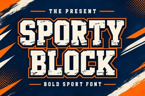
Heavy chamfered collegiate varsity block slab
Sporty Block is a classic heavy collegiate athletic slab serif built for 2- and 3-color layered jersey outlines, banners, and spirit wear.
Ideas for this font
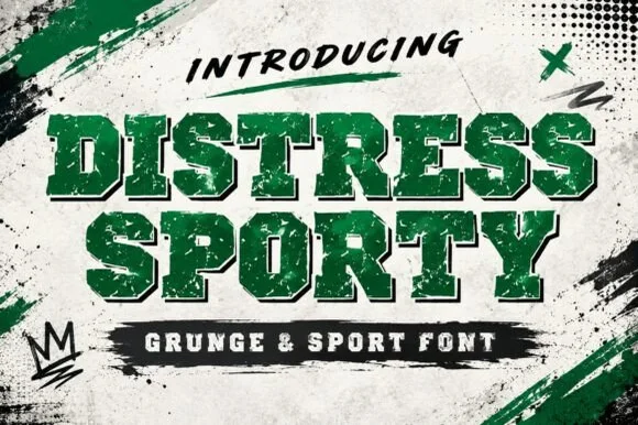
Heavy cracked-plastisol grunge varsity slab serif
Distress Sporty is a rugged collegiate varsity slab serif pre-weathered with cracked plastisol-ink splits and rough turf grit.
Ideas for this font
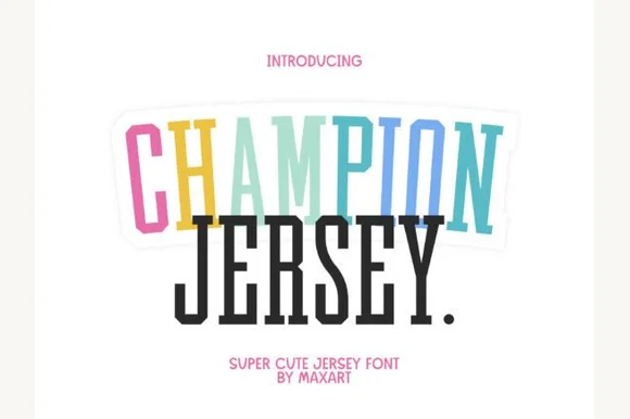
Tall extra-condensed athletic & pastel varsity slab serif
Champion Jersey is a tall, slim extra-condensed varsity slab serif packing long team names, Taylor-era tour titles, and slogans into narrow spaces.
Ideas for this font
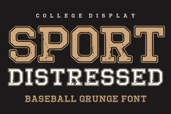
College slab block in layered grunge cuts
Sport Distressed is a college slab block shown in two treatments on one page: a tan filled cap with a thin keyline, and a white outline cap with a worn, speckled fill, both built on the same squared athletic skeleton.
Ideas for this font
Same independent foundry
Allow optional Google Analytics to measure visits and catalogue actions. Your search words and notes are not included. Privacy & storage