High-Contrast Display Serif

Seniors + Wolles Elegant Modern Serif
Pairs sculptural editorial warmth with Seniors's clean modern geometry.
Inspect Wolles Elegant Modern Serif specimenDisclosure: MakerFileHub may earn a commission from qualifying purchases via paid links on this page. How our links work.
Heavy collegiate-like capitals with clipped corners and narrow straight counters
Seniors fills a white poster header with tightly fitted orange capitals, where the S, O and R use strongly chamfered outer corners, thick rectangular stems surround narrow counters and the I stays a simple bar.
Paid link
Get this fontProject & layout blueprintsAt-a-glance maker compatibility
Sturdy stroke walls and open counters weed cleanly on adhesive vinyl, HTV apparel film, and cut cardstock.
Visual anatomy & craft review
The stems stay thick and rectangular, the corners chamfer at forty-five degrees, the fit runs tight and the counters narrow into straight slots. That chamfer is the character: the word reads as a varsity header without an outline, which is why the sample sets a short title above a photograph. The graduation photo supplies context, not an alphabet, so test the tight fit on a real class name or year and keep 40 pt before the narrow counters close. The tight fit is the risk: the letters almost touch, so a two-digit year closes into a block and the counters of the R and the A plug, which is why class names belong at 40 pt and above.
Chamfered · Tight fit · Collegiate
Two-font hierarchy recipes
Tested contrast partners — pairing Seniors with grounded secondary typography.
Seniors + Wolles Elegant Modern Serif
Pairs sculptural editorial warmth with Seniors's clean modern geometry.
Inspect Wolles Elegant Modern Serif specimen
Seniors + Honey
Introduces organic movement on pull-quotes, signatures and gift tags.
Inspect Honey specimenPractical applications
Concrete hierarchy, scale and production guidance tailored to Seniors’s stroke geometry.
The chamfered caps suit a graduation header, and the tight fit holds a class year at 60 pt on an A2 poster, where the clipped corners read as athletic intent.
Hierarchy & layout recipe
Print an A2 poster: set the year at 60 pt on one row, keep 10 mm between letters so the chamfers stay separate, and keep 26 mm of clear ground beneath before the photograph at 14 pt.
Pre-production check
A tight fit printed with extra ink closes the counters; check the proof at final size and open 1 mm per gap.
The collegiate caps set an awards banner, and the heavy stems read at 56 pt across an A3 sheet, so the header carries without a second element.
Hierarchy & layout recipe
Print an A3 banner: set the heading at 56 pt on one row, keep 22 mm beneath before the names at 14 pt, and keep 20 mm of margin all round so the chamfers stay whole.
Pre-production check
Two tightly fitted rows stacked look like one block; check the banner and keep the second line in a plain sans.
The chamfered blocks give a gym sign weight, and the rectangular stems hold a short name at 50 mm on a painted panel, clear from the far pavement.
Hierarchy & layout recipe
Paint a 500 by 250 mm panel: set the name at 50 mm on one row, keep 8 mm of clear space between letters, and keep 22 mm of border on all sides so no chamfered corner is cut by the edge.
Pre-production check
Chamfered corners painted at 26 mm read as damage; check the mounted panel and hold the name at 44 mm.
Technical & licence verification
Confirm included OTF/TTF/WOFF formats, full glyph tables and licence coverage on the live store page before batch production.
Closest visual alternatives
Matched across letterform anatomy, stroke behaviour and craft applications.

Wide geometric variable sans
Mechacore is a wide geometric sans in black on yellow: square extended letters, a flat-topped C, a stencil variant, five weights from light to bold, and an ultra-expanded width, laid out as a technical sheet with rules, labels and a barcode, so the plate reads as a system rather than a single font.
Ideas for this font
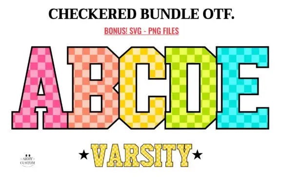
Tall varsity-style blocks filled with bright two-tone checks
Checkered Back to School shows tall angular slab capitals filled with pink, peach, yellow, lime and turquoise checks: the B and D keep small squared counters, the A opens a narrow rectangle, a thin black outline bounds the pattern and a smaller line below repeats the structure at reduced scale.
Ideas for this font
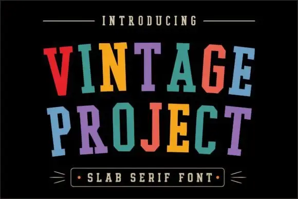
Uneven collegiate slab display
Vintage Project is a tall narrow collegiate slab in six colours on black: caps with heavy square serifs and small slab spurs, each letter tilted and offset so the two words sit on a loose uneven arc, with a boxed tracked line at the foot between two drawn arrows.
Ideas for this font
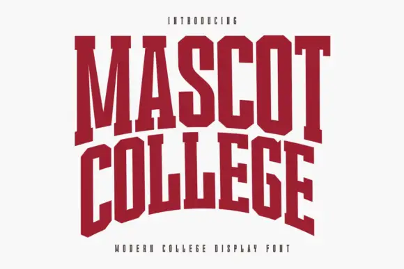
Very condensed collegiate slabs with tall stems and flat feet
Mascot College is a very condensed collegiate slab in which the stems run tall, the slabs are flat and thin and the counters close to slits, so a long name fits one line on a narrow format.
Ideas for this font
Same independent foundry
Allow optional Google Analytics to measure visits and catalogue actions. Your search words and notes are not included. Privacy & storage