High-Contrast Display Serif

Picky Charm + Raffined
Pairs sculptural editorial warmth with Picky Charm's clean modern geometry.
Inspect Raffined specimenDisclosure: MakerFileHub may earn a commission from qualifying purchases via paid links on this page. How our links work.
Cute duo pairing a monoline script with puffy lowercase shapes
Picky Charm is a two-cut family in which a monoline script writes the first word and puffy lowercase shapes stack the second, so a two-line design gets a written voice and a soft block from one purchase.
Paid link
Get this fontProject & layout blueprintsAt-a-glance maker compatibility
Set Cricut or Silhouette operation to Pen, Foil Quill, or Laser Score — not Basic Blade Cut.
Visual anatomy & craft review
The script draws a tall P with a hooked bowl, a light i, a curly c and a looped k; the puffy cut builds fat lowercase shapes with tiny counters and rounded joins. The pairing is the character: the script is thin and loopy and the puffy cut is heavy and blunt, which is why the sample sets them on two lines at very different sizes. The script holds at 20 pt and the puffy cut fills a card at 60 pt, and both print in one flat colour each. The pale grid ground, the butterfly, the daisies and the studio line are presentation; the green script and pink puffy words are the family.
Cute · Duo · Puffy
Two-font hierarchy recipes
Tested contrast partners — pairing Picky Charm with grounded secondary typography.
Picky Charm + Raffined
Pairs sculptural editorial warmth with Picky Charm's clean modern geometry.
Inspect Raffined specimen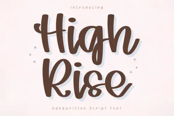
Picky Charm + High Rise
Introduces organic movement on pull-quotes, signatures and gift tags.
Inspect High Rise specimenPractical applications
Concrete hierarchy, scale and production guidance tailored to Picky Charm’s stroke geometry.
The script writes the occasion and the puffy cut carries the name, so a small card reads as designed rather than typed at 40 pt and 20 pt.
Hierarchy & layout recipe
Print an A6 card: set the name at 40 pt in the puffy cut, set the occasion at 20 pt in the script above it, and keep 12 mm between the two so the script's descenders clear the puffy counters.
Pre-production check
A thin script set immediately above a heavy cut looks unbalanced; check the card and open the gap to 12 mm or more.
The puffy shapes read from behind a shop counter, and the monoline script gives the maker's name a light line at 30 mm and 16 pt.
Hierarchy & layout recipe
Print a 50 mm round sticker: set the product word at 30 mm in the puffy cut, set the maker at 16 pt in the script beneath, and keep 4 mm inside the die so the round joins have clean margin.
Pre-production check
A round sticker die cutting a puffy edge looks uneven; check the sticker and keep the word centred on the circle rather than the square.
The puffy shapes suit a child's name card, and the script writes the class name at 16 pt where a formal sans would feel cold.
Hierarchy & layout recipe
Print a 90 by 50 mm label: set the child's name at 30 mm in the puffy cut, set the class in 16 pt of the script beneath, and laminate with 5 mm of clear border so the counters stay open.
Pre-production check
Laminating over a tiny counter can trap air and look cloudy; check the finished label and keep the counters at 3 mm or wider.
Technical & licence verification
Confirm included OTF/TTF/WOFF formats, full glyph tables and licence coverage on the live store page before batch production.
Closest visual alternatives
Matched across letterform anatomy, stroke behaviour and craft applications.
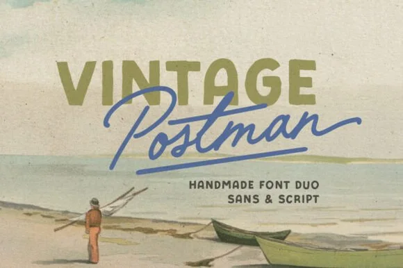
Vintage stamp sans and monoline script duo
Vintage Postman pairs a sturdy retro sans with the look of a soft rubber stamp and a brisk monoline brush script: the olive sans holds a solid horizontal line while the angled script cuts across the baseline with a hand-signed slant.
Ideas for this font
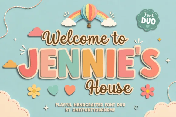
Playful duo pairing outlined chunky caps with a monoline script
Jennie's House is a two-cut family in which chunky pastel capitals wear a heavy outline and a monoline script writes a second line, so a short phrase reads as stacked paper stickers.
Ideas for this font
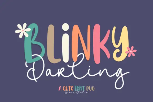
Duo
Blinky Darling Duo shows tall uneven printed forms with rounded ends, each capital in a different pastel tone across a plum ground, above a fine white script line whose D and g carry large open loops and whose tails extend well past the caps.
Ideas for this font
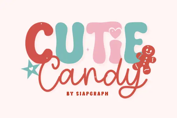
Playful duo pairing puffy candy capitals with a loose monoline script
Cutie Candy is a two-cut family in which puffy pastel capitals bounce along a wavy baseline and a loose monoline script writes the second word, so a short greeting reads as something decorated on a gingerbread tile.
Ideas for this font
Same independent foundry
Allow optional Google Analytics to measure visits and catalogue actions. Your search words and notes are not included. Privacy & storage



