High-Contrast Display Serif

Bee Kind Duo + Things
Pairs sculptural editorial warmth with Bee Kind Duo's clean modern geometry.
Inspect Things specimenDisclosure: MakerFileHub may earn a commission from qualifying purchases via paid links on this page. How our links work.
Font duo pairing a fat rounded sans with a monoline connected script
Bee Kind is a two-part family in which a very fat rounded capital sans carries the weight and a monoline script answers it, so a design gets a headline voice and a written line from one purchase.
Paid link
Get this fontProject & layout blueprintsAt-a-glance maker compatibility
Weld or Unite overlapping script joins into one continuous vector path before sending to the blade.
Visual anatomy & craft review
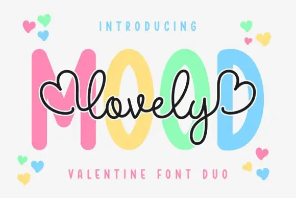
The B builds two even bowls on a straight stem, the E shortens its arms, the K opens a wide junction and the D closes a fat bowl, all at the heaviest rounded weight with flat-sided terminals; the second cut draws a continuous monoline script whose letters join without a break. The pairing is the character: the sans has almost closed counters and the script is as light as the sans is heavy, which is why the sample sets one inside the other. The script holds at 20 pt and the sans fills a poster at 100 pt, so the two cuts are used at very different sizes. The cream ground, the bees, the daisies and the word above are presentation; the fat caps and the written line are the family.
Duo · Rounded · Friendly
Two-font hierarchy recipes
Tested contrast partners — pairing Bee Kind Duo with grounded secondary typography.
Bee Kind Duo + Things
Pairs sculptural editorial warmth with Bee Kind Duo's clean modern geometry.
Inspect Things specimen
Bee Kind Duo + Coastal Honey
Introduces organic movement on pull-quotes, signatures and gift tags.
Inspect Coastal Honey specimenPractical applications
Concrete hierarchy, scale and production guidance tailored to Bee Kind Duo’s stroke geometry.
The fat caps carry the name and the script writes the date, so a card gets two voices without a second purchase at 40 pt.
Hierarchy & layout recipe
Print a 120 mm square card: set the name at 40 pt in the sans across the upper half, set the date at 20 pt in the script beneath, and keep 12 mm between the two so the script's ascenders clear the caps.
Pre-production check
A script set too close under fat caps looks cramped; check the card and open the gap rather than shrinking the date.
The rounded fat sans reads from a supermarket shelf, and the monoline script gives the small producer a handwritten line at 14 pt.
Hierarchy & layout recipe
Print a 70 by 50 mm label: set the product word at 24 pt in the sans, set the producer name at 14 pt in the script under it, and keep 6 mm of margin from the label edge so the script tail is not trimmed.
Pre-production check
A script tail running into the label edge reads as a bleed fault; check the label die and pull the line inward.
The heavy caps read from the garden gate and the monoline script gives the price and time line a friendly hand at 90 pt and 26 pt.
Hierarchy & layout recipe
Print an A3 poster: set the headline at 90 pt in the sans, set the location and time at 26 pt in the script in the lower third, and keep 30 mm of clear ground between the two blocks.
Pre-production check
Mixing a poster-weight sans and a hairline script can leave the date unreadable at distance; check the poster from three metres and move the time line into a small caps sans instead.
Technical & licence verification
Confirm included OTF/TTF/WOFF formats, full glyph tables and licence coverage on the live store page before batch production.
Closest visual alternatives
Matched across letterform anatomy, stroke behaviour and craft applications.
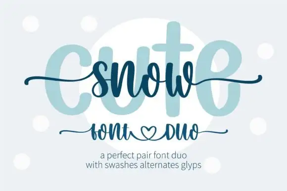
Heavy print and thin swash script
Snow Cute Duo is a pairing in icy blue: a very heavy rounded capital face drawn as a pale ghost, and a thin swash script written across it, with curls and a heart under the caption line.
Ideas for this font
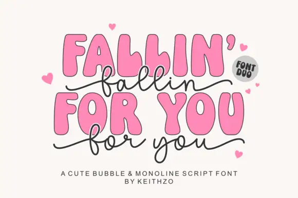
Heavy irregular rounded capitals with a thin linked lowercase script
Fallin for You pairs heavy irregular rounded capitals with a thin linked lowercase script: the script f and l loop high, the y drops low, long side tails curl outward and hearts surround the title.
Ideas for this font
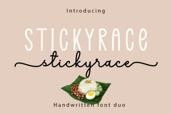
Tall monoline capitals with a thin script
Stickyrace is a duo on a warm sand ground: very tall thin monoline capitals with rounded ends, and a fine script of the same word beneath whose tails run in from the left margin and out to the right.
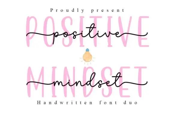
Tall narrow printed forms behind a fine lowercase script
Positive Mindset is a duo in which tall narrow separate capitals stand behind a fine lowercase script line, with the script carrying long side tails and small t and d loops while the print keeps tiny terminal projections.
Ideas for this font
Same independent foundry
Allow optional Google Analytics to measure visits and catalogue actions. Your search words and notes are not included. Privacy & storage