High-Contrast Display Serif

Gingerbread Duo + Kernova
Pairs sculptural editorial warmth with Gingerbread Duo's clean modern geometry.
Inspect Kernova specimenDisclosure: MakerFileHub may earn a commission from qualifying purchases via paid links on this page. How our links work.
Wide signpaint script & condensed slab-caps duo
Gingerbread Duo sets a broad, low-contrast signpaint script beneath tall letterspaced slab capitals on the same dark cover, with heart-shaped tittles and one long exit stroke.
Paid link
Get this fontProject & layout blueprintsAt-a-glance maker compatibility
Weld or Unite overlapping script joins into one continuous vector path before sending to the blade.
Visual anatomy & craft review
The script word sits low and wide, with shallow ascenders, open round bowls and a deep looped g pushing well below the baseline. Both tittles on the cover are drawn as solid hearts rather than points, and the final d exits into a long stroke that sweeps right and slightly upward before it stops. The companion line is a narrow capital alphabet with flat square serifs, near-even widths and about a quarter-em of tracking, so it reads as a painted credit line rather than a second display voice. The gingerbread shapes and heart cut-outs at the edges are separate artwork, and the circular sticker in the top corner is a promotional overlay rather than part of the typeface.
Baked · Round · Hand-painted
Two-font hierarchy recipes
Tested contrast partners — pairing Gingerbread Duo with grounded secondary typography.
Gingerbread Duo + Kernova
Pairs sculptural editorial warmth with Gingerbread Duo's clean modern geometry.
Inspect Kernova specimen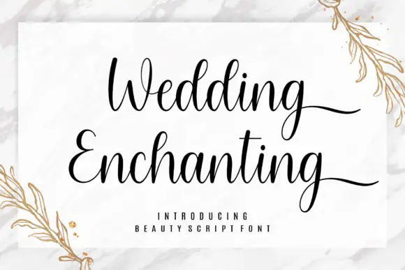
Gingerbread Duo + Wedding Enchanting
Introduces organic movement on pull-quotes, signatures and gift tags.
Inspect Wedding Enchanting specimenPractical applications
Concrete hierarchy, scale and production guidance tailored to Gingerbread Duo’s stroke geometry.
A two-word script name fits the shallow height of a sleeve band, while the slab capitals can carry weight and ingredient notes in the same printed lockup.
Hierarchy & layout recipe
Set the script at about 22 pt so the word spans roughly 3 inches on a 4-inch kraft sleeve, then place the capitals at 9 pt with 0.2 em tracking underneath, clear of the descending g.
Pre-production check
The heart tittles are fixed glyphs, so confirm your actual i and j positions carry them before promising a heart in the final design.
The flat square serifs and even widths hold up at distance, which suits a fascia where the script alone would blur into a brown smear.
Hierarchy & layout recipe
Keep the capitals at 4-inch cap height across the fascia and reserve the script for a 10-inch-wide side panel, where the exit tail has room to run without meeting the frame.
Pre-production check
At four inches the square serifs should still read square, so test a scaled print before you commit to the sign quotation.
The pairing gives a small publication both a warm hand-painted headline and a neutral line for the issue number and date.
Hierarchy & layout recipe
Run the script across the top third, then set the slab capitals at 8 pt under a hairline rule for the volume and date, keeping at least 12 mm between rule and tail.
Pre-production check
The script has no true italic, so do not shear it to fake one: the slant breaks the heart tittles off centre.
Technical & licence verification
Confirm included OTF/TTF/WOFF formats, full glyph tables and licence coverage on the live store page before batch production.
Closest visual alternatives
Matched across letterform anatomy, stroke behaviour and craft applications.
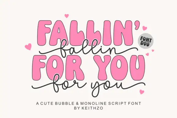
Heavy irregular rounded capitals with a thin linked lowercase script
Fallin for You pairs heavy irregular rounded capitals with a thin linked lowercase script: the script f and l loop high, the y drops low, long side tails curl outward and hearts surround the title.
Ideas for this font
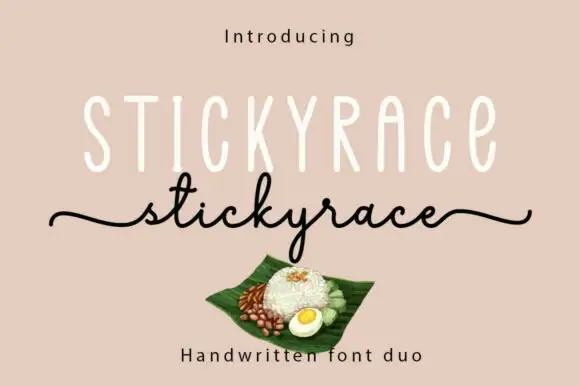
Tall monoline capitals with a thin script
Stickyrace is a duo on a warm sand ground: very tall thin monoline capitals with rounded ends, and a fine script of the same word beneath whose tails run in from the left margin and out to the right.
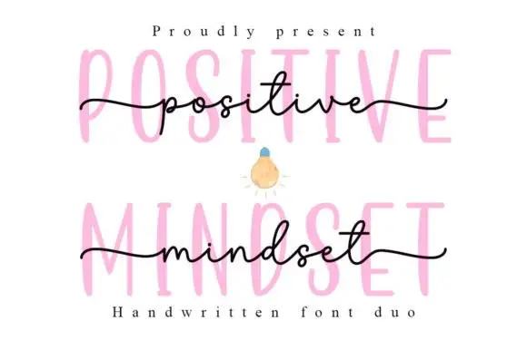
Tall narrow printed forms behind a fine lowercase script
Positive Mindset is a duo in which tall narrow separate capitals stand behind a fine lowercase script line, with the script carrying long side tails and small t and d loops while the print keeps tiny terminal projections.
Ideas for this font
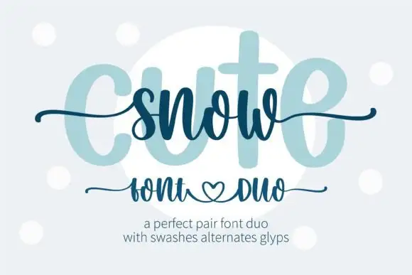
Heavy print and thin swash script
Snow Cute Duo is a pairing in icy blue: a very heavy rounded capital face drawn as a pale ghost, and a thin swash script written across it, with curls and a heart under the caption line.
Ideas for this font
Allow optional Google Analytics to measure visits and catalogue actions. Your search words and notes are not included. Privacy & storage