Neutral Sans Workhorse

Mother Embroidery + Bareum
Lets Mother Embroidery own the focal silhouette while handling secondary copy, sizing and subheads cleanly.
Inspect Bareum specimenDisclosure: MakerFileHub may earn a commission from qualifying purchases via paid links on this page. How our links work.
Curvy bohemian & split-tail retro display sans
Mother Embroidery is a curvy, bohemian uppercase display font (neither a script nor a classic serif) accented with swooping R/M/Y split legs.
Paid link
Get this fontProject & layout blueprintsAt-a-glance maker compatibility
Weld or Unite overlapping script joins into one continuous vector path before sending to the blade.
Visual anatomy & craft review
Mother Embroidery is a curvy bohemian display in caps with rounded wedge strokes and swooping split legs on the R, M and Y, so a word reads as hand-drawn lettering with a botanical softness rather than a geometric sans. The strokes are even and heavy, the counters are round, and the split legs extend below the baseline, which means the layout needs foot room. It needs roughly 20 mm for the split to read as intentional, and it is at its best in one matte colour on a natural ground such as linen, clay or kraft.
Curvy-boho · Split-tailed · Decorative-caps
Two-font hierarchy recipes
Tested contrast partners — pairing Mother Embroidery with grounded secondary typography.
Mother Embroidery + Bareum
Lets Mother Embroidery own the focal silhouette while handling secondary copy, sizing and subheads cleanly.
Inspect Bareum specimen
Mother Embroidery + Wolles Elegant Modern Serif
Grounds bold display lettering with classic typographic authority on posters, badges and apparel.
Inspect Wolles Elegant Modern Serif specimenPractical applications
Concrete hierarchy, scale and production guidance tailored to Mother Embroidery’s stroke geometry.
Split legs and rounded wedges read as hand-drawn lettering, which suits a botanical workshop better than a clean sans. The split gives a short word a graceful base without a rule.
Hierarchy & layout recipe
Sign 400 x 600 mm, word 80 mm with 10 mm foot room, 40 mm margins. Card 105 x 148 mm, heading 16 mm, details 7/10 pt. Label 60 x 40 mm, word 8 mm, 4 mm die margin.
Pre-production check
Split legs reach below the baseline and collide with a caption placed close beneath. Fix 12 mm between the word and the next line, and check one printed card for a collision.
Bohemian letterforms read as a studio's own lettering rather than a template, which is what a craft business sells. Even strokes print cleanly on a kraft label.
Hierarchy & layout recipe
Label 70 x 50 mm, word 12 mm, 4 mm die margin. Yarn band 200 x 45 mm, word 9 mm within the flat 120 mm centre. Banner 900 x 400 mm, word 160 mm, 60 mm margins.
Pre-production check
Yarn bands wrap a soft cylinder and split legs at the ends distort on the curve. Keep the word within the flat centre, and check one band on an actual skein before the run.
Curvy caps with split tails read as a relaxed, earthy wedding suite, which suits an outdoor ceremony. The face holds at 22 mm on an invitation header without a script.
Hierarchy & layout recipe
Invitation 120 x 180 mm, names 26 mm with 10 mm foot room, details 9/13 pt, 15 mm margins. Menu 120 x 210 mm, header 16 mm. Tag 45 x 80 mm, names 8 mm, hole 5 mm clear.
Pre-production check
A favour tag at 45 mm has no room for split legs plus a hole, and the counter gets punched out. Use the plain alternate on tags, and keep the split forms for the invitation and menu.
Technical & licence verification
Confirm included OTF/TTF/WOFF formats, full glyph tables and licence coverage on the live store page before batch production.
Closest visual alternatives
Matched across letterform anatomy, stroke behaviour and craft applications.
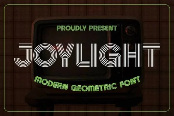
5-line concentric 1980s CRT-TV & synth-funk multiline sans
Joylight is a sleek retro-futuristic multilinear display font tracing geometric uppercase letters in five crisp parallel neon-ready tracks.
Ideas for this font
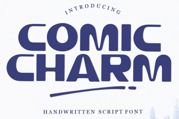
Wide retro-modern rounded display with tucked crossbars
Comic Charm is a wide, smooth rounded display font featuring curved C-bowls, hooked R/A legs, and approachable mid-century charm.
Ideas for this font
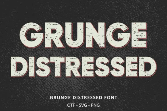
Heavy wide stamp-weathered sans + SVG & PNG letter sets!
Grunge Distressed is a wide, heavy stamp-textured sans serif bundled with OTF, SVG, and PNG files for rugged posters, shirts, and badges!
Ideas for this font
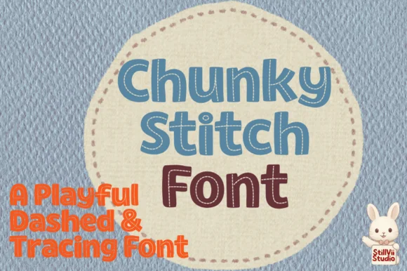
Playful chunky block font with dashed interior stitch lines
Chunky Stitch is a rounded, solid block typeface pierced down the center of every stroke by a crisp dashed running-stitch line.
Ideas for this font
Same independent foundry
Allow optional Google Analytics to measure visits and catalogue actions. Your search words and notes are not included. Privacy & storage