Neutral Sans Workhorse

Olive + Mango Dream
Lets Olive own the focal silhouette while handling secondary copy, sizing and subheads cleanly.
Inspect Mango Dream specimenDisclosure: MakerFileHub may earn a commission from qualifying purchases via paid links on this page. How our links work.
Chunky organic botanical-retro block sans (OTF & TTF)
Olive is a stout, softly rounded organic display sans with gently tapered stems and warm 1970s Mediterranean market charm (OTF & TTF).
Paid link
Get this fontProject & layout blueprintsAt-a-glance maker compatibility
Sturdy stroke walls and open counters weed cleanly on adhesive vinyl, HTV apparel film, and cut cardstock.
Visual anatomy & craft review
Olive is a chunky organic display sans with softly rounded corners, gently tapered stems and slightly irregular blocks, wrapped in a white sticker keyline on the specimen, so a word reads as a Mediterranean market label rather than a geometric poster. The irregularity is small and repeatable, which keeps it legible at 20 mm, and the sticker keyline lets it sit over a busy background. It needs roughly 24 mm for the taper to read, and it is best in jet black on cream or in one dark ink on terrazzo pink.
Earthy-groovy · Chunky-sans · Friendly
Two-font hierarchy recipes
Tested contrast partners — pairing Olive with grounded secondary typography.
Olive + Mango Dream
Lets Olive own the focal silhouette while handling secondary copy, sizing and subheads cleanly.
Inspect Mango Dream specimen
Olive + Glofi
Grounds bold display lettering with classic typographic authority on posters, badges and apparel.
Inspect Glofi specimenPractical applications
Concrete hierarchy, scale and production guidance tailored to Olive’s stroke geometry.
A soft organic block reads as a market stall's own label, which is what a small deli prints on a bottle and a card. The taper gives the name warmth at 16 mm, and one ink on a coated label keeps the print cheap.
Hierarchy & layout recipe
Label 70 x 95 mm, name 16 mm, weight 5 pt, 5 mm top arc and 4 mm die margin. Card 105 x 148 mm, heading 20 mm, details 8/11 pt. Sign 600 x 400 mm, word 110 mm, 40 mm margins.
Pre-production check
A 16 mm label name on a curved bottle closes the tapered stem and the word reads as a solid slab. Print digitally or keep the name at 20 mm, and check one applied label on a filled bottle.
Organic blocks read as a summer food market, which is what a street event prints on a poster. The heavy forms hold at 260 mm in one ink, and the soft corners keep the tone warm without a photograph.
Hierarchy & layout recipe
Poster A2, word 260 mm, details 22/28 pt, 30 mm margins and 20 mm trim. Banner 1500 x 400 mm, word 240 mm, 100 mm margins. Header 1200 x 300 mm, word 140 mm, 50 mm margins.
Pre-production check
A banner printed on mesh shows perforations through a solid fill and the word looks dotted. Print the word on a solid vinyl panel and sew it on, and check one hung panel in daylight.
Soft rounded blocks read as a spring plant sale, which is what a nursery paints on a board. The taper holds at 110 mm on a sign, and the face stays friendly at 12 mm on a seed card.
Hierarchy & layout recipe
Sign 900 x 600 mm, word 170 mm, 60 mm margins. Pot label 40 x 60 mm, name 6 mm, 3 mm margins. Seed card 105 x 148 mm, heading 18 mm, notes 8/11 pt, 12 mm margins.
Pre-production check
A 6 mm pot label closes the rounded corner into a square and the variety name reads as a block. Keep pot labels at 8 mm or use a plain sans, and check one label pushed into a pot.
Technical & licence verification
Confirm included OTF/TTF/WOFF formats, full glyph tables and licence coverage on the live store page before batch production.
Closest visual alternatives
Matched across letterform anatomy, stroke behaviour and craft applications.
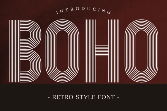
7-line concentric 1970s disco & roller-rink multiline sans
Boho (by Eystore) is a nostalgic 1970s multiline geometric display font built from seven crisp concentric parallel stripes.
Ideas for this font
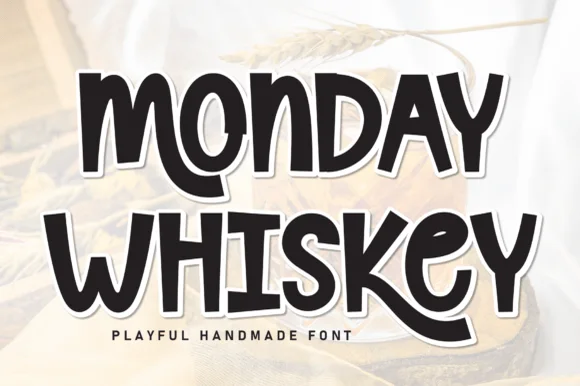
Playful hand-drawn caps with offset outline
Monday Whiskey is a playful hand-drawn display in near-black with a white contour and a heavy offset shadow, set over a warm sepia photograph: fat irregular caps, a bouncing baseline, an E drawn with uneven arms and an S that swings open, with a tracked caption beneath.
Ideas for this font
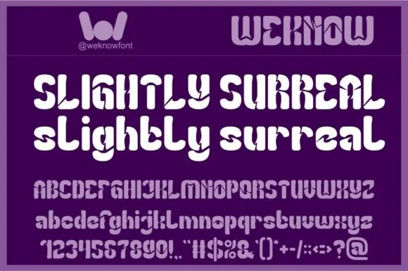
1968 Fillmore-inspired geometric psychedelic sans (Full charset)
Slightly Surreal is a complete geometric-psychedelic display font (uppercase, lowercase, 0–9 & full symbols) blending 1960s mod curves with crisp modern spacing.
Ideas for this font
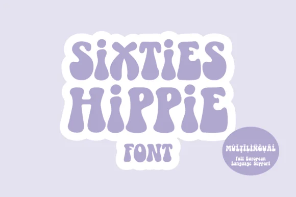
Heavy 1960s flower-power & Fillmore poster display
Sixties Hippie is a warm, bottom-heavy 1960s flower-power display font with pinched waists, plump teardrop feet, and full European multilingual support.
Ideas for this font
Same independent foundry
Allow optional Google Analytics to measure visits and catalogue actions. Your search words and notes are not included. Privacy & storage