 #1 · Best Overall
Wisteria Tale
Whimsical handwritten script with cork-screw curls and tall capitals
Get fontPaid link
Read review ↓Disclosure: MakerFileHub may earn a commission from qualifying purchases via paid links on this page. How our links work.
Botanical scripts, blossom detail & garden signage
Spring lettering is mostly a botanical problem: leaves that grow out of a terminal, blossoms that replace a dot, and a script light enough to feel airy but thick enough to print. Wisteria Tale and Hi Bestina build the botanical detail into the stroke, Blossom Script and Simplicity keep it fine, and Kahuyung and Tjiwidej Heritage cover the rounded and cottagecore registers.
Quick verdict
Wisteria Tale is the most convincing botanical script for spring signage, Blossom Script suits cards and tags, and Kahuyung handles the playful rounded display. Tjiwidej Heritage is the pick for a cottagecore garden brand.
Quick answer
Short on time? Start with our three highest-rated spring standouts before scrolling the full breakdown.
#1 · Best OverallWhimsical handwritten script with cork-screw curls and tall capitals
 #2 · Runner-Up Pick
Connected upright script with looping entries ending in leaves and outlined flowers
 #3 · Editor's Choice
We kept 25 of 453 candidates after removing floral monogram alphabets that share the palette but are a different job. Judged on whether leaves are attached to the stroke, how the script reads at 1 inch on a plant marker, and contrast in a light palette.
Side-by-side summary
Compare specimens, OpenType/PUA traits and primary project roles side by side.
| Rank & Font | Style & File Specs | Best Project Fit | Store Listing |
|---|---|---|---|
| ScriptAlternates & swashes | Garden wedding invitation, fantasy novel cover or botanical tea tin | Get fontPaid link | |
| ScriptPUA encoded · Alternates & swashes | A floral names invitation | Get fontPaid link | |
| ScriptPUA encoded · Alternates & swashes | A florist collection heading | Get fontPaid link | |
| ScriptPUA encoded · Alternates & swashes | A botanical maker’s round seal | Get fontPaid link | |
| ScriptPUA encoded · Alternates & swashes | A floral guest-book name cover | Get fontPaid link |
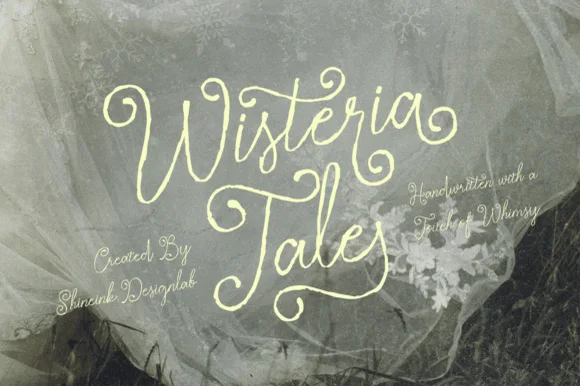
#1 · Best OverallWisteria Tale is a whimsical handwritten script in which the capitals climb into corkscrew curls, the joins stay monoline and the terminals spiral, so a two-word title reads as something written with a fine pen on a card.
The W opens into two tall curls, the i carries a light dot, the s wobbles a shallow spine, the t crosses a high bar, the e turns a round eye and the final a finishes a spiral, all at a monoline weight with tall ascenders and generous loops. The curls are the character: they add height rather than weight, which is why the sample sets two stacked words with wide leading and lets the spirals fill the space. Because the stroke is even, the face holds at 22 pt and prints in one colour, but the spirals need a smooth stock to survive. The tulle photograph, the small italic credit lines and the studio note are presentation; the cream script words are the face.
Garden wedding invitation, fantasy novel cover or botanical tea tin — Set at generous display scale over muted sage, charcoal or parchment.
Fine organic pen strokes excel in print, foil and digital art.
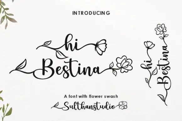
#2 · Runner-Up PickHi Bestina shows dark connected script in two lines on white, where thin rising strokes meet fuller downstrokes, the h opens a loop, the B closes round and a small pointed crossbar finishes the t while long entries grow leaf shapes and outlined flowers.
The joins stay upright rather than slanted, the hairline entries stretch sideways and end in drawn botany, and the downstrokes thicken enough to read at a distance. That leafy entry is the character: an invitation gains a botanical flourish without a second illustration, which is why the sample uses several of them across two lines. The cover shows the joins but not the mechanics, so confirm whether leaves and flowers are alternates or separate pieces, keep generous lateral space and check the exact spelling of names before you set a card.
A floral names invitation — Set the confirmed two-line greeting in black at the centre of a white invitation with plain event details below.
Verify floral inputs and allow the ending flower to clear the margin.
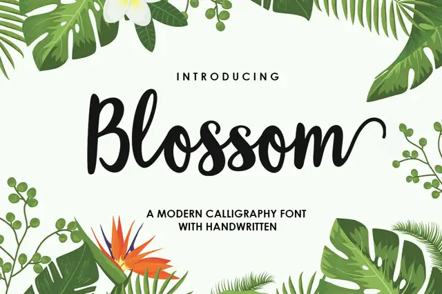
#3 · Editor's ChoiceBlossom Script is a broad connected brush script with tall B and l forms, open rounded middles and an exit stroke that rises instead of trailing flat.
The letters are wider than they are tall in the lower-case, and the connections sit at mid-height, so a word holds together as one buoyant shape rather than a row of separate forms. The B carries a large upper loop and the l rises well above the x-height; the final m turns upward into a long curve that finishes above the baseline, which is the gesture the whole sample is built around. Weight is even, with soft brushy ends rather than sharp entry points, so the script stays friendly at large sizes. Tropical foliage at the corners of the preview is separate artwork, and the sub-line naming the style sits in a smaller hand-printed face.
A florist collection heading — Place the title in a clear band above a plain care note, with flowers outside the lettering.
Confirm the exact end swash for the actual word.
 #4 · Top Maker Utility
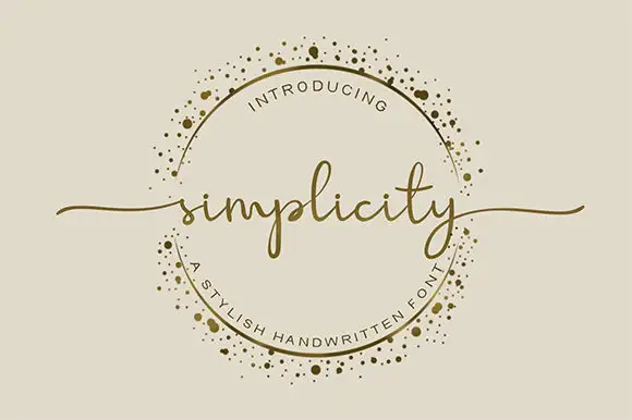
Simplicity sets a fine lowercase word across an ornamental ring, with long swashes extending beyond the circle on either side. The l rises above a low lowercase body, the p drops below it, the final y carries a narrow descending loop and the long end strokes supply much of the width.
The body stays low and fine, the ascender rises, the descender loops and the end strokes travel far out. Those long exits are the character: the word reaches past its own bounding box, which is why the sample lets it cross a decorative ring. The ring is separate artwork rather than an included ornament, so plan the exits in your layout, keep 26 pt for the fine joins and give at least 24 mm of clear space at each end.
A botanical maker’s round seal — Keep the words across the circle’s centre. Break the ring where the letters or swashes cross it instead of running a line through the text.
Check the real phrase and ring clearance at seal size; the gold border is artwork, not a promised glyph.
 #5 · Standout Silhouette
Hailey is a beauty script in which the strokes stay medium in weight, the ascenders loop high and long swashes enter and leave the word, so a single name reads as a written logo on a soft ground.
The h climbs a tall loop, the a closes a round bowl, the i carries a light dot, the l rises into a second loop, the e turns a light eye and the y drops a wide tail, all at a medium brush weight with generous entry and exit swashes and a gentle slope. The swashes are the character: they sit outside the word and take as much width as the letters, which is why the sample sets one name across a circular panel. Because the downstrokes are medium, the face holds from 26 pt and prints on smooth stock. The blush circle, the botanical sprig, the arched lettering above and the small caps beneath are presentation; the dark script name is the face.
A floral guest-book name cover — Keep the name alone in the centre, with a small plain date well below its lowest loop; put floral art in one distant corner.
Confirm the exact swash variants and leave ample vertical space.
 #6
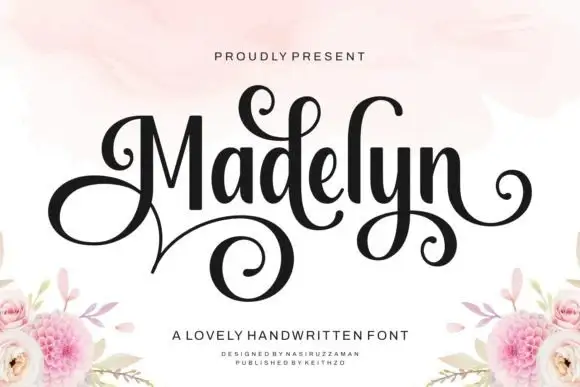
Madelyn uses upright dark stems with a large looping M and curled d, y and terminal strokes, where a broad lower spiral extends beneath the left half of the name and floral corner illustrations sit around it as separate artwork.
The stems stand upright, the contrast swings from thick to hairline, the initial spirals and one descender curls wide. That upright stance is the character: the name reads as a signed inscription rather than a slanted hand, which is why the sample keeps one word centred. The floral corners are separate artwork, so plan 24 mm beneath the spiral, keep 30 pt for the hairlines and check the M loop against the margin. The initial spiral is the stroke that breaks: it is drawn on the hairline, so it snaps in foil and closes into a blob below about 30 pt, which is why one word on a card is the honest use.
A guest-book name cover — Centre the name in the upper half and place the plain guest-book label well below the spiral, leaving flowers at the bottom corners.
Check the exact initial and available curls.
 #7
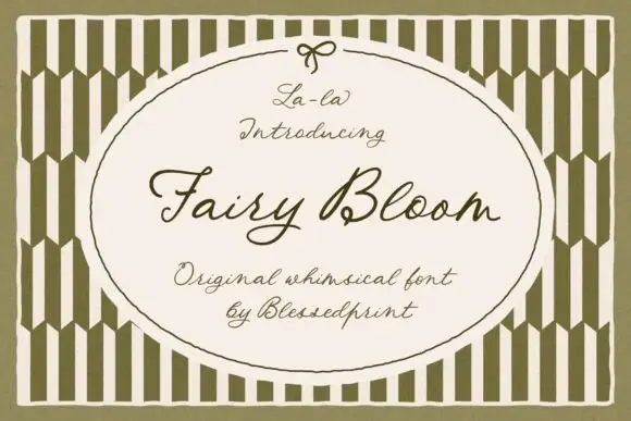
Fairy Bloom is a whimsical formal script in which the capitals open into wide ribbon loops, the stroke stays light and even, and the joins curl into small ornate turns.
The capital F opens with a broad looped stem and a curl above the crossbar, and the capital B that follows closes two looped bowls, which is where the face gets its ornamental character. The lowercase stays light and open: the a and the i close small bowls, the r keeps a short arm, the y drops a fine tail and the l rises into a narrow loop, all at one even weight. Because the stroke is light and the loops are generous, the face reads as invitation calligraphy rather than as a display script, and it holds at 20 pt on a card without cluttering. The olive striped field, the oval panel with its bow and the four small caption lines are presentation; the script is the two words.
A garden-ceremony welcome cover — Keep the script inside a broad empty panel with names/date in plain type below the y tail.
Compare actual uppercase sets and proof fine strokes.
 #8
Welcome features relaxed lowercase cursive with long level beginning and ending swash tails, tailored for round wood signs and entryways, where the smooth monoline-leaning strokes and open letter spacing keep words calm while the extended w and e tails span a circular blank.
The stroke stays one width, the spacing opens, the tails run level and the word sits calm. That level tail is the character: the greeting stretches to the width of a round board without a bigger point size, which is why the sample targets door signs. Plan the tails against the blank's curve, keep the stroke at 3 mm for cutting, and check the exits in your own word before committing the sign. The wide tail is also the weak point on a shaped blank: it has to end inside the panel, so a 12 mm tail on a 300 mm round board is safe and anything longer gets trimmed at the edge.
Round wood welcome sign or nursery plaque — Centre the tailed lowercase word across the middle third and tuck family names below in small caps.
PUA-encoded tails weld cleanly in Cricut/Silhouette; verify thin tail tips before weeding small decals.
 #9
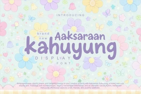
Kahuyung (Aaksaraan Kahuyung) is a sweet, bouncy mixed-case display font with rounded marker terminals and gentle descending 'y/g' loops.
Kahuyung is a bouncy mixed-case display sans with rounded marker terminals and soft descending loops on the y and g, drawn at a friendly middle weight that stays open at small sizes. Letters alternate slightly above and below a common baseline, which produces its bounce without tilting individual glyphs, so a line keeps a readable spine. Bowls are generous and counters wide, and the face suits short phrases on pastel surfaces where a heavier display would look aggressive; it needs about 10 mm of cap-height before the rounded terminals stop thickening on cheap stock.
Flower-girl gift bag, pastel planner cover & sticker sheet — Stack smaller eyebrow ('Aaksaraan', 38 pt) neatly over larger lowercase hero ('kahuyung', 76 pt) in lilac or sage.
Clean, disconnected rounded strokes cut and weed fast on Cricut vinyl, HTV, and Print-Then-Cut stickers down to 0.6 in!
 #10
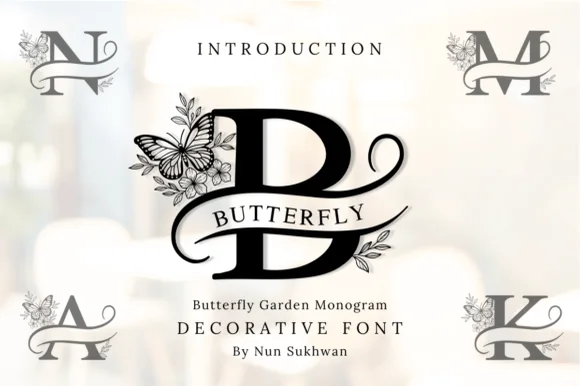
Butterfly Garden Monogram is an illustrated split-frame uppercase alphabet wrapping classic serif initials in delicate wildflowers and perched butterflies.
Butterfly Garden Monogram is a botanical split-frame monogram in which the initial sits between two mirrored stems with a butterfly hovering at the top: a bracketed capital on a split bar, drawn leaves climbing both sides and a butterfly with hairline wings closing the frame. The wings and the leaf veins are the finest elements and both close first. It needs roughly 36 mm for the wing and the leaf to read, and it is best in one fine ink on smooth card, or a foil impression above 40 mm where the wings still separate.
Mother's Day garden tote, mug & engraved cutting board — Set a single 4-to-5-inch monogram initial centered and place the full name inside the horizontal bar in tracked serif caps.
Fine botanical petal lines and butterfly wing veins shine in sublimation, laser engraving, and print—avoid weeding under 4 inches on vinyl.
 #11
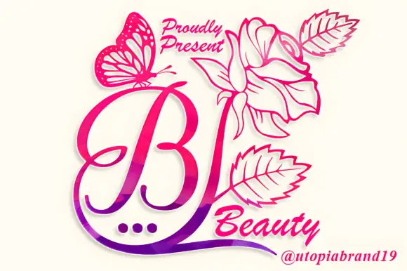
Beauty Flower Monogram is a single ornate script initial with a long descending swash that turns into a line-drawn rose, two leaves and a butterfly, set in a warm pink-to-magenta gradient.
The preview shows one mark at the centre of a white card: a capital B drawn in a fluid script with a thick-to-thin stroke, a small loop at the top and a long tail that swings down and to the right before rising into a rose drawn in fine line work. Two leaves branch off the stem, a butterfly with filigree wings sits at the upper left, and three small dots rest under the initial like a printer's ornament. The words at the top and bottom are set in a second script, smaller and lighter, and the whole composition is coloured with a gradient that runs from pink at the top to violet at the foot. The mark is a monogram system rather than a text face, so the value is in the composition: one letter, one flower, one insect, and a great deal of white space around them.
A floral initial reception card — Place the verified B motif above a plain guest name on a tall ivory reception card.
Check the initial mapping and proof the fine leaf veins.
 #12
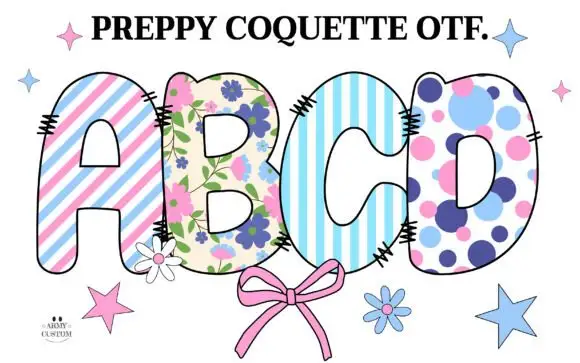
Preppy Coquette is a colour font in which each cap is filled with a prep pattern: pink and blue stripes, a floral print on cream, a pale striped ground and a lilac polka dot, with stitched edges and a drawn bow under the row.
ABCD fills the middle of the card, and each letter is a fat rounded shape with a fine dark outline and a small stitched edge, filled with a different print: diagonal pink stripes, a floral sprig pattern, pale blue stripes and lilac dots on cream. Below the row a pink bow is drawn in outline, and around it small stars and daisies float on the white ground. A heading at the top names the set in a serif with a full stop, and a small credit sits at the lower left. The palette is deliberately soft and the patterns are small-scale, so the word reads as fabric rather than as a colour page, which is what the coquette style is: bows, gingham, flowers and a lot of pale pink.
A pastel picnic invitation — Set the phrase on white with a plain aqua time block at the lower right, leaving an empty margin around the edge hatches.
Confirm the exact listing and chosen pattern variant in the final words.
 #13
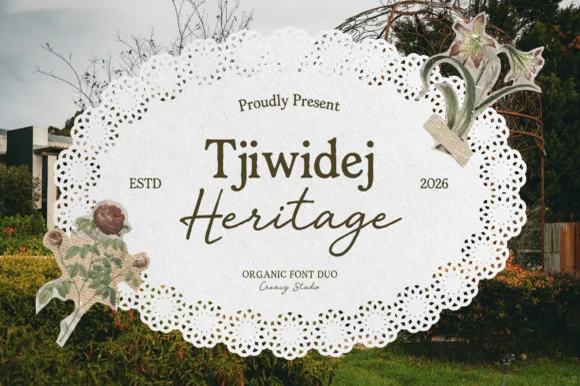
Tjiwidej Heritage is a sun-drenched cottagecore font duo pairing a warm, organic book serif with an unhurried botanical garden script.
Tjiwidej Heritage is a two-part family: a humanist book serif with a warm olive-brown cast, generous x-height and softly bracketed serifs, plus a slanted botanical script whose flourishes stay airy rather than dense. The serif carries names, headings and short body copy; the script carries one or two words only, because its connections are loose and its ascenders long. Together they set up a clear hierarchy without needing a third face, which is what a small producer wants on packaging. The serif is comfortable at 8 pt in print, while the script wants 14 mm or more before the ligatures resolve.
Botanical tea tin, artisanal honey jar, soap wrap & zine — Stack mixed-case Serif (64 pt) directly above overlapping Script (60 pt) flanked by 'ESTD / 2026'.
Clean solid strokes print razor-sharp on textured cotton paper and cut on 1.2 in+ Cricut vinyl (Weld script joins!).
 #14
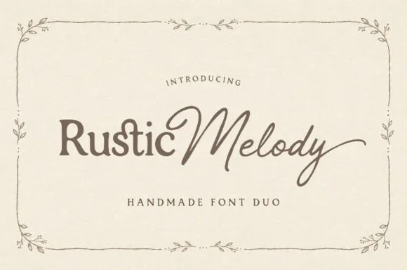
Rustic Melody is a graceful handmade font duo pairing a gently organic mixed-case serif ('Rustic') with a flowing fine-pen signature script ('Melody')!
Rustic Melody is a duo of a handcrafted organic serif and an airy signature calligraphy: the serif carries uneven edges that read as cut paper, short bracketed serifs and a warm irregular rhythm, while the calligraphy runs a light stroke with joined letters and long tapered exits for names. The pair lets one card carry a printed headline and a signed line, and the light calligraphy is the weaker element in print. The serif needs roughly 22 mm and the calligraphy 26 mm for their detail to read.
Barn-or-garden wedding invitation, vow booklet & place card — Place mixed-case Serif (60 pt) + title-case Script (76 pt) side-by-side above wide-tracked Serif small-caps ('HANDMADE FONT DUO').
Serif cuts cleanly at 0.85 in+; delicate Signature Script shines in flat print, foil stamping, Cricut Pens, or 1.4 in+ welded vinyl.
 #15
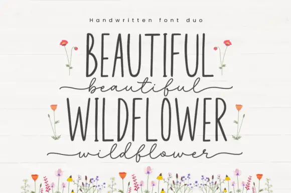
Beautiful Wildflower Duo is a two-cut pair in which very narrow upright capitals set the plain line and a fine lowercase script runs beneath with long outer strokes, so a card can hold two registers in one soft tone.
The capital cut compresses to narrow stems with even terminals, while the script cut keeps a light body, long entries at the first letter and a long exit at the last, with swashes encoded for variation. The width contrast is the character: a narrow cap row answers a loose script, which is why the sample stacks them with floral artwork around. Set the caps at 34 pt and the script at 28 pt, and keep 16 mm between the rows so the outer strokes do not touch. The flower illustrations are separate artwork rather than font accessories; the two lettered rows are the duo.
A garden ceremony programme cover — Use the upright capitals for the programme title and one short script line below. Move the date and location into a plain bottom block rather than a third decorative style.
Confirm both styles and the actual phrase in the current listing; floral artwork is not assumed included.
 #16
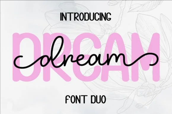
Dream Duo combines a plump, soft-cornered uppercase sans-serif with a fluid monoline script that threads cleanly across wide titles.
Dream Duo pairs a chunky pastel rounded sans with a smooth monoline cursive: the sans is a fat even-width block with fully rounded corners and tight spacing for headlines, while the cursive is a soft even stroke with open loops and a gentle slant. The pair is built for a soft palette, so it loses its character when printed in a single harsh black. The monoline hairline is the finest element and it breaks first. The sans needs roughly 26 mm and the cursive 28 mm for their detail to read.
Nursery wall name sign & sweet-sixteen acrylic backdrop — Scale the background sans to 3.5 inches tall in soft pastel and center the dark monoline script across the middle 60% height.
Weld all cursive joins before cutting vinyl, and use Cricut's Slice or a 0.07 in offset knockout if avoiding two-layer vinyl overlap.
 #17
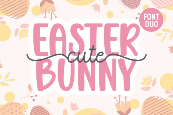
Cute Easter Bunny combines a tall, chunky hand-cut uppercase sans with a sweet monoline cursive accented by long side tails.
Cute Easter Bunny is a playful pair of a tall pastel sans with a tailed monoline script: the sans is a soft narrow block whose counters stay open, while the script finishes every word with a small bunny tail that lifts off the baseline. The pair is built for a soft spring palette, so it loses its charm in a single harsh ink. The tail is the finest element and it closes into a dot once the face is reduced. The sans needs roughly 22 mm and the script 26 mm for their detail to read.
Personalized Easter basket tag & egg-hunt tote — Place two stacked uppercase words in pastel vinyl and overlay the dark tailed script across the seam between rows.
Use Print-Then-Cut with an offset white sticker border for multi-color tags, or layer smooth HTV pressing the chunky sans base first.
 #18
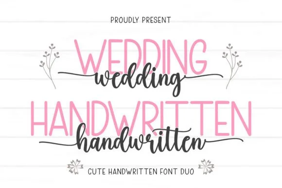
Wedding Handwritten pairs a tall, narrow rounded sans-serif with a lively thick-thin calligraphy script sporting symmetrical side tails.
Wedding Handwritten pairs a tall slender sans with a tailed calligraphy script: the sans is a narrow even-width capital set for details and directions, while the script runs a high-contrast stroke with long ascenders and a tail that lifts off the last letter. The pair is a stationery set, so both cuts have to survive one ink and a matte stock. The script tail is the finest element and it breaks first. The sans needs roughly 20 mm and the script 30 mm for their detail to read.
Save-the-date card, acrylic table sign & seating chart — Set table numbers or 'SAVE THE DATE' in 1.8 in blush or gold sans and center couple names across the lower half in charcoal script.
Weld the script letters before cutting vinyl for acrylic wedding signs, and handle the fine horizontal outer tails gently on transfer tape.
 #19
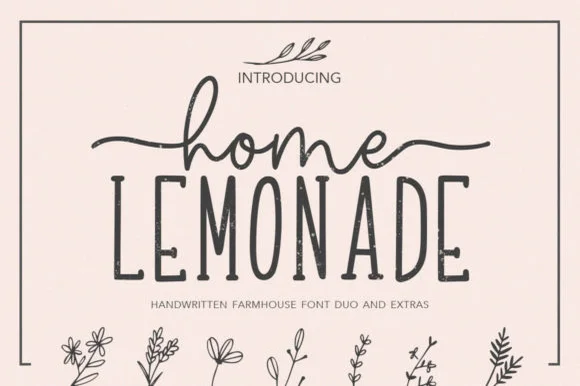
Home Lemonade is a coordinated farmhouse font duo pairing a wide-tailed monoline cursive script, a tall skinny uppercase sans, and floral doodles.
Home Lemonade is a farmhouse family of a monoline script, a tall narrow sans and a set of botanical extras: the script runs an even light stroke with wide loops for names, the sans is narrow with blunt ends for lists and prices, and the extras supply drawn lemons, leaves and jars at the same weight. All three share one palette so a stand can be built from one purchase. The script needs roughly 24 mm and the extras 20 mm for their detail to read.
Lemonade-stand wood sign, beverage dispenser & pitcher tag — Center 1 lowercase script word with side tails directly above a wider uppercase sans word, accented by 1 botanical sprig.
Both the monoline script and skinny sans cut cleanly on Oracal 651 glass/wood vinyl at 1 inch+ scale—weld script joins first.
 #20
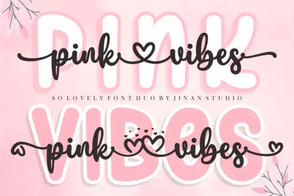
Pink Vibes Duo pairs two fat rounded capital rows, drawn in white with a soft pink glow, with a small dark connected script that runs across them, and in the lower sample the script joins the words with heart shapes instead of a plain connector stroke.
The caps stay broad and inflated, the script stays thin and dark, the contrast between the two weights carries the pair and the hearts sit where a ligature would normally go. The upper sample sets the script over the caps without hearts, the lower inserts one heart between the words and a second heart cluster on the final s, so the decorative join is an option rather than the default. Branches in the corners are cover artwork. Check which connector glyphs your file carries before planning the heart link, keep 30 pt for the script strokes and set the caps in one colour so the pink glow does not come from the type.
A two-level greeting — Keep capitals above script rather than overlapping; leave heart tails in open space.
Check connector variants and actual duo contents.
 #21
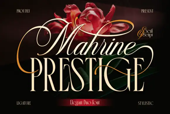
Mahrine Prestige shows a pale slanted upper word with thin connected-looking strokes and large loops, while tall narrow PRESTIGE capitals form a more upright base crossed by a fine sweeping extension, and red flowers with gold flourishes fill the dark background.
The upper line leans, the loops grow large, the lower caps stand upright and a single extension crosses both. That vertical pairing is the character: a light script floats above a narrow serif and one stroke ties them, which is why the sample stacks the two members tightly. The flower and flourish assets are cover decoration, so confirm both member files and their metrics, keep 20 mm between the rows and check that the crossing extension clears the caps. The crossing extension is the failure point: it has to clear the caps below, so 20 mm between the rows keeps it off their tops, and the loop thins out under 30 pt and needs a coated sheet.
A formal invitation-title pairing — Reserve a clear gap between loops and keep event details plain.
Verify both selected members and exact alternate mapping.
 #22
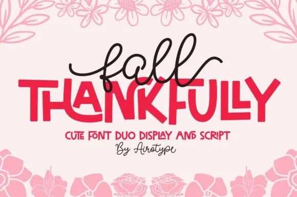
Fall Thankfully pairs a looping monoline cursive script with a heavy, interlocking all-caps sans display face.
Fall Thankfully is a duo of a monoline tail script and a bouncy all-caps sans: the script runs an even stroke that finishes every word with a long lifted tail, while the sans is a chunky capital set whose baseline hops so a short line looks hand-set. The pair is built for autumn market goods, where one line is written and one is printed. The script tail is the finest element and it closes into a dot when reduced. The script needs roughly 28 mm and the sans 24 mm for their detail to read.
Thanksgiving host apron & kitchen tea towel — Set the main family or harvest word in the heavy sans at 2.5 in cap height, then tuck a 1-word script lead-in slightly overlapping the upper-left letters.
Weld the overlapping script loops before cutting HTV, and peel away from the narrow 'f' and 'l' ascender counters slowly.
 #23
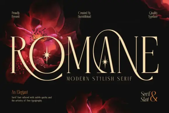
Romane is a very tall modern serif in which the capitals stretch, the hairlines stay slender, the R leg sweeps below the line and a large loop rises around the central A, so a name reads as a couture title with movement at both ends.
The R curves its leg far under the baseline, the A carries a rising loop around its apex, the O closes a tall narrow bowl and every stem holds a fine contrast that thins at the joins, with ligatures available for awkward pairs. The sweeping extensions are the character: ornament arrives from the letters themselves, which is why the sample sets one name on black with floral artwork behind. Because the hairlines are fine, the face wants coated stock from 18 pt and the loop needs 18 mm of clear space above the cap line. The red flowers and stars behind the title are artwork; the cream capitals are the face.
A botanical feature-cover title — Use a clear title panel with authorised botanical imagery elsewhere.
Proof swashes and hairlines at intended size.
 #24
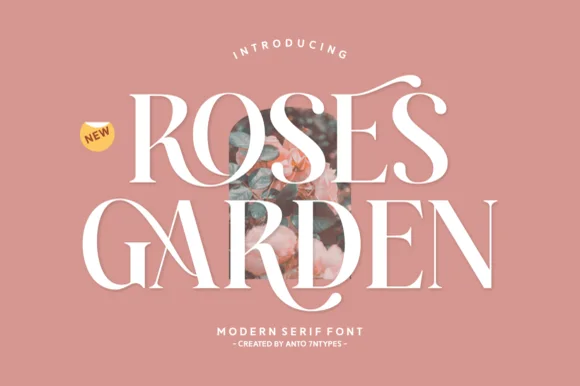
Roses Garden is a refined modern editorial serif crowned with graceful overhead S-swashes, looped ligatures, and multilingual support.
A high-contrast floral-editorial serif shown in snow white over dusty terracotta rose: a delicate ribbon flourish arches over the S, the R and G bowls curve with crisp Didone contrast, and the hairlines run thin against heavy stems, so the word reads as a fashion masthead rather than a book face. The flourishes are drawn to frame a photographic inset, which is why the composition leaves a window at the centre. The size floor is set by the hairline strokes, and the face needs a smooth stock to hold them. The floral framing is staging.
Rose-garden wedding invitation, bridal menu & perfume box — Stack 2 uppercase words at 54–90 pt with +10 tracking over dusty rose, sage, or ivory.
Ultra-thin horizontal hairlines belong in flat print, letterpress, and foil stamping rather than blade-cut vinyl.
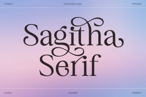 #25
Sagitha Serif is a lyrical, high-contrast display serif where arched ascender ribbons and teardrop terminals weave across mixed-case titles.
Sagitha Serif is a romantic high-contrast serif with soaring ascender loops: hairline hairlines against heavy stems, very tall ascenders that loop above the cap height and small ball terminals on the diagonals. The loops grow the word upward and need extra leading, and the hairlines silt on textured stock. It needs roughly 30 mm for the loop and the hairline to read, and it is best in one fine ink on coated or smooth stock, or a foil impression above 40 pt.
Bridal boutique, floral studio & hair-care packaging — Stack a two-word mixed-case title tightly so upper-row descenders ('g', 'y') Converse naturally with lower-row capitals.
Thin hairline bridges call for 300 DPI print, digital graphics, or foil stamping rather than intricate small-scale vinyl cutting.
Practical buyer checklist
Key cutting, printing and pairing answers before choosing a spring typeface.
Mid-weight scripts and rounded sans faces at 2 inches or more. Very fine botanicals lose their leaves at that scale, and on outdoor markers the thin detail peels off within a season.
It needs 4.5:1 against the background for small text. Pale green on cream usually fails, so darken either the lettering or the ground. For large display, 3:1 is the minimum.
A botanical script is a text face with leaf-like terminals, while a floral monogram is an alphabet designed for single initials inside a wreath or frame. They look related but cannot do each other's job.
Latin binomials need macrons and accented vowels rarely present in craft fonts. If the label is botanical, verify the specific characters, or set the plant name in a text face with full Latin coverage.
Keep exploring
Explore adjacent maker roundups or check our practical pre-production checklists.
17 curated fonts · Previews & pairings
24 curated fonts · Previews & pairings
36 curated fonts · Previews & pairings
29 curated fonts · Previews & pairings
Guides: Invitation font checklist · Vinyl & cutting checklist · How to pair script & sans fonts
Allow optional Google Analytics to measure visits and catalogue actions. Your search words and notes are not included. Privacy & storage