Editorial Serif Anchor

Lucy Script + Augler
Anchors Lucy Script's fluid strokes with crisp Roman proportions on wedding suites, headers and packaging.
Inspect Augler specimenDisclosure: MakerFileHub may earn a commission from qualifying purchases via paid links on this page. How our links work.
Ornamental script with flared capitals and curled terminals
Lucy Script is an ornamental script in which the capitals flare at the base, the joins stay heavy and the terminals curl, so a two-word title reads as a vintage shopfront painted by hand.
Paid link
Get this fontProject & layout blueprintsAt-a-glance maker compatibility
Weld or Unite overlapping script joins into one continuous vector path before sending to the blade.
Visual anatomy & craft review
The L opens a wide flared capital, the u keeps two heavy stems, the c curls a narrow crescent, the y drops a hooked tail and the S swells a heavy spine, all at a brush contrast with flared capitals, curled terminals and a moderate slope. The flare is the character: the capitals widen where they meet the baseline, which is why the sample sets two stacked words in gold over a painted scene. Because the downstrokes are heavy, the face holds from 28 pt and prints on most stocks; the curled terminals need margin. The painted interior, the figure and the small caption are presentation; the gold script words are the face.
Ornamental · Flared · Vintage
Two-font hierarchy recipes
Tested contrast partners — pairing Lucy Script with grounded secondary typography.
Lucy Script + Augler
Anchors Lucy Script's fluid strokes with crisp Roman proportions on wedding suites, headers and packaging.
Inspect Augler specimen
Lucy Script + Inkora
Keeps small-scale dates, URLs, nutrition facts and care instructions crisp and legible below script titles.
Inspect Inkora specimenPractical applications
Concrete hierarchy, scale and production guidance tailored to Lucy Script’s stroke geometry.
The flared capitals read as painted shopfront lettering, and the heavy strokes hold a two-word name at 70 mm on glass in one light colour.
Hierarchy & layout recipe
Cut a 700 by 250 mm vinyl sign: set the words at 70 mm, keep the curled terminals 20 mm inside the panel edge, and keep the thin joins at 3 mm of vinyl so they survive weeding.
Pre-production check
A curled terminal thinner than 3 mm tears during weeding; check the cut file and thicken the tail rather than the letters.
The ornamental script suits a period invitation, and the heavy weight keeps both names readable at 30 pt on a smooth card in one ink.
Hierarchy & layout recipe
Print a 130 by 180 mm card: set both names at 30 pt on two lines with 1.4 line spacing, set the details in an 8 pt caps serif beneath, and keep 18 mm of margin for the flares.
Pre-production check
Flared capitals on stacked lines crowd at tight leading; check the printed card and open the spacing before reducing the size.
The vintage script suits a seasonal confectionery label, and the heavy strokes stay solid at 20 pt on a paper label in one ink.
Hierarchy & layout recipe
Print a 70 by 50 mm label: set the shop name at 20 pt, set the product line in a 7 pt sans beneath, and keep 5 mm from the die so the curled tail is not cut away.
Pre-production check
A curled tail cut by a small die looks broken; check the imposed label and raise the whole word by 2 mm.
Technical & licence verification
Confirm included OTF/TTF/WOFF formats, full glyph tables and licence coverage on the live store page before batch production.
Closest visual alternatives
Matched across letterform anatomy, stroke behaviour and craft applications.
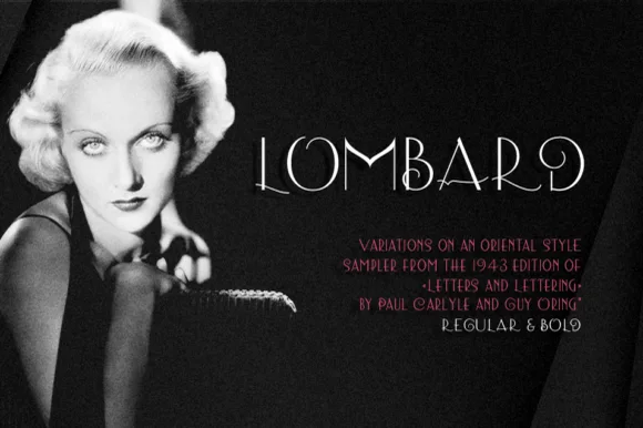
Thin art deco caps
Lombard is a thin art deco display in white over a black-and-white portrait: high-waisted capitals with hairline strokes, an O drawn as a circle, a Q with a long tail and a stepped A, set at a moderate size with tracked notes beneath in red, so the plate reads as a period title card.
Ideas for this font
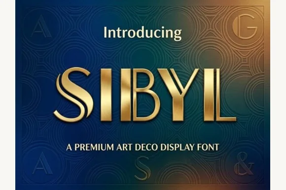
Dual-bar architectural 1920s Art Deco display sans
Sibyl is a sleek architectural Art Deco display font pairing bold vertical pillars with crisp parallel twin hairline stems.
Ideas for this font
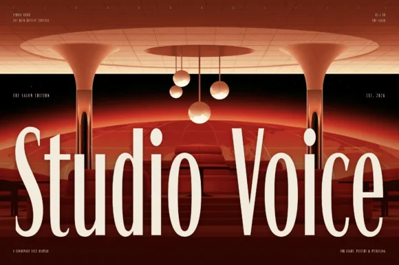
Condensed brutalist sans with tall stems and flat terminals
Studio Voice is a condensed brutalist sans in which the stems run very tall, the terminals stay flat and the counters squeeze to narrow slots, so a two-word title reads as a gallery graphic rather than as a headline.
Ideas for this font
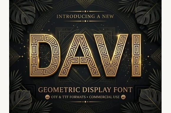
Geometric display caps inlaid with a greek-key maze pattern
Davi is a geometric display capital alphabet in which every stroke is a wide band filled with a drawn greek-key maze, so a word reads as gilded metalwork rather than as lettering.
Ideas for this font
Same independent foundry
Allow optional Google Analytics to measure visits and catalogue actions. Your search words and notes are not included. Privacy & storage