High-Contrast Display Serif

Delauney + Raffined
Pairs sculptural editorial warmth with Delauney's clean modern geometry.
Inspect Raffined specimenDisclosure: MakerFileHub may earn a commission from qualifying purchases via paid links on this page. How our links work.
Bold low-waisted 1920s Art Deco geometric sans
Delauney is a bold, solid single-layer Art Deco sans serif defined by dramatic low-waisted crossbars on 'E', 'A', and 'R' and crisp geometric poise.
Paid link
Get this fontProject & layout blueprintsAt-a-glance maker compatibility
Sturdy stroke walls and open counters weed cleanly on adhesive vinyl, HTV apparel film, and cut cardstock.
Visual anatomy & craft review
Delauney is a nineteen-twenties Art Deco geometric sans with a low waist: tall narrow caps, a very high crossbar, a small aperture and a strict geometric construction with no curve in the stems. The low waist stacks a long word vertically, and the small aperture closes first when the face shrinks. It needs roughly 20 mm for the aperture and the waist to read, and it is best in one deep ink on cream, or a fine gilt on deep green where the narrow stems print as light bars.
1920s-cinema · Low-waisted · Sturdy-Deco
Two-font hierarchy recipes
Tested contrast partners — pairing Delauney with grounded secondary typography.
Delauney + Raffined
Pairs sculptural editorial warmth with Delauney's clean modern geometry.
Inspect Raffined specimen
Delauney + Simple Alphabet
Introduces organic movement on pull-quotes, signatures and gift tags.
Inspect Simple Alphabet specimenPractical applications
Concrete hierarchy, scale and production guidance tailored to Delauney’s stroke geometry.
A low-waisted Deco sans gives a wedding the geometry of a printed programme rather than a script, which is what a modern couple wants. The tall caps set the names at 30 pt, and the narrow stems fit a long table plan on one sheet.
Hierarchy & layout recipe
Invitation 130 x 180 mm, names 30 pt with 8 mm aperture clearance, details 9/13 pt, 15 mm margins. Menu 120 x 210 mm, header 16 pt, courses 9/12 pt. Table plan 400 x 600 mm, names 11 mm, 20 mm margins.
Pre-production check
An 11 mm table-plan name closes the aperture and the names read as solid bars at a distance. Raise the plan to 15 mm, and proof one plan before the set.
A Deco geometric sans reads as a brass plate rather than a modern logo, which is what a cocktail bar wants at its entrance. The tall caps hold at 50 mm on a plate, and one gilt ink on deep green prints the plate and the menu cover from one file.
Hierarchy & layout recipe
Door plate 300 x 120 mm, word 50 mm with 8 mm aperture clearance, 15 mm margins. Menu cover 150 x 230 mm, title 36 pt, 15 mm margins. Coaster 95 mm round, word 10 mm, 4 mm die margin.
Pre-production check
A 95 mm coaster at 10 mm closes the aperture and the word becomes a solid slab. Use a single letter on the coaster, and print one coaster before the batch.
A Deco sans gives a winter dinner the geometry of a printed invitation without a script, which suits a long table. The tall caps hold at 26 pt on a menu header, and one deep ink on cream prints the invitation, the menu and the cards as a suite.
Hierarchy & layout recipe
Invitation 130 x 180 mm, names 26 pt with 8 mm aperture clearance, details 9/13 pt, 15 mm margins. Menu 120 x 210 mm, header 20 pt, courses 9/12 pt. Table card 90 x 50 mm, name 12 pt, 4 mm margins.
Pre-production check
At 12 pt on a table card the aperture closes and the name reads as a plain block that greys out. Raise table cards to 16 pt, and proof one card before the set.
Technical & licence verification
Confirm included OTF/TTF/WOFF formats, full glyph tables and licence coverage on the live store page before batch production.
Closest visual alternatives
Matched across letterform anatomy, stroke behaviour and craft applications.
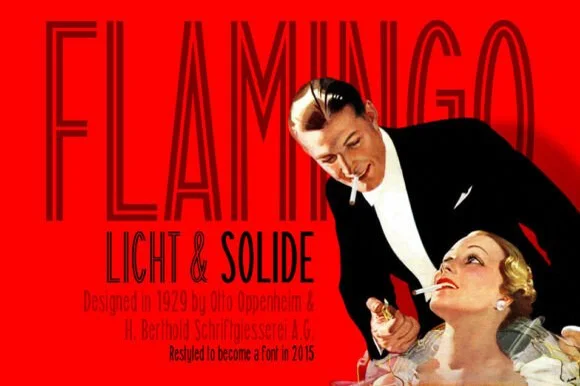
Ultra-condensed thin sans with tall stems and flat terminals
Flamingo is an ultra-condensed thin sans in which the stems run very tall, the terminals stay flat and the counters narrow to slots, so a single word reads as a 1920s film title card.
Ideas for this font
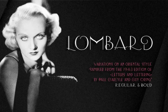
Thin art deco caps
Lombard is a thin art deco display in white over a black-and-white portrait: high-waisted capitals with hairline strokes, an O drawn as a circle, a Q with a long tail and a stepped A, set at a moderate size with tracked notes beneath in red, so the plate reads as a period title card.
Ideas for this font
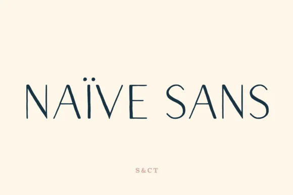
Thin geometric wide-set sans
Naive Sans is a thin geometric sans in navy on cream: very light stems, a large x-height, an oval O, and a wide, even spacing with a dieresis on the i, so the pair reads as a refined, slightly airy modern sans rather than a display face.
Ideas for this font
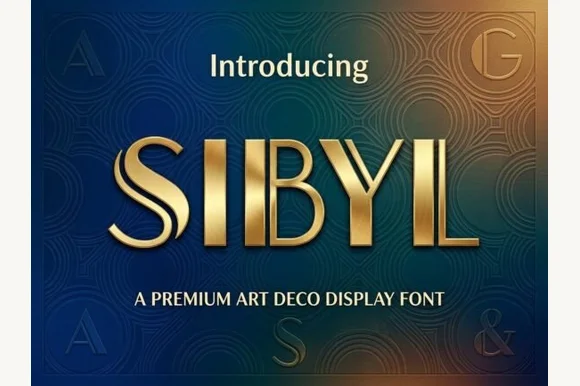
Dual-bar architectural 1920s Art Deco display sans
Sibyl is a sleek architectural Art Deco display font pairing bold vertical pillars with crisp parallel twin hairline stems.
Ideas for this font
Same independent foundry
Allow optional Google Analytics to measure visits and catalogue actions. Your search words and notes are not included. Privacy & storage