Neutral Sans Workhorse

Aven + Limited Coffee
Lets Aven own the focal silhouette while handling secondary copy, sizing and subheads cleanly.
Inspect Limited Coffee specimenDisclosure: MakerFileHub may earn a commission from qualifying purchases via paid links on this page. How our links work.
Stepped-skyscraper fluted 1920s Art Deco display (OTF & TTF)
Aven is a showstopping 1920s Art Deco display font sculpting stepped Chrysler-Building triple flutes into bold geometric capitals (OTF & TTF).
Paid link
Get this fontProject & layout blueprintsAt-a-glance maker compatibility
Sturdy stroke walls and open counters weed cleanly on adhesive vinyl, HTV apparel film, and cut cardstock.
Visual anatomy & craft review
Aven is a 1920s Art Deco display that sculpts stepped triple flutes into bold geometric capitals, with solid heavy faces and striped architectural side ribs, so a word reads as a Chrysler-era façade rather than a normal Deco headline. The ribs repeat across the stems, which means the face needs size for the flutes to read, and the solid faces keep it legible at 24 mm. It needs roughly 32 mm for the triple flutes to hold, and it is best in champagne gold on midnight blue or in one ink on ivory.
Gatsby-fluted · Skyscraper · Glamorous
Two-font hierarchy recipes
Tested contrast partners — pairing Aven with grounded secondary typography.
Aven + Limited Coffee
Lets Aven own the focal silhouette while handling secondary copy, sizing and subheads cleanly.
Inspect Limited Coffee specimen
Aven + Majestic Letters
Grounds bold display lettering with classic typographic authority on posters, badges and apparel.
Inspect Majestic Letters specimenPractical applications
Concrete hierarchy, scale and production guidance tailored to Aven’s stroke geometry.
Stepped flutes read as a grand hotel façade, which is what a black-tie wedding borrows. The face sets a long couple name in a narrow column, and the ribs foil into three fine channels on matte board at 30 pt.
Hierarchy & layout recipe
Invitation 120 x 180 mm, names 30 pt, details 9/13 pt, 15 mm margins and 10 mm trim. Menu 120 x 210 mm, header 16 pt, dishes 9/13 pt. Sign 600 x 900 mm, names 90 mm, 25 mm frame clearance.
Pre-production check
Block foil on a 0.4 mm flute bridges two channels into one wide groove and the Deco detail disappears. Keep the flute at 0.8 mm minimum for foil, and pull one foil proof before the suite.
Stepped Deco capitals read as a heritage hotel, which is what a cocktail or hotel brand prints on a carton. The ribs give a short name architecture at 20 pt, and one metallic on a dark ground reads as a façade at night.
Hierarchy & layout recipe
Carton 55 x 140 x 30 mm, name 20 pt, weight 5.5 pt, 8 mm margins. Label 40 x 70 mm, name 12 pt, 4 mm top arc. Sign 900 x 300 mm, word 140 mm, 50 mm margins.
Pre-production check
A 12 pt label name closes the triple flutes in flexo and the word reads as a solid stem. Print labels digitally or keep the name at 16 pt, and check one applied label on a bottle.
Architectural Deco lettering reads as a period exhibition title, which is what a design museum shows. The flutes give the poster detail without an illustration, and the heavy faces hold at 200 mm in a two-colour run.
Hierarchy & layout recipe
Poster A1, title 200 mm, dates 26/32 pt, 40 mm margins and 25 mm trim. Catalogue 210 x 280 mm, cover 54 pt, 20 mm margins. Panel 1200 x 800 mm, title 180 mm, notes 18/24 pt.
Pre-production check
At 200 mm the flutes need a 1 mm gap, and a raster upscale fills them into a grey stripe. Supply vector art, specify a 1 mm minimum, and check one print at 1:1 before mounting.
Technical & licence verification
Confirm included OTF/TTF/WOFF formats, full glyph tables and licence coverage on the live store page before batch production.
Closest visual alternatives
Matched across letterform anatomy, stroke behaviour and craft applications.
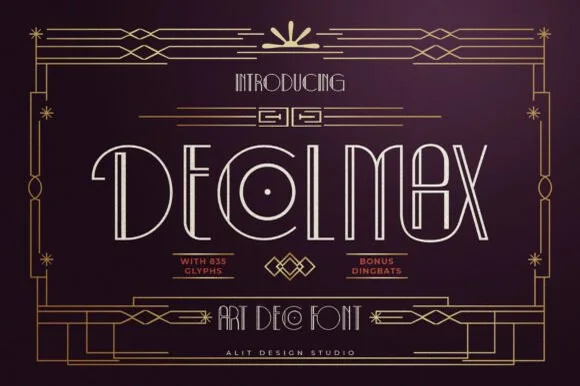
Slender dual-line Parisian Art Deco font (635 glyphs + bonus dingbats)
Decolmax is a rich 635-glyph Art Deco display suite combining slender open-inline capitals, interlocking ligatures, and bonus geometric dingbats!
Ideas for this font
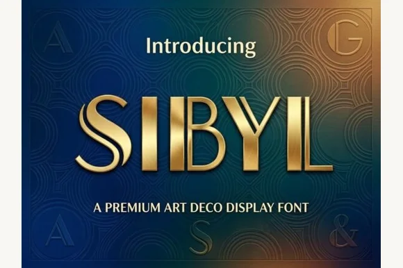
Dual-bar architectural 1920s Art Deco display sans
Sibyl is a sleek architectural Art Deco display font pairing bold vertical pillars with crisp parallel twin hairline stems.
Ideas for this font
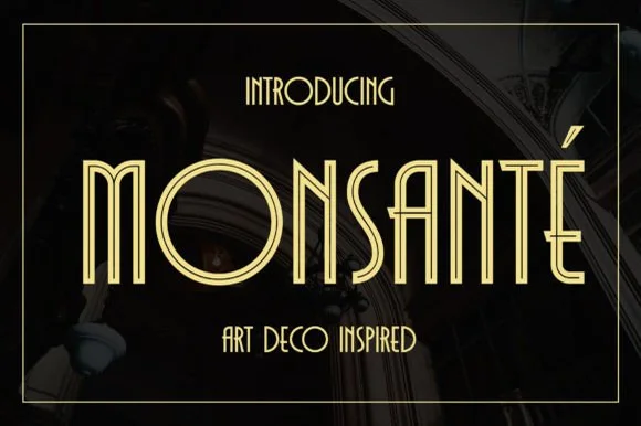
1920s Art Deco double-line inline geometric display
Monsante is a tall, geometric 1920s Art Deco display typeface built from crisp parallel double-line inline strokes and low-waisted crossbars.
Ideas for this font
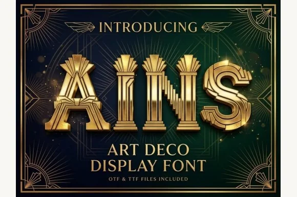
Fluted Art-Deco pillar & theater-marquee display (OTF & TTF)
Ains is a grand 1920s Art Deco display font carving vertical architectural column flutes down the center of wide geometric capitals (OTF & TTF).
Ideas for this font
Same independent foundry
Allow optional Google Analytics to measure visits and catalogue actions. Your search words and notes are not included. Privacy & storage