Modern Grotesque Body

Vickenta Noistre + Saltriver Grotesk
Creates crisp high-hierarchy contrast beneath Vickenta Noistre headlines across menus, websites and labels.
Inspect Saltriver Grotesk specimenDisclosure: MakerFileHub may earn a commission from qualifying purchases via paid links on this page. How our links work.
Tall condensed Victorian thorny & swashed display serif
Vickenta Noistre is a tall, condensed Victorian display serif adorned with median thorns, dramatic dropped capitals, and curled descenders.
Paid link
Get this fontProject & layout blueprintsAt-a-glance maker compatibility
Crisp hairline serifs shine on stationery, foil stamping, and packaging; add slight offset for small decals.
Visual anatomy & craft review
Vickenta Noistre is a tall condensed Victorian thorny display serif: narrow bracketed stems, split serifs that finish in a drawn thorn, swashes that curl off the caps and a small spur on the round letters. The thorns break the silhouette and the condensation keeps a long word in a narrow board, but the thorns close first at small sizes. It needs roughly 32 mm for the thorn and the swash to read, and it is best in one dense ink on cream and stone, or a single dark red on parchment, and it should never be reversed small.
Victorian-gothic · Tall-condensed · Ornate
Two-font hierarchy recipes
Tested contrast partners — pairing Vickenta Noistre with grounded secondary typography.
Vickenta Noistre + Saltriver Grotesk
Creates crisp high-hierarchy contrast beneath Vickenta Noistre headlines across menus, websites and labels.
Inspect Saltriver Grotesk specimen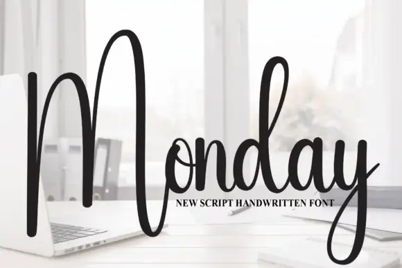
Vickenta Noistre + Monday
Adds a warm human signature touch for 1-to-3-word callouts without competing against structured serif capitals.
Inspect Monday specimenPractical applications
Concrete hierarchy, scale and production guidance tailored to Vickenta Noistre’s stroke geometry.
A thorny Victorian serif reads as a period bill rather than a cartoon monster, which is what a themed fright night wants at the gate. The thorns hold at 120 mm across a poster, and one dense ink plus a spot red prints the poster, the tickets and the candles.
Hierarchy & layout recipe
Poster A2, word 120 mm with 14 mm thorn clearance, times 40 mm, 20 mm margins. Ticket 100 x 50 mm, word 14 mm, 4 mm perforation. Candle label 60 x 40 mm, word 10 mm, 3 mm margins.
Pre-production check
A 60 x 40 mm candle label at 10 mm closes the thorns into a black bar and the name is unreadable by candlelight. Raise the label word to 16 mm, and check one label in the actual light.
A thorny display serif reads as an old apothecary mark rather than a modern brand, which is what a small herbalist wants on a bottle. The split serifs hold at 24 mm on a label, and one ink prints the label and the box stamp in one order.
Hierarchy & layout recipe
Bottle label 90 x 70 mm, word 24 mm with 6 mm thorn clearance, 5 mm margins. Box stamp 100 x 60 mm, word 22 mm, 6 mm margins. Card 85 x 55 mm, word 14 mm, 5 mm margins.
Pre-production check
On an 85 x 55 mm card the thorn touches the next letter and the name reads as a barbed bar. Keep the card word at 20 mm, and check one card before the run.
A thorny condensed serif reads as a printed country bill rather than a modern flyer, which is what an autumn fair wants on a fence. The narrow stems hold a long fair name at 110 mm, and one ink prints the poster and the prize labels in one pass.
Hierarchy & layout recipe
Poster A2, word 110 mm with 12 mm thorn clearance, details 34 mm, 20 mm margins. Tent sign 600 x 400 mm, word 90 mm, 25 mm margins. Prize label 90 x 60 mm, word 16 mm, 5 mm margins.
Pre-production check
A 90 x 60 mm prize label at 16 mm fills the split serif and the word reads as a stain. Raise the label word to 22 mm, and print one label before the batch.
Technical & licence verification
Confirm included OTF/TTF/WOFF formats, full glyph tables and licence coverage on the live store page before batch production.
Closest visual alternatives
Matched across letterform anatomy, stroke behaviour and craft applications.
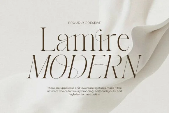
Whisper-thin high-fashion ligature & architectural serif
Lamire Modern is an ultra-light, tall-statured editorial serif featuring sweeping diagonal ligatures across both uppercase and lowercase.
Ideas for this font
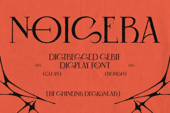
Distressed detailed serif display
Noisera is a distressed serif display in near-black on orange paper: very tall narrow letters with high-contrast stems, thin slab-like serifs cut with notches and small punctures through the bowls, with a stack of bracketed captions and a spray of black botanical shapes at the foot.
Ideas for this font
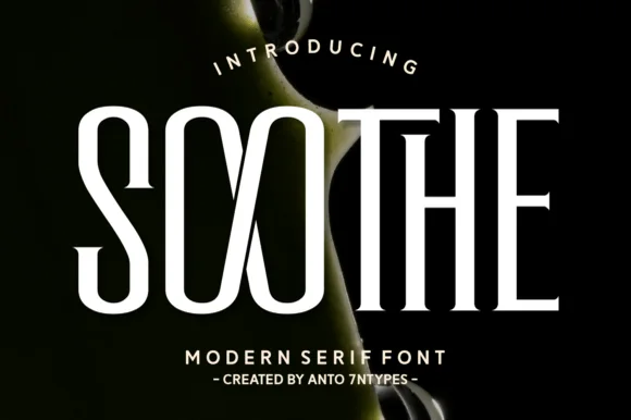
High-contrast condensed serif
Soothe is a modern serif in cream on a dark botanical ground: very high contrast, condensed caps with hairline joins, sharp flat serifs and a circular O, set in two lines with a tracked caption beneath, so the pair reads as a fashion or beauty masthead.
Ideas for this font
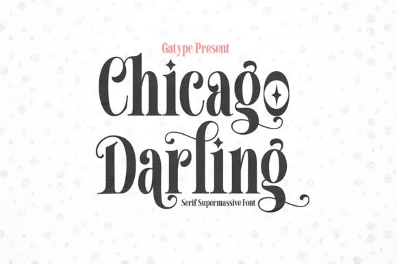
High-contrast vintage display serif with curled ball terminals
Chicago Darling is a bold, condensed modern-vintage serif distinguished by curled spiral terminals, sparkling counters, and deep descender loops.
Ideas for this font
Allow optional Google Analytics to measure visits and catalogue actions. Your search words and notes are not included. Privacy & storage