Modern Grotesque Body

Monarch Heritage + Kohilo
Creates crisp high-hierarchy contrast beneath Monarch Heritage headlines across menus, websites and labels.
Inspect Kohilo specimenDisclosure: MakerFileHub may earn a commission from qualifying purchases via paid links on this page. How our links work.
Tall high-contrast editorial display serif (Regular & Italic)
Monarch Heritage is a tall, narrow luxury editorial serif family (Regular & Italic) with crisp Didone hairlines and poised classical proportions.
Paid link
Get this fontProject & layout blueprintsAt-a-glance maker compatibility
Crisp hairline serifs shine on stationery, foil stamping, and packaging; add slight offset for small decals.
Visual anatomy & craft review
Monarch Heritage is a tall high-contrast editorial display serif with a regular and an italic: thin hairlines against firm stems, sharp wedge serifs, a small ball terminal on the f and a tall ascender that gives a word vertical presence. The hairlines are the weakest part in print and the wedge serifs are what survives at display size. It needs roughly 24 mm for the wedge serif and the hairline to read, and it is best in one black on a smooth text stock, or a single deep colour on cream where the hairlines stay open.
Regal · High-contrast · Editorial
Two-font hierarchy recipes
Tested contrast partners — pairing Monarch Heritage with grounded secondary typography.
Monarch Heritage + Kohilo
Creates crisp high-hierarchy contrast beneath Monarch Heritage headlines across menus, websites and labels.
Inspect Kohilo specimen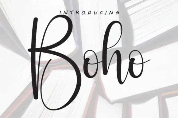
Monarch Heritage + Boho
Adds a warm human signature touch for 1-to-3-word callouts without competing against structured serif capitals.
Inspect Boho specimenPractical applications
Concrete hierarchy, scale and production guidance tailored to Monarch Heritage’s stroke geometry.
A high-contrast display serif with a true italic is what a long feature actually needs, because emphasis stays in one colour instead of jumping to bold. The tall ascenders give the title presence at 60 pt, and the italic sets works inline without a second family.
Hierarchy & layout recipe
Opener 210 x 297 mm, title 60 pt with 10 mm serif clearance, standfirst 11/15 pt, body 9/13.5 pt in two columns of 82 mm, 18 mm margins. Running head 10 pt, 8 mm from the trim.
Pre-production check
At 10 pt the running head's hairlines disappear on an uncoated sheet and the words read as broken marks. Set running heads at 12 pt or in the roman, and proof one signature at 1:1.
A tall editorial serif gives a wedding the formality of a printed book rather than a script, which is what a couple wanting restraint will choose. The regular holds the names at 28 pt, and the italic sets the venue line so the suite reads as set type.
Hierarchy & layout recipe
Invitation 130 x 180 mm, names 28 pt with 10 mm serif clearance, details 9/13 pt, 15 mm margins. Order of service 105 x 148 mm, header 16 pt, text 8/11 pt. Menu 120 x 210 mm, courses in italic 10 pt, dishes 9/13 pt.
Pre-production check
At 8 pt inside the order of service the italic hairlines fill and the hymn titles look heavier than the headings. Raise the text to 9.5 pt, and proof one booklet before the set.
A high-contrast editorial serif reads as a printed imprint rather than a studio logo, which is what a small press wants on its catalogue. The wedge serifs hold at 36 pt on a cover, and the italic supplies the imprint line in the same family.
Hierarchy & layout recipe
Catalogue cover 170 x 240 mm, name 36 pt, subtitle in italic 14 pt, 18 mm margins. Imprint page 148 x 210 mm, name 11 pt, details 8/11.5 pt. Card 85 x 55 mm, name 12 pt, italic line 9 pt.
Pre-production check
On an 85 x 55 mm card the italic line at 9 pt fills its wedges and reads as bold rather than slanted. Keep the card italic at 10 pt, and print one card before the order.
Technical & licence verification
Confirm included OTF/TTF/WOFF formats, full glyph tables and licence coverage on the live store page before batch production.
Closest visual alternatives
Matched across letterform anatomy, stroke behaviour and craft applications.

Crisp neoclassical high-contrast fashion editorial serif
Askino is a clean, restrained high-contrast editorial serif with razor-flat hairlines, tall ascenders, and un-cluttered Parisian magazine elegance.
Ideas for this font

Swashed editorial serif family (Regular & Italic)
The Bilstein Editorial is a high-fashion serif duo (Regular & Italic) combining crisp upright Roman ligatures with lush, calligraphic Italic swashes.
Ideas for this font
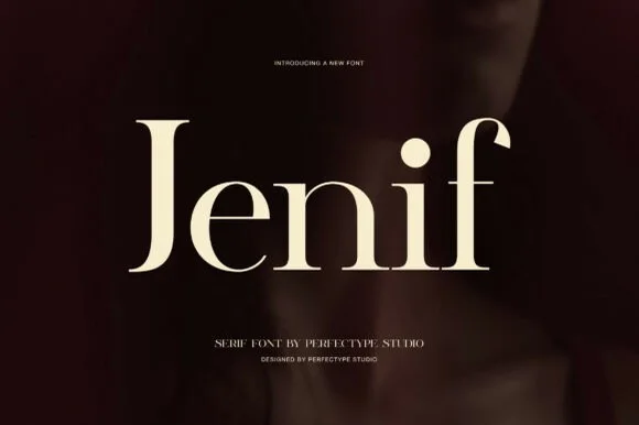
Pure classical high-contrast transitional editorial serif
Jenif is a poised, pure-form modern classical serif with crisp flat serifs, tall 'f' arches, and distraction-free gallery poise.
Ideas for this font
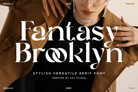
High-fashion ligature editorial serif (Regular + Italic)
Fantasy Brooklyn is a chic modern editorial serif (Regular & Italic) featuring interlocking 'oo' infinity ligatures and sculpted runway contrast!
Ideas for this font
Same independent foundry
Allow optional Google Analytics to measure visits and catalogue actions. Your search words and notes are not included. Privacy & storage