Modern Grotesque Body

Peach Mighties + Cultivo
Creates crisp high-hierarchy contrast beneath Peach Mighties headlines across menus, websites and labels.
Inspect Cultivo specimenDisclosure: MakerFileHub may earn a commission from qualifying purchases via paid links on this page. How our links work.
Heavy soft serifs with curled initials and generous lower hooks
Peach Mighties is a heavy soft serif in which the strokes stay thick and round, the counters shrink, the capital P curls inward and the y and lower terminals sweep out into broad soft hooks.
Paid link
Get this fontProject & layout blueprintsAt-a-glance maker compatibility
Sturdy stroke walls and open counters weed cleanly on adhesive vinyl, HTV apparel film, and cut cardstock.
Visual anatomy & craft review
The P turns its bowl inward, the y drops a broad outward hook, several lower terminals finish in soft sweeps and the internal counters stay small ovals. The generous hook is the character: it gives the end of a word a gesture without adding a separate swash. Because the hooks travel, keep 20 mm at each end from 28 pt and let the spelling stay short so two hooks do not collide. The dress photograph, stars and badge in the sample are presentation; the cream lettering is the face.
Heavy · Soft · Hooked
Two-font hierarchy recipes
Tested contrast partners — pairing Peach Mighties with grounded secondary typography.
Peach Mighties + Cultivo
Creates crisp high-hierarchy contrast beneath Peach Mighties headlines across menus, websites and labels.
Inspect Cultivo specimen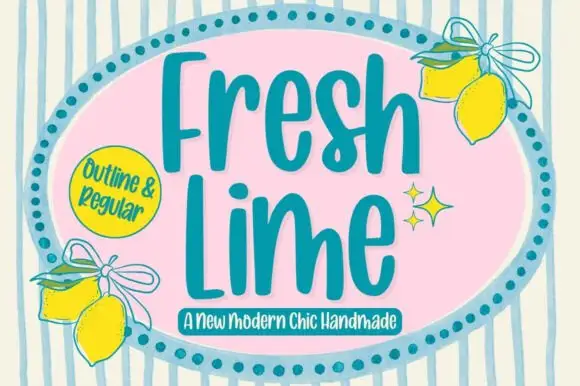
Peach Mighties + Fresh Lime
Adds a warm human signature touch for 1-to-3-word callouts without competing against structured serif capitals.
Inspect Fresh Lime specimenPractical applications
Concrete hierarchy, scale and production guidance tailored to Peach Mighties’s stroke geometry.
The soft hooks give a retro card its finish, and the heavy body keeps a short greeting clear at 34 pt on an A6 sheet in one ink. The heavy row keeps a greeting readable across a table.
Hierarchy & layout recipe
Print an A6 card: set the greeting at 34 pt, keep 20 mm of clear card at each end for the outward hooks, and set the age at 14 pt in a rounded sans beneath with 12 mm of clear ground.
Pre-production check
Two hooks set closer than 6 mm look like one joined letter; check the proof and keep 8 mm between the words. Set the two words apart deliberately.
The heavy serif carries a paper label, and the small counters stay open at 20 pt on a 60 mm panel in one flat ink. The thick strokes stay solid in one flat ink on paper.
Hierarchy & layout recipe
Print a 60 by 40 mm label: set the bakery name at 20 pt, keep 5 mm of border so the hooks are not trimmed, and set the city in a 6 pt caps beneath with 5 mm of clear ground. Centre the name on the label.
Pre-production check
A hook cut by the die edge reads as a fault; check the artwork and keep 6 mm between the hook and the die. A 6 mm gap is safer at this size.
The soft hooks warm a valentine, and the heavy row keeps a short phrase readable at 30 pt across an A6 card. The hooks give the phrase its warmth without a second face.
Hierarchy & layout recipe
Print an A6 card: set the phrase at 30 pt, keep 18 mm of clear card on both sides, and leave the lower third blank for a handwritten line with 10 mm of clear ground. Print the card on a smooth stock.
Pre-production check
A wide hook printed into the writing area is smudged; check the card and keep 12 mm of white below the last hook.
Technical & licence verification
Confirm included OTF/TTF/WOFF formats, full glyph tables and licence coverage on the live store page before batch production.
Closest visual alternatives
Matched across letterform anatomy, stroke behaviour and craft applications.
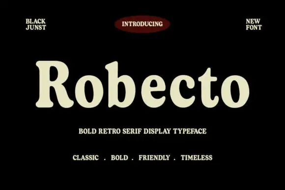
Heavy soft retro serif
Robecto is a heavy soft serif in cream on black: mixed case with thick stems, narrow counters, rounded shoulder ends and short bracketed serifs, set as one large word under a red oval badge and between two small tracked notes, with three tracked lines beneath that name its character.
Ideas for this font
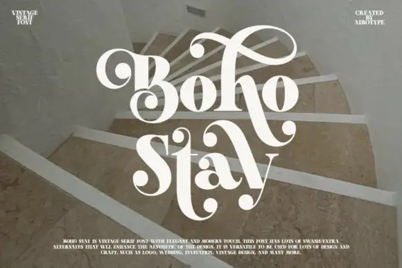
Heavy soft serifs with large ball-ended looping swashes
Boho Stay is a heavy soft serif in which the letters carry strong thick-thin contrast, the counters stay tight and large curled swashes with ball ends frame the capital, rise over the first row and sweep between the two title lines.
Ideas for this font
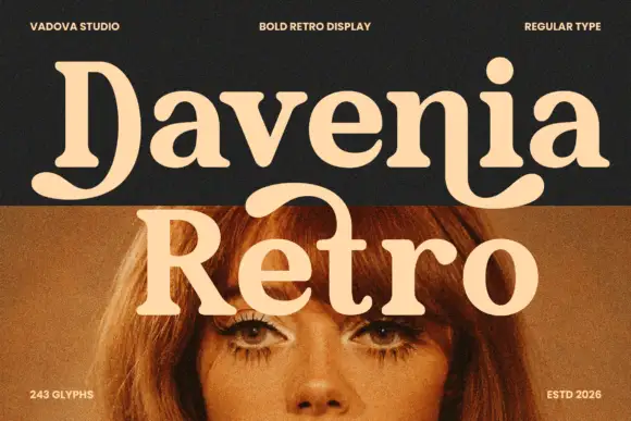
Heavy soft serif lettering with a broad D tail and hooked n ending
Davenia Retro sets a bold serif with high-waisted bowls, a round shoulder and a D that opens into a swash, so a two-word title looks like a printed poster from the early seventies.
Ideas for this font
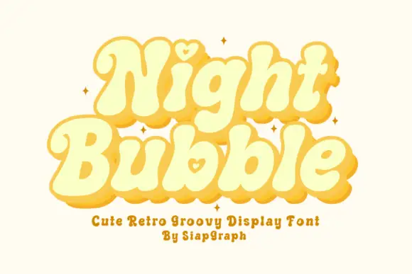
Soft retro bubble letters with hearts
Night Bubble is a soft retro display face in butter yellow: fat rounded letterforms, an offset pink shadow, and a small heart tucked into the counters of the N and the b.
Ideas for this font
Same independent foundry
Allow optional Google Analytics to measure visits and catalogue actions. Your search words and notes are not included. Privacy & storage