High-Contrast Display Serif

Madliners + The Bilstein Editorial
Pairs sculptural editorial warmth with Madliners's clean modern geometry.
Inspect The Bilstein Editorial specimenDisclosure: MakerFileHub may earn a commission from qualifying purchases via paid links on this page. How our links work.
Rough-edged vintage monoline script & stamp sans duo
Madliners is a warm vintage monoline font duo combining a thick, rough-edged connected script (with underline tail) and a matching stamp sans.
Paid link
Get this fontProject & layout blueprintsAt-a-glance maker compatibility
Fine grain and micro-texture excel in 300 DPI print, sublimation, and screen print rather than small vinyl weeding.
Visual anatomy & craft review
Madliners is a duo: a rough-edged vintage monoline script with a shaky even line, plus a stamp-textured sans for the supporting details. The script carries personality and the sans carries information, so a sign uses two voices from one family. The rough edge is drawn into the contour, so a one-colour print keeps it, and the monoline survives small sizes better than a contrast script. The script needs roughly 22 mm and the stamp sans 12 mm for the texturing to read.
Retro-surf · Rough-monoline · Handcrafted
Two-font hierarchy recipes
Tested contrast partners — pairing Madliners with grounded secondary typography.
Madliners + The Bilstein Editorial
Pairs sculptural editorial warmth with Madliners's clean modern geometry.
Inspect The Bilstein Editorial specimen
Madliners + Wishful Women
Introduces organic movement on pull-quotes, signatures and gift tags.
Inspect Wishful Women specimenPractical applications
Concrete hierarchy, scale and production guidance tailored to Madliners’s stroke geometry.
A shaky vintage script paired with a stamp sans reads as a hand-painted bar sign rather than a designed logo. The script holds the name at 40 mm, and the stamp sans sets the drinks list at 12 mm in the same one-colour separation.
Hierarchy & layout recipe
Menu board 600 x 900 mm, script 80 mm, sans 24 mm, 30 mm margins. Matchbook 50 x 35 mm, script 10 mm, 3 mm margins. Card 85 x 55 mm, script 16 mm, sans 8 pt, 5 mm margins.
Pre-production check
On a 50 x 35 mm matchbook the script at 10 mm closes its lifted joins and the name reads as a squiggle. Keep the matchbook in the sans only, and print one before the order.
A rough monoline script reads as chalk on a board, which is what a beach bar wants on its summer poster. The shaky line holds at 90 mm, and the stamp sans carries the prices at 20 mm in the same flat ink.
Hierarchy & layout recipe
Poster A2, script 120 mm, sans 34 mm, 20 mm margins. Drink list 150 x 300 mm, script 40 mm, sans 12 mm. Towel tag 60 x 90 mm, script 14 mm with a 4 mm hole and 8 mm clear.
Pre-production check
On a 60 x 90 mm towel tag the script at 14 mm loses the rough edge and reads as a plain monoline. Raise the tag to 20 mm or set it in the sans, and print one tag on the loop card first.
A vintage monoline script and a stamp sans give a coffee shop a hand-lettered menu rather than a printed franchise board. The script sets the house name at 60 mm, and the sans lists the seasonal drinks at 18 mm in a single pass.
Hierarchy & layout recipe
Menu board 900 x 1200 mm, script 90 mm, sans 30 mm, 40 mm margins. Bag stamp 90 x 50 mm, script 16 mm, 6 mm margins. Window decal 600 x 200 mm, script 80 mm, 20 mm edge clearance.
Pre-production check
A bag stamp at 16 mm on kraft wicks the rough edge into the paper and the script reads as a blur. Raise the stamp to 24 mm or use the sans, and check one stamped bag before the run.
Technical & licence verification
Confirm included OTF/TTF/WOFF formats, full glyph tables and licence coverage on the live store page before batch production.
Closest visual alternatives
Matched across letterform anatomy, stroke behaviour and craft applications.
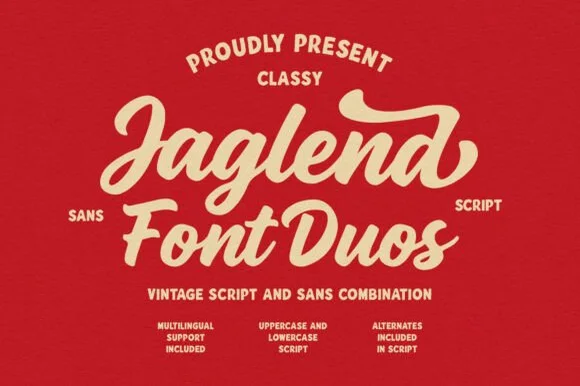
Retro sign-painter brush script & rugged condensed sans duo
Jaglend Font Duo pairs a thick, creamy vintage sign-painter brush script with a sturdy, hand-drawn condensed uppercase sans companion.
Ideas for this font
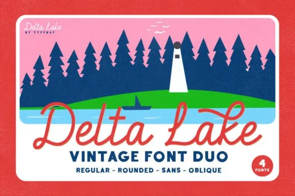
4-font vintage national-park & lake-camp duo (Regular, Rounded, Sans, Oblique)
Delta Lake Font is a 4-font vintage outdoor duo bundling matched Script (Regular & Rounded tails) and bold camp Sans (Regular & Oblique).
Ideas for this font
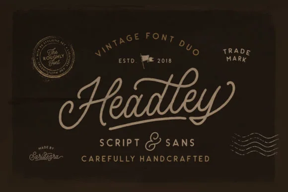
Weathered heritage monoline script & rough vintage sans duo
Headley Duo is a classic heritage font pairing combining a sweeping monoline badge script with a subtly roughened uppercase sans.
Ideas for this font
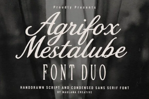
Bold retro brush script + tall skinny condensed sans duo
Agrifox Mestalube is a high-contrast heritage font duo pairing a juicy slanted brush script with a tall, airy monoline condensed sans.
Ideas for this font
Same independent foundry
Allow optional Google Analytics to measure visits and catalogue actions. Your search words and notes are not included. Privacy & storage