Neutral Sans Workhorse

Nusantara Heritage + Limited Coffee
Lets Nusantara Heritage own the focal silhouette while handling secondary copy, sizing and subheads cleanly.
Inspect Limited Coffee specimenDisclosure: MakerFileHub may earn a commission from qualifying purchases via paid links on this page. How our links work.
Carved Southeast-Asian temple & batik ornamental serif
Nusantara Heritage is an ornate cultural display serif inspired by Indonesian archipelago temple carvings, tropical flora, and traditional craft motifs.
Paid link
Get this fontProject & layout blueprintsAt-a-glance maker compatibility
Sturdy stroke walls and open counters weed cleanly on adhesive vinyl, HTV apparel film, and cut cardstock.
Visual anatomy & craft review
Nusantara Heritage is an ornate cultural display serif crowned with flame-carved finials, foliate curl spurs along the stems and PUA-encoded craft motifs, so a word reads as a carved temple panel rather than a decorated title. The carving sits inside and above the letter, which means the face needs size for the motifs to read, and the serifs stay legible at 20 pt. It needs roughly 32 mm for the carving to hold, and it is best in charcoal on pale parchment or in gold on deep indigo.
Archival-cultural · Temple-carved · Ornate
Two-font hierarchy recipes
Tested contrast partners — pairing Nusantara Heritage with grounded secondary typography.
Nusantara Heritage + Limited Coffee
Lets Nusantara Heritage own the focal silhouette while handling secondary copy, sizing and subheads cleanly.
Inspect Limited Coffee specimen
Nusantara Heritage + Evoire
Grounds bold display lettering with classic typographic authority on posters, badges and apparel.
Inspect Evoire specimenPractical applications
Concrete hierarchy, scale and production guidance tailored to Nusantara Heritage’s stroke geometry.
Carved ornamental serifs read as a cultural craft brand, which is what a small coffee or textile business prints on a carton. The finials give the name its origin at 20 pt, and one ink on coated board keeps the print affordable.
Hierarchy & layout recipe
Carton 200 x 150 x 80 mm, word 44 mm, 25 mm margins. Label 70 x 95 mm, name 16 pt, origin 8 pt, 5 mm top arc and 4 mm die margin. Sign 900 x 400 mm, word 160 mm, 60 mm margins.
Pre-production check
A 16 pt label name on a curved bag closes the foliate curls into a solid mass. Print labels digitally or keep the name at 20 pt, and check one applied label before the batch.
Ornate heritage serifs read as a craft-history title, which is what a museum publication wants. The carve holds at 60 pt on coated stock, and the motifs give the cover its subject without a photograph.
Hierarchy & layout recipe
Cover 210 x 280 mm, title 60 pt, subtitle 12/16 pt, 20 mm margins and 10 mm trim. Opener 420 x 297 mm, headline 110 mm, body 9.5/14 pt. Panel 1200 x 800 mm, title 190 mm, notes 18/24 pt.
Pre-production check
A 60 pt ornate serif on uncoated stock spreads the fine curls into a stain and the title looks blurred. Print coated or enlarge to 76 pt, and check one printed signature before the run.
Temple-carved lettering reads as a heritage festival brand, which is what a spring cultural fair needs. The finials hold at 260 mm in one ink, and the programme carries the same face at 40 pt on the cover.
Hierarchy & layout recipe
Poster A2, word 260 mm, dates 22/28 pt, 30 mm margins and 20 mm trim. Programme A5, cover 40 pt, acts 8/11 pt. Stage sign 1200 x 500 mm, word 200 mm, 80 mm margins.
Pre-production check
A stage sign printed on mesh loses the carved finials in the perforations and the word reads as a rough block. Print the word on a solid panel and sew it on, and check one hung panel in daylight.
Technical & licence verification
Confirm included OTF/TTF/WOFF formats, full glyph tables and licence coverage on the live store page before batch production.
Closest visual alternatives
Matched across letterform anatomy, stroke behaviour and craft applications.
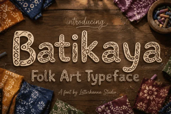
Intricate Indonesian Batik wax-resist folk-art display font
Batikaya is an artisanal folk-art display typeface (NOT a handwriting worksheet font!) filling woodcut-style letters with traditional wax-resist spirals, dots, and leaves!
Ideas for this font

Bold letterpress-inked vintage editorial serif
Worldstar is a bold vintage editorial serif (NOT casual handwriting!) featuring warm bracketed curves and subtle antique letterpress edge ink.
Ideas for this font
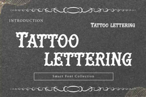
Letterpress tattoo lettering
Tattoo Lettering is a decorative plate in cream on charcoal: a swollen display alphabet with notched spurs and heavy serifs, set in two lines with a thin ornamental rule above and below, a small tracked label at the left and a boxed note at the foot naming the collection.
Ideas for this font
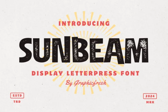
Chunky hand-cut vintage letterpress sans display
Sunbeam is a bold, wide-stance vintage sans display typeface pairing hand-carved organic contours with subtle letterpress speckle texture.
Ideas for this font
Same independent foundry
Allow optional Google Analytics to measure visits and catalogue actions. Your search words and notes are not included. Privacy & storage