Editorial Serif Anchor

Camelia Beauty + Lumera Editorial
Anchors Camelia Beauty's fluid strokes with crisp Roman proportions on wedding suites, headers and packaging.
Inspect Lumera Editorial specimenDisclosure: MakerFileHub may earn a commission from qualifying purchases via paid links on this page. How our links work.
Clean upright medium-weight monoline cursive script
Camelia Beauty is a calm, tidy monoline handwritten script with open C/B capitals and smooth, legible upright lowercase.
Paid link
Get this fontProject & layout blueprintsAt-a-glance maker compatibility
Weld or Unite overlapping script joins into one continuous vector path before sending to the blade.
Visual anatomy & craft review
A clean upright monoline cursive shown in slate charcoal over billowy white linen: uniform medium-thin marker curves with clean open loops and no fussy swashes, so the word reads as confident hand lettering rather than as a formal calligraphic script. The monoline stroke is what makes it feel modern, and the upright axis keeps a two-word name level without a bounce. Because nothing is hairline, the face survives small sizes and cuts without welding on the larger variants. The coastal linen behind is staging. Uses are beauty, spa, wellness and quiet wedding stationery, where the lettering should look considered rather than decorative.
Breezy · Clean-monoline · Linen
Two-font hierarchy recipes
Tested contrast partners — pairing Camelia Beauty with grounded secondary typography.
Camelia Beauty + Lumera Editorial
Anchors Camelia Beauty's fluid strokes with crisp Roman proportions on wedding suites, headers and packaging.
Inspect Lumera Editorial specimen
Camelia Beauty + Headline
Keeps small-scale dates, URLs, nutrition facts and care instructions crisp and legible below script titles.
Inspect Headline specimenPractical applications
Concrete hierarchy, scale and production guidance tailored to Camelia Beauty’s stroke geometry.
A clean monoline script reads as a modern beauty brand rather than a heritage apothecary, and because the stroke is uniform it holds on a small serum label where a contrast script would thin into nothing and force a smaller, weaker mark.
Hierarchy & layout recipe
Print a 45 by 70 mm label: the brand at 12 pt, the product at 8 pt, and the volume at 7 pt. Keep 4 mm inside the die, set the script on one line above a tracked sans in caps, and leave 10 mm at the foot for the batch code.
Pre-production check
Check the 12 pt brand on the bottle, where a thin connector can fill; keep the stroke above 0.4 mm. Confirm the 7 pt volume reads in the hand and that the label sits square on a curved bottle.
The upright axis and open loops suit a bridesmaid box or a place card that has to be read at a glance across a table, and the clean monoline keeps a long guest name legible where a swashed script would turn into a ribbon.
Hierarchy & layout recipe
Print a 90 by 50 mm place card: the name at 20 pt, the table at 8 pt, and one ink on a heavy cotton card. Keep 8 mm margins, keep the name centred, and leave 10 mm at the foot for the table number.
Pre-production check
Check the 20 pt name at arm's length, where a loop can close on a textured card. Confirm the table number reads from a standing distance and that the card stands without curling.
A calm monoline reads as a personal note from a therapist rather than as a marketing card, which is what a spa or a wellness studio wants to hand over after a treatment, and the absence of swashes keeps it from looking like a wedding invitation.
Hierarchy & layout recipe
A6 card: the greeting at 24 pt, the message in a 10 pt sans, and the studio at 8 pt. Keep 15 mm margins, print one ink on a soft white card, and leave 12 mm at the foot for a handwritten signature.
Pre-production check
Check the 24 pt greeting at home-print resolution, where the stroke can break up; keep it above 0.4 mm. Confirm the message reads at arm's length and that the signature space is clear of print.
Technical & licence verification
Confirm included OTF/TTF/WOFF formats, full glyph tables and licence coverage on the live store page before batch production.
Closest visual alternatives
Matched across letterform anatomy, stroke behaviour and craft applications.
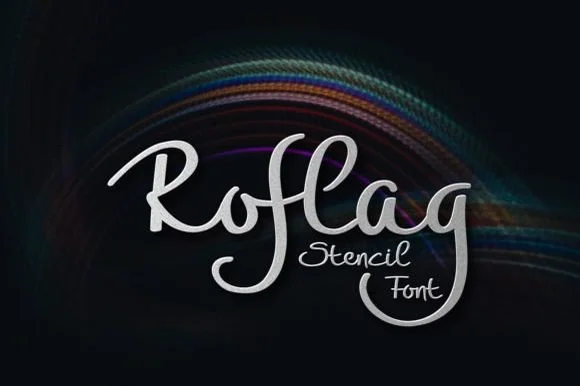
Brush script with stencil bridges
Roflag Stencil is a brush script in silver on a dark ground: a moderate stroke with visible modulation, tall looping ascenders, curled terminals and small bridges cut through several strokes, set as one word with a second line in the same hand and a subtle light trail behind.
Ideas for this font
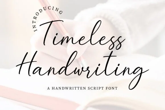
Natural fountain-pen journal & correspondence script
JIM MART's fountain-pen handwriting script pairs airy, fast-flowing ink strokes with natural baseline bounce and crisp lowercase connections.
Ideas for this font
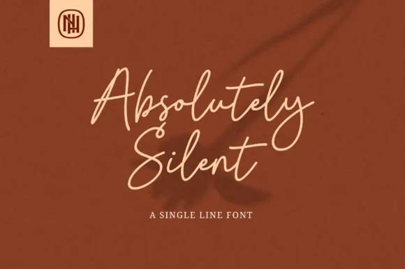
Airy tall-looped monoline fountain-pen script
Absolutely Silent is a graceful, slender monoline cursive script with tall narrow ascender loops and sweeping crossed 't' bars.
Ideas for this font
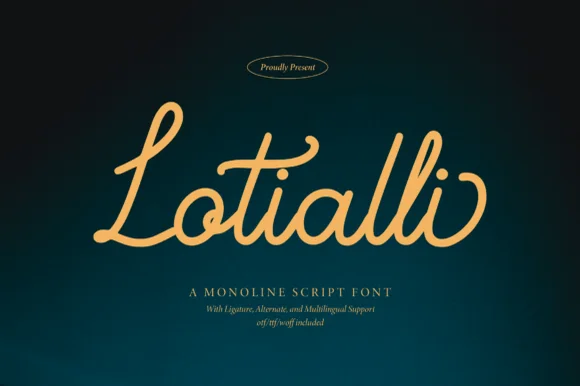
Monoline script with ligatures
Lotialli is a monoline script in warm gold on a deep teal gradient: even stroke weight, a tall looped L, a rounded bowl on the o, and connected letters that keep a steady rhythm across the word without ornament.
Same independent foundry
Allow optional Google Analytics to measure visits and catalogue actions. Your search words and notes are not included. Privacy & storage