Neutral Sans Workhorse

Rusted Sabbath + Corven
Lets Rusted Sabbath own the focal silhouette while handling secondary copy, sizing and subheads cleanly.
Inspect Corven specimenDisclosure: MakerFileHub may earn a commission from qualifying purchases via paid links on this page. How our links work.
Savage black metal capitals built from spiked, dripping strokes
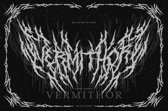
Rusted Sabbath is a black metal display alphabet in which the stems split into spikes, the counters disappear and the tops of the letters run into flame-like hooks, so a band name reads as a sigil before it reads as words.
Paid link
Get this fontProject & layout blueprintsAt-a-glance maker compatibility
Fine grain and micro-texture excel in 300 DPI print, sublimation, and screen print rather than small vinyl weeding.
Visual anatomy & craft review
The R breaks its bowl into three clawed points, the U turns into a fork, the S carries two rows of spikes, the T raises a crown of thorns and the D ends in a dripping tail, all at a skeletal weight with sharp, irregular terminations and no optical spacing at all. The deliberate illegibility is the character: the face is built to be read as an emblem on a patch or a cassette cover, not as text. Because the points are thin, the face needs 60 pt before the spikes print, and it belongs on one colour over black. The framed black field, the small typewriter caps above and the subtitle below are presentation; the spiked band name is the face.
Metal · Spiked · Illegible
Two-font hierarchy recipes
Tested contrast partners — pairing Rusted Sabbath with grounded secondary typography.
Rusted Sabbath + Corven
Lets Rusted Sabbath own the focal silhouette while handling secondary copy, sizing and subheads cleanly.
Inspect Corven specimen
Rusted Sabbath + The Lumina Awesome
Grounds bold display lettering with classic typographic authority on posters, badges and apparel.
Inspect The Lumina Awesome specimenPractical applications
Concrete hierarchy, scale and production guidance tailored to Rusted Sabbath’s stroke geometry.
The spiked skeleton reads as a patch on a dark shirt, and the deliberate illegibility suits a venue poster that trades on atmosphere rather than clarity.
Hierarchy & layout recipe
Print a 300 mm wide chest print: set the band name at 90 mm over black, keep every spike at 1.5 mm minimum stroke, and leave 40 mm of clear shirt under the word for the date line in typewriter caps.
Pre-production check
Spikes thinner than 1.4 mm break away in a screen print; check the film at full size and thicken the points rather than reducing the word.
The spikes cut a silhouette that reads at thumbnail size, and a zine cover gains an emblem that a legible serif could never carry at 140 pt.
Hierarchy & layout recipe
Print an A5 cover: set the title at 140 pt white on black, bleed the spikes past the trim on three sides, and set the issue number in a 7 pt mono in the lower corner.
Pre-production check
A bleeding spike that stops just inside the trim looks like a printing error; check the imposed cover and either bleed fully or pull the word in by 10 mm.
The emblem shape compresses into a label, and the sawtooth outline gives a small cassette sticker a recognisable silhouette at 45 mm.
Hierarchy & layout recipe
Print a 45 by 45 mm label: set the name at 30 mm, keep 5 mm of black around the spikes so the die does not clip them, and set the catalogue number in a 5 pt mono beneath.
Pre-production check
A die cut through a spike leaves a sliver of backing; check the sticker sheet and keep every point inside the die by 3 mm.
Technical & licence verification
Confirm included OTF/TTF/WOFF formats, full glyph tables and licence coverage on the live store page before batch production.
Closest visual alternatives
Matched across letterform anatomy, stroke behaviour and craft applications.
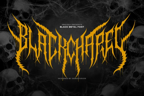
Spiked black-metal sigil lettering with ragged edges and dripping points
Blackchapel is an extreme-metal sigil face in which the letters merge into a spiked mass, the stems split into thorns and the bottoms run into drips, so a word reads as a band logo rather than as readable type.
Ideas for this font
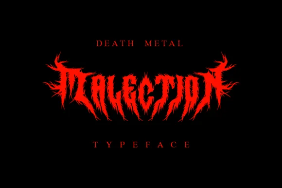
Symmetrical flame-thorned underground death-metal logo font
Malection is a ferocious underground death-metal display font sculpting jagged flame-like thorns into symmetrical band-logo arches.
Ideas for this font
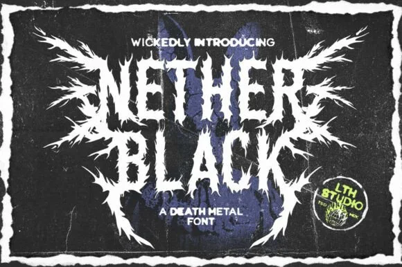
Jagged symmetrical death-metal thorn display
Nether Black is a ferocious death-metal display typeface erupting with symmetrical thorn spikes and splintered outer wings.
Ideas for this font
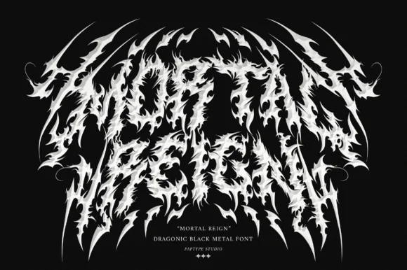
Dragonic thorny black-metal display with flame-like spikes and a winged arch
Mortal Reign is a black-metal display face in which the letters are built from flame-like spikes, the word arches upward at both ends and the thorns interlock between letters, so the mark reads as a winged sigil.
Ideas for this font
Same independent foundry
Allow optional Google Analytics to measure visits and catalogue actions. Your search words and notes are not included. Privacy & storage