Neutral Sans Workhorse

Malection + Furion
Lets Malection own the focal silhouette while handling secondary copy, sizing and subheads cleanly.
Inspect Furion specimenDisclosure: MakerFileHub may earn a commission from qualifying purchases via paid links on this page. How our links work.
Symmetrical flame-thorned underground death-metal logo font
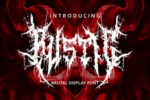
Malection is a ferocious underground death-metal display font sculpting jagged flame-like thorns into symmetrical band-logo arches.
Paid link
Get this fontProject & layout blueprintsAt-a-glance maker compatibility
Fine grain and micro-texture excel in 300 DPI print, sublimation, and screen print rather than small vinyl weeding.
Visual anatomy & craft review
Malection is a symmetrical death-metal display in which the band-name arches flare outward into flame-shaped thorns while keeping a readable central letter core, and the family includes alternate configurations so the silhouette can be tuned. The thorns grow from the outer contour rather than being scattered behind the word, which means the letters remain the anchor and the ornament can be reduced. Heavy cores hold at poster scale; the thorn tips vanish below roughly 20 mm. It is a logo device first and a typeface second, and it should not carry anything but a name.
Death-metal · Flame-thorned · Symmetrical
Two-font hierarchy recipes
Tested contrast partners — pairing Malection with grounded secondary typography.
Malection + Furion
Lets Malection own the focal silhouette while handling secondary copy, sizing and subheads cleanly.
Inspect Furion specimen
Malection + Majestic Letters
Grounds bold display lettering with classic typographic authority on posters, badges and apparel.
Inspect Majestic Letters specimenPractical applications
Concrete hierarchy, scale and production guidance tailored to Malection’s stroke geometry.
Symmetrical flame thorns are the convention of the genre, and this face delivers it without hand-drawing, which is what a small band needs from a logo file. Heavy cores stay legible on a flyer seen at arm's length in a dark venue.
Hierarchy & layout recipe
Logo 260 mm wide on a 900 mm hoodie print area, 30 mm margins. Flyer A5, logo 150 mm wide, date block 10/13 pt. Sleeve 312 x 312 mm, logo 190 mm, credits 7 pt.
Pre-production check
Thorn tips under 0.4 mm bridge on a 110-mesh screen print and the silhouette fills into a solid mass. Approve a strike-off, and use the sparser alternate if the print closes the outer contour.
A thorned symmetrical silhouette reads as a warning mark from a distance, which is what an attraction poster needs at a gate. The readable core lets a guest still find the event name.
Hierarchy & layout recipe
Poster A2, logo 300 mm wide, times 24/30 pt, 30 mm margins. Gate sign 1200 x 500 mm, logo 500 mm, 120 mm margins. Tee print 280 x 320 mm, logo 220 mm.
Pre-production check
Gate signs are printed on PVC and viewed at dusk, where a red-on-black logo loses all definition. Check one 1:1 print under sodium lighting, and lighten the core letter colour if the silhouette disappears.
The face works as a badge rather than a wordmark, which lets a small label put one mark across a deck, a cassette and a window without a second design. Symmetry makes it read level when applied by hand.
Hierarchy & layout recipe
Window decal 300 x 220 mm, logo 200 mm wide, 15 mm cut margin. Cassette inlay 100 x 64 mm, logo 60 mm, side label 4 mm. Deck 210 x 810 mm, logo 150 mm on a 200 mm centre panel.
Pre-production check
Hand-applied decals are rarely level, so a symmetrical logo exaggerates any tilt. Print a 3 mm registration mark on a peel-off tab, and check one applied decal against the window frame before producing stock.
Technical & licence verification
Confirm included OTF/TTF/WOFF formats, full glyph tables and licence coverage on the live store page before batch production.
Closest visual alternatives
Matched across letterform anatomy, stroke behaviour and craft applications.
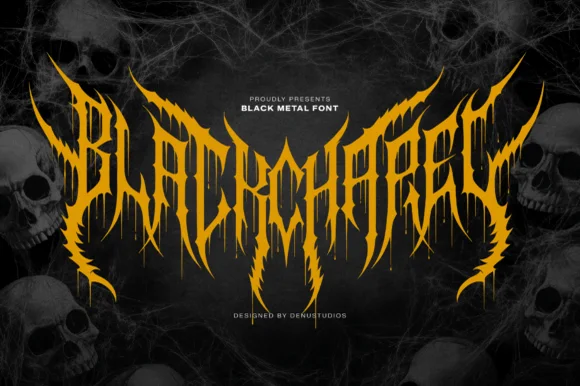
Spiked black-metal sigil lettering with ragged edges and dripping points
Blackchapel is an extreme-metal sigil face in which the letters merge into a spiked mass, the stems split into thorns and the bottoms run into drips, so a word reads as a band logo rather than as readable type.
Ideas for this font
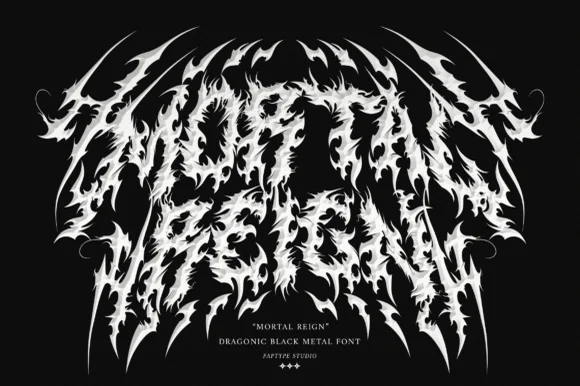
Dragonic thorny black-metal display with flame-like spikes and a winged arch
Mortal Reign is a black-metal display face in which the letters are built from flame-like spikes, the word arches upward at both ends and the thorns interlock between letters, so the mark reads as a winged sigil.
Ideas for this font
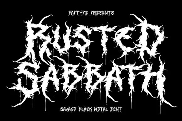
Savage black metal capitals built from spiked, dripping strokes
Rusted Sabbath is a black metal display alphabet in which the stems split into spikes, the counters disappear and the tops of the letters run into flame-like hooks, so a band name reads as a sigil before it reads as words.
Ideas for this font
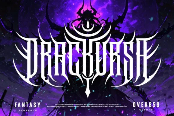
Symmetrical dark-fantasy & death-metal crest font (859+ glyphs)
Drackursa is a monumental 859-glyph dark-fantasy & death-metal typeface engineered with tall vertical blade stems and sweeping wing ligatures.
Ideas for this font
Same independent foundry
Allow optional Google Analytics to measure visits and catalogue actions. Your search words and notes are not included. Privacy & storage