Neutral Sans Workhorse

Demise + Bareum
Lets Demise own the focal silhouette while handling secondary copy, sizing and subheads cleanly.
Inspect Bareum specimenDisclosure: MakerFileHub may earn a commission from qualifying purchases via paid links on this page. How our links work.
Sharp inline-highlighted underground metal blackletter
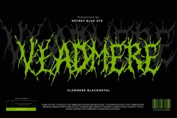
Demise is a razor-chiseled underground gothic blackletter featuring crisp vertical facets and grimdark poster presence.
Paid link
Get this fontProject & layout blueprintsAt-a-glance maker compatibility
Sturdy stroke walls and open counters weed cleanly on adhesive vinyl, HTV apparel film, and cut cardstock.
Visual anatomy & craft review
Demise is a razor-chiselled blackletter with crisp vertical facets and split highlights running down each stem, so the letters read as carved bone rather than ink. The structure is a true gothic skeleton, narrow and tightly spaced, and the facet line is the only decoration, which keeps a word legible at 30 mm. The highlights are thin, so they close below roughly 22 mm and should be treated as size-dependent; the face is a logo and poster device, not a text face, and it wants a dark ground with a cold light ink.
Underground-metal · Chiseled-inline · Grimdark
Two-font hierarchy recipes
Tested contrast partners — pairing Demise with grounded secondary typography.
Demise + Bareum
Lets Demise own the focal silhouette while handling secondary copy, sizing and subheads cleanly.
Inspect Bareum specimen
Demise + Kernova
Grounds bold display lettering with classic typographic authority on posters, badges and apparel.
Inspect Kernova specimenPractical applications
Concrete hierarchy, scale and production guidance tailored to Demise’s stroke geometry.
Faceted gothic stems read as a chiselled crest, which is the register an underground merch label wants. Split highlights give a two-tone effect from one ink on a dark ground.
Hierarchy & layout recipe
Deck 210 x 810 mm, crest 140 mm on a 200 mm centre panel, 25 mm to the bolt holes. Shirt print 300 x 320 mm, crest 220 mm. Label 90 x 110 mm, crest 26 mm, abv 4.5 pt on a 6 mm baseline.
Pre-production check
At 26 mm on a bottle label the facet highlights close and the crest reads as a black block. Use the solid variant for small labels, and keep the faceted cut for surfaces above 100 mm.
Carved facets read as an engraved poster rather than a font sample, which is what a dark-fantasy release wants. Tight spacing gives a title density without ornament.
Hierarchy & layout recipe
Poster A2, word 300 mm, times 22/28 pt, 30 mm margins. Sleeve 312 x 312 mm plus 3 mm bleed, word 200 mm, credits 7 pt. Zine A5, header 50 mm, body 8.5/12 pt.
Pre-production check
Streaming thumbnails render a dense blackletter as a solid rectangle at 55 px. Check the title at that size, and reduce to two initials if the silhouette disappears.
Bone-chiselled letterforms suit a tarot or séance theme where the reference is antique rather than gory. Split highlights survive a dark venue better than a thin outline.
Hierarchy & layout recipe
Poster A2, word 280 mm, times 22/28 pt, 30 mm margins. Invitation 120 x 180 mm, names 20 pt, details 8.5/12 pt, 15 mm margins. Spine 45 mm wide, title 7 mm repeated.
Pre-production check
Invitations are read in low light and an 8.5 pt blackletter detail line is unreadable. Keep the practical copy in a plain serif at 9 pt or above, and test one invitation in a dimmed room.
Technical & licence verification
Confirm included OTF/TTF/WOFF formats, full glyph tables and licence coverage on the live store page before batch production.
Closest visual alternatives
Matched across letterform anatomy, stroke behaviour and craft applications.
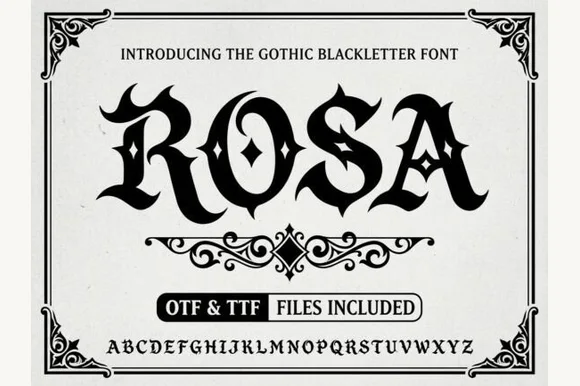
Gothic blackletter with ornaments
Rosa is a gothic blackletter display in black on white: heavy broken strokes with diamond-shaped counters, sharp spurs and a dense texture, set inside an ornamental corner frame with a scroll divider, a file badge and a complete alphabet line at the foot.
Ideas for this font
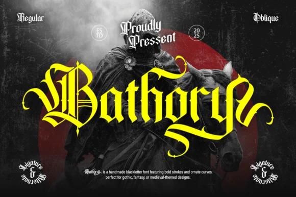
Ornate medieval blackletter family (Regular & Oblique)
Bathory is a lush, handmade medieval blackletter family (Regular & Oblique) featuring double-barred capitals and sweeping flame-curled descenders.
Ideas for this font
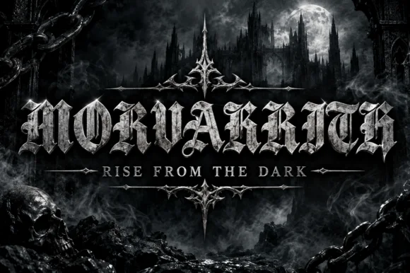
Blackletter with a metal bevel treatment
Morvakrith is a heavy blackletter shown with a metallic bevel: dense vertical strokes, sharp spurs and a narrow lowercase rhythm, rendered in polished silver over a moonlit castle scene with a skull, chains and a motto rule beneath.
Ideas for this font
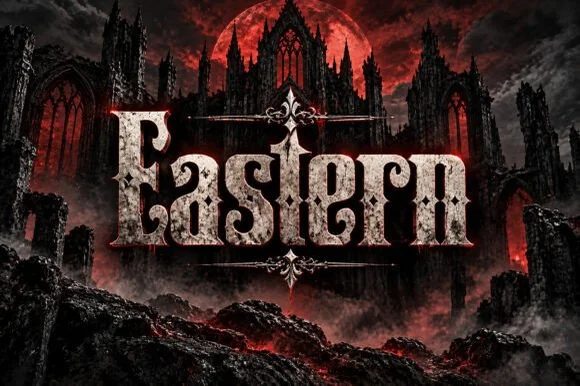
Weathered cathedral Fraktur blackletter display (OTF)
Eastern is a dramatic medieval Fraktur blackletter display font featuring bifurcated crown spurs and classic gothic lowercase (OTF).
Ideas for this font
Same independent foundry
Allow optional Google Analytics to measure visits and catalogue actions. Your search words and notes are not included. Privacy & storage