Neutral Sans Workhorse

Blackchapel + Hermano
Lets Blackchapel own the focal silhouette while handling secondary copy, sizing and subheads cleanly.
Inspect Hermano specimenDisclosure: MakerFileHub may earn a commission from qualifying purchases via paid links on this page. How our links work.
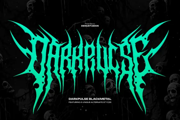
Spiked black-metal sigil lettering with ragged edges and dripping points
Blackchapel is an extreme-metal sigil face in which the letters merge into a spiked mass, the stems split into thorns and the bottoms run into drips, so a word reads as a band logo rather than as readable type.
Paid link
Get this fontProject & layout blueprintsAt-a-glance maker compatibility
Fine grain and micro-texture excel in 300 DPI print, sublimation, and screen print rather than small vinyl weeding.
Visual anatomy & craft review
The B dissolves into a fan of spikes, the l and the a share stems, the c is a hooked blade and the final flourish reaches past the last letter, all at a heavy weight with edges cut into points. Legibility is deliberately compromised: the face works as a mark at 80 pt and above, where the silhouette reads as a mass with a hint of letters, and it collapses below 30 pt. The drips at the bottom are part of the drawing rather than a treatment, which is why they cannot be removed without redrawing. The dark ground, the yellow ink, the skulls and cobwebs, the small label are presentation; the sigil face is the word shown.
Sigil · Spiked · Extreme
Two-font hierarchy recipes
Tested contrast partners — pairing Blackchapel with grounded secondary typography.
Blackchapel + Hermano
Lets Blackchapel own the focal silhouette while handling secondary copy, sizing and subheads cleanly.
Inspect Hermano specimen
Blackchapel + Orvelia
Grounds bold display lettering with classic typographic authority on posters, badges and apparel.
Inspect Orvelia specimenPractical applications
Concrete hierarchy, scale and production guidance tailored to Blackchapel’s stroke geometry.
The spiked mass reads as a band mark at 90 pt, and the silhouette holds on a cover where a legible logotype would look mainstream.
Hierarchy & layout recipe
Print a 120 mm square sleeve: set the mark at 90 pt across the centre, set the album title in a 9 pt caps serif at the foot, and keep 14 mm of margin so the outer spikes stay inside the square trim.
Pre-production check
Spikes printed close to a trim look cropped; check the artwork at final size and scale the mark down rather than trimming the points.
The dense spikes screen-print as one silhouette, and the mass reads at 80 mm across a chest panel where a thin logotype would sink into the fabric.
Hierarchy & layout recipe
Screen a 280 mm chest print: set the mark at 80 mm, keep the thinnest point at 1.5 mm minimum, and stay 50 mm below the collar so the print clears the shoulder seam.
Pre-production check
A spike under 1 mm closes on a coarse mesh; check a pull on the actual shirt and thicken the points rather than simplifying the drawing.
The sigil reads as a mark at 30 mm on a die-cut sticker, and the silhouette survives the cut where a detailed face would lose its edges.
Hierarchy & layout recipe
Print a 60 mm die-cut sticker: set the mark at 30 mm inside the die, keep 4 mm between the spike tips and the cut line, and check that no point is thinner than the blade can follow.
Pre-production check
A die cut through a spike leaves a sliver that peels; check the cut file and blunt the two thinnest points before ordering.
Technical & licence verification
Confirm included OTF/TTF/WOFF formats, full glyph tables and licence coverage on the live store page before batch production.
Closest visual alternatives
Matched across letterform anatomy, stroke behaviour and craft applications.
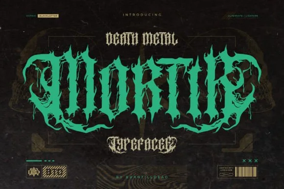
Twisted thorny death-metal blackletter with hooked spurs and long tails
Mortir is a death-metal blackletter in which the gothic skeleton is twisted, the stems sprout thorns and the descenders run long, so a word reads as a brutal logotype with blackletter bones still visible.
Ideas for this font
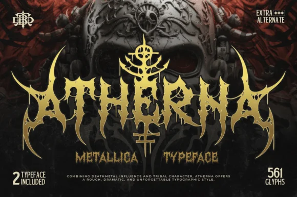
Tribal-horned extreme metal face with dripping points and a horned crest
Atherna is an extreme-metal face in which the letters grow horns and thorns, the joins drip downward and a crest sits above the word, so the mark reads as a tribal sigil rather than as type.
Ideas for this font
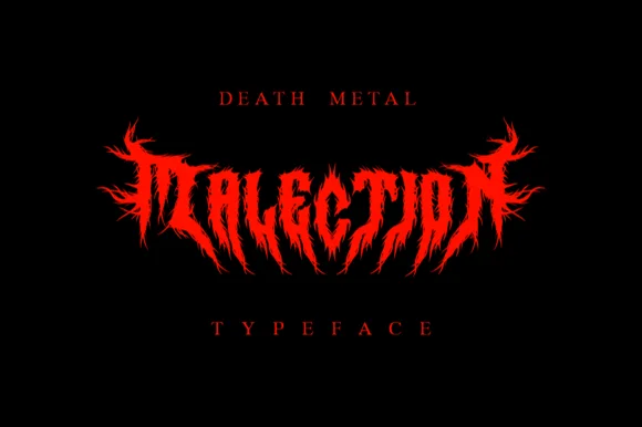
Symmetrical flame-thorned underground death-metal logo font
Malection is a ferocious underground death-metal display font sculpting jagged flame-like thorns into symmetrical band-logo arches.
Ideas for this font
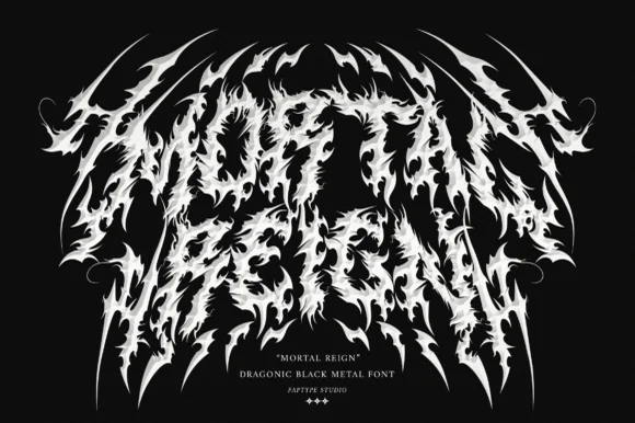
Dragonic thorny black-metal display with flame-like spikes and a winged arch
Mortal Reign is a black-metal display face in which the letters are built from flame-like spikes, the word arches upward at both ends and the thorns interlock between letters, so the mark reads as a winged sigil.
Ideas for this font
Same independent foundry
Allow optional Google Analytics to measure visits and catalogue actions. Your search words and notes are not included. Privacy & storage