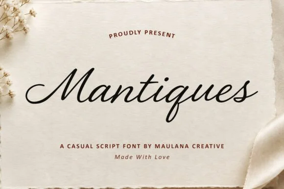
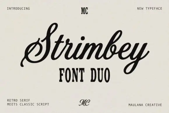
High-Contrast Display Serif

Gulberg + Aureline
Pairs sculptural editorial warmth with Gulberg's clean modern geometry.
Inspect Aureline specimenDisclosure: MakerFileHub may earn a commission from qualifying purchases via paid links on this page. How our links work.
Slanted brush script with broad rough capitals
Gulberg is a slanted brush script with strong pressure changes and short angular shoulders, laid over broad, lightly roughened capital lettering.
Paid link
Get this fontProject & layout blueprintsAt-a-glance maker compatibility
Fine grain and micro-texture excel in 300 DPI print, sublimation, and screen print rather than small vinyl weeding.
Visual anatomy & craft review
The script leans hard right and carries real velocity: the G opens with a wide aperture and a short spur, the r has a sharp angular shoulder, and the g loops below with a narrow tail. Contrast between the thick downstroke and the thin upstroke is strong enough that the joins pinch, which is why the sample reads as brushed lettering rather than a drawn cursive. The capital line above and below is wide, heavy and slightly irregular at the edges, so it frames the script without competing with it. A small multilingual note on the card is a specification claim from the listing rather than something visible in the preview, so treat language coverage as a question for the live product page.
Rugged · Slanted · Hand-brushed
Two-font hierarchy recipes
Tested contrast partners — pairing Gulberg with grounded secondary typography.
Gulberg + Aureline
Pairs sculptural editorial warmth with Gulberg's clean modern geometry.
Inspect Aureline specimen
Gulberg + Lovely
Introduces organic movement on pull-quotes, signatures and gift tags.
Inspect Lovely specimenPractical applications
Concrete hierarchy, scale and production guidance tailored to Gulberg’s stroke geometry.
A slanted script over broad capitals gives a small badge both movement and a solid frame, which suits a hands-on trade identity.
Hierarchy & layout recipe
Keep the script at 18 pt inside a 70 mm badge, set the capital line at 7 pt with 0.15 em tracking, and leave 3 mm between the g tail and the badge edge.
Pre-production check
The g tail narrows quickly, so check it at the final badge size, where it is the first stroke to break up.
The hard slant reads as speed, and the rough capital edges suit a cheaply printed publication better than a refined serif would.
Hierarchy & layout recipe
Set the masthead at 64 pt across the cover width, keep interior headlines in one plain condensed face at 16 pt, and reserve the script for the cover alone so the slant stays an event.
Pre-production check
Proof the rough edges at 100 percent, because on coarse paper stock the broken contours print heavier than they look on screen.
Wide capitals carry across a banner at distance while the script adds a hand-painted signature line beneath the club name.
Hierarchy & layout recipe
Print the capitals at 30 cm total width across a 1.5 m banner, add the script at 25 percent of that height, and keep the banner edge at least 5 cm from the lowest stroke.
Pre-production check
Long banners stretch printed artwork, so check the script's slant angle after the panel is scaled, since shear changes the lean.
Technical & licence verification
Confirm included OTF/TTF/WOFF formats, full glyph tables and licence coverage on the live store page before batch production.
Closest visual alternatives
Matched across letterform anatomy, stroke behaviour and craft applications.
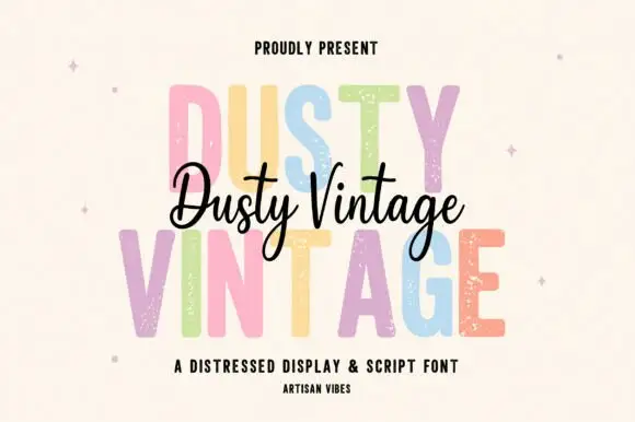
Tall distressed display caps layered with a flowing connected script
Dusty Vintage layers a tall distressed capital alphabet with a flowing connected script, so the same name appears as a worn printed word and as a light handwritten line across it.
Ideas for this font
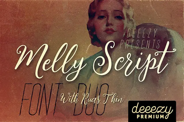
Slanted rounded script paired with an extremely narrow display face
Melly Script Font Duo pairs a slanted rounded script with an extremely narrow capital display face, so a design can carry a soft headline and a tall thin second line from one purchase.
Ideas for this font
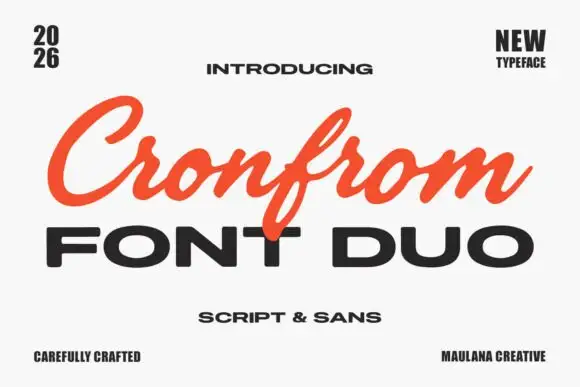
Slanted retro script paired with a wide bold sans in capitals
Cronfrom pairs a slanted retro script with a wide bold sans, so one lockup can carry a handwritten sign name and a hard-edged second line beneath it.
Ideas for this font
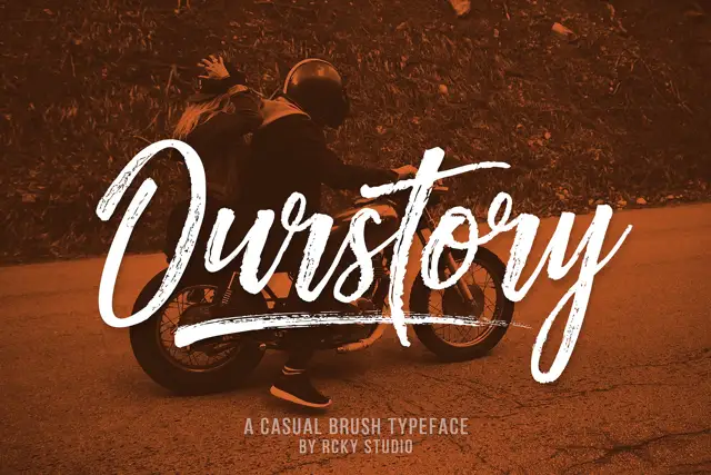
Rough brush script with a fine companion
Ourstory is a duo on a warm-toned photograph: a rough brush script in white with dry, split strokes and a long underline swash, plus a fine companion hand for smaller lines.
Same independent foundry
Allow optional Google Analytics to measure visits and catalogue actions. Your search words and notes are not included. Privacy & storage