Modern Grotesque Body

Starveil + Corven
Creates crisp high-hierarchy contrast beneath Starveil headlines across menus, websites and labels.
Inspect Corven specimenDisclosure: MakerFileHub may earn a commission from qualifying purchases via paid links on this page. How our links work.
Dark celestial serif with crescent moons & stars (344 glyphs, OTF/TTF/WOFF2)
Starveil is a dark celestial display serif (344 glyphs, Latin Extended-A, TTF/OTF/WOFF2) embedding crescent moons and star sparkles into flared stems.
Paid link
Get this fontProject & layout blueprintsAt-a-glance maker compatibility
Sturdy stroke walls and open counters weed cleanly on adhesive vinyl, HTV apparel film, and cut cardstock.
Visual anatomy & craft review
Starveil is a dark celestial serif with crescent moons and stars built into the glyph set: fine-bracketed serifs, a firm stem, crescents that replace the dots and tittles and small four-point stars on the diagonals, across a large multilingual glyph set supplied as OTF, TTF and WOFF2. The crescents are the finest element and the stars are what closes first. It needs roughly 30 mm for the crescent and the star to read, and it is best in one silver on black or a deep ink on cream, and it holds up on screen at 14 px where the crescents become plain dots.
Cosmic-mystic · 344-glyphs · Celestial
Two-font hierarchy recipes
Tested contrast partners — pairing Starveil with grounded secondary typography.
Starveil + Corven
Creates crisp high-hierarchy contrast beneath Starveil headlines across menus, websites and labels.
Inspect Corven specimen
Starveil + Easy Handwriting
Adds a warm human signature touch for 1-to-3-word callouts without competing against structured serif capitals.
Inspect Easy Handwriting specimenPractical applications
Concrete hierarchy, scale and production guidance tailored to Starveil’s stroke geometry.
A celestial serif reads as a printed almanac rather than a modern cover, which is what an issue about night or astronomy wants. The crescents give the title its sky at 72 pt, and one metallic ink on a dark ground keeps the stars as points rather than grit.
Hierarchy & layout recipe
Cover 210 x 297 mm, title 72 pt with 10 mm star clearance, cover lines 10/14 pt, 18 mm margins. Feature opener 60 pt. Folio mark 12 mm, 8 mm from the trim.
Pre-production check
At 12 mm on the folio mark the stars turn to grit and the mark reads as a smudge. Use one ornament on the folio and keep the face for the cover, then proof one cover at 1:1.
A dark celestial serif reads as a painted night sign rather than a modern logo, which is what a late bar wants above its door. The crescents hold at 40 mm on a panel, and one silver ink prints the panel and the matchbook from one file.
Hierarchy & layout recipe
Sign panel 1200 x 400 mm, word 120 mm with 12 mm star clearance, 30 mm margins. Matchbook 50 x 35 mm, word 9 mm, 3 mm margins. Card 85 x 55 mm, word 14 mm, 5 mm margins.
Pre-production check
On a 50 x 35 mm matchbook the crescent closes into a dot and the name reads as plain serif. Use the dotless cut on the matchbook, and check one before the order.
A celestial serif gives a winter dinner a night-sky motif without an illustration, which is what a late seating wants. The crescents hold at 20 pt on a menu header, and one deep ink on cream prints the card, the menu and the table cards as one suite.
Hierarchy & layout recipe
Card 105 x 148 mm, greeting 20 mm with 8 mm star clearance, note 8/11 pt, 12 mm margins. Menu 120 x 210 mm, header 18 pt, courses 9/12 pt. Table card 90 x 50 mm, name 12 pt, 4 mm margins.
Pre-production check
At 12 pt on a table card the crescents close and the name reads as a plain serif with specks. Raise table cards to 16 pt or use the plain cut, and proof one card before the set.
Technical & licence verification
Confirm included OTF/TTF/WOFF formats, full glyph tables and licence coverage on the live store page before batch production.
Closest visual alternatives
Matched across letterform anatomy, stroke behaviour and craft applications.
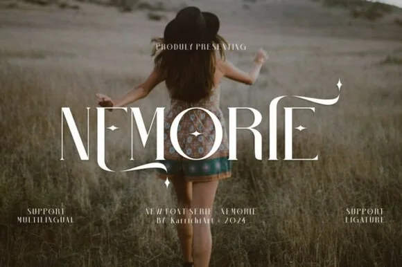
Celestial high-contrast art-nouveau & fantasy ligature serif
Nemorie is a refined high-contrast display serif featuring sweeping scythe-like swash bars, sculpted ligatures, and four-point star accents.
Ideas for this font
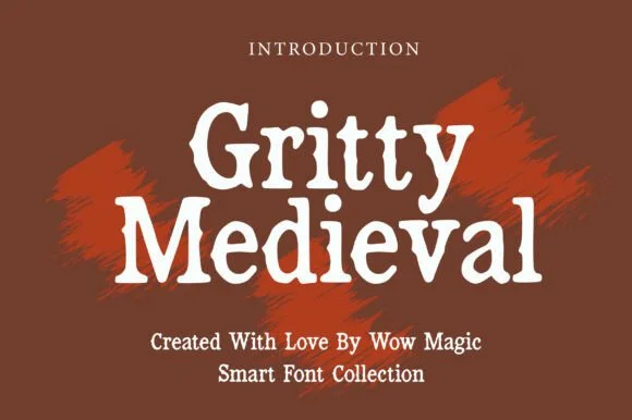
Rough stone-chipped medieval tavern & folklore serif
Gritty Medieval is a rugged, rough-edged medieval serif with hand-chipped contours that feel carved into tavern oak or iron.
Ideas for this font
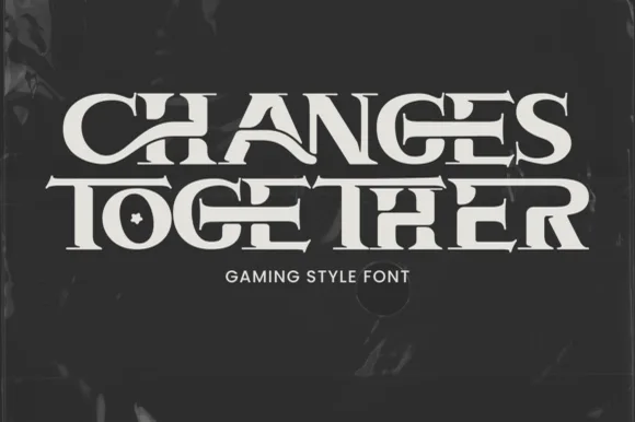
Interlocking ligature fantasy-RPG & gaming title serif
Changes Together is a bold, wide fantasy-gaming serif bridging extended horizontal crossbars ('H-A', 'T-O-G-E-T-H-E-R') and carving a star inside 'O'!
Ideas for this font
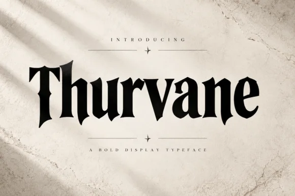
Heavy blade-spurred gothic wedge serif (OTF)
Thurvane is a bold hybrid gothic-wedge serif merging heavy Roman readability with sharp medieval diamond spurs and blade hooks (OTF).
Ideas for this font
Same independent foundry
Allow optional Google Analytics to measure visits and catalogue actions. Your search words and notes are not included. Privacy & storage