Modern Grotesque Body

Thurvane + Headline
Creates crisp high-hierarchy contrast beneath Thurvane headlines across menus, websites and labels.
Inspect Headline specimenDisclosure: MakerFileHub may earn a commission from qualifying purchases via paid links on this page. How our links work.
Heavy blade-spurred gothic wedge serif (OTF)
Thurvane is a bold hybrid gothic-wedge serif merging heavy Roman readability with sharp medieval diamond spurs and blade hooks (OTF).
Paid link
Get this fontProject & layout blueprintsAt-a-glance maker compatibility
Sturdy stroke walls and open counters weed cleanly on adhesive vinyl, HTV apparel film, and cut cardstock.
Visual anatomy & craft review
Thurvane is a heavy gothic-wedge serif that fuses Roman readability with medieval diamond spurs, blade hooks on the terminals and a dropped T spur. The stems are massive and the strokes nearly uniform, so the face reads as carved rather than calligraphic, and the wedge serifs give it a stonemason's geometry. It holds at 14 pt in print because the counters stay open, which is unusual for this weight, and it looks correct on labels, menus and covers where authority matters more than warmth. Small caps would be a natural companion but are not implied.
Chiseled-bold · Gothic-serif · Commanding
Two-font hierarchy recipes
Tested contrast partners — pairing Thurvane with grounded secondary typography.
Thurvane + Headline
Creates crisp high-hierarchy contrast beneath Thurvane headlines across menus, websites and labels.
Inspect Headline specimen
Thurvane + Honey and Lemon
Adds a warm human signature touch for 1-to-3-word callouts without competing against structured serif capitals.
Inspect Honey and Lemon specimenPractical applications
Concrete hierarchy, scale and production guidance tailored to Thurvane’s stroke geometry.
Carved wedge serifs read as a brand that has been around, which is what a craft distillery is selling against a shelf of modern labels. Massive stems hold at 10 pt on an abv line under a varnish.
Hierarchy & layout recipe
Label 80 x 110 mm, name 20 mm, abv 4.5 pt, 5 mm top arc. Menu 210 x 320 mm, section heads 14 pt, dishes 9/13 pt, 20 mm margins. Patch 70 x 40 mm, word 8 mm, 4 mm stitched border.
Pre-production check
A leather patch is embossed and a blade hook under 1 mm fills in the press. Request a 1:1 emboss proof, and if the hook closes, use the flat-sided alternate for the patch and keep the hook for print.
The wedge construction suits a period subject without ornament, so a thriller cover reads as serious rather than gothic. Open counters keep a 14 pt chapter line legible where a blackletter would fail.
Hierarchy & layout recipe
Hardcover 152 x 229 mm, title 38 pt, author 15 pt, 18 mm margins, spine 8.5 pt. Podcast cover 3000 x 3000 px, title 360 px, safe area 10 percent. Poster A2, title 200 mm, details 20/26 pt.
Pre-production check
Foil on a hardcover spine at 8.5 pt fills the wedge serifs into a solid block. Use blind emboss or a single-colour print for the spine, and check one bound proof rather than a flat sheet.
Heavy carved letters read as a sign cut into a board, which is what a steakhouse or butcher wants above a counter. Uniform strokes print cleanly on kraft where a high-contrast serif would break.
Hierarchy & layout recipe
Menu A4, headings 20 pt, cuts 9/13 pt, 15 mm margins. Label 80 x 100 mm, name 16 mm, abv 4.5 pt. Board header 1200 x 300 mm, word 150 mm, 80 mm margins.
Pre-production check
Kraft board absorbs ink unevenly and heavy stems look patchy under warm shop lighting. Print a test on the actual stock, and if the fill mottles, add a white underbase or move the header to a painted panel.
Technical & licence verification
Confirm included OTF/TTF/WOFF formats, full glyph tables and licence coverage on the live store page before batch production.
Closest visual alternatives
Matched across letterform anatomy, stroke behaviour and craft applications.
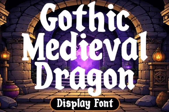
Chunky fantasy serif with rounded wedge serifs and heavy lowercase bowls
Gothic Medieval Dragon is a chunky fantasy serif in which the serifs wedge out round, the lowercase bowls stay heavy and the contrast stays low, so a game-night title reads as friendly storybook lettering rather than as black-metal type.
Ideas for this font
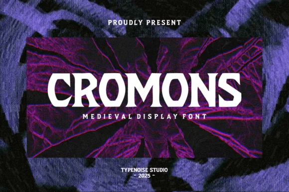
Heavy wide battle-ready medieval wedge serif
Cromons is a brawny, heavy-weight medieval wedge serif built to punch stark white fantasy, gaming, and esport headlines through dark backgrounds!
Ideas for this font
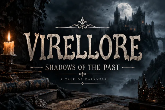
Rugged ornamental display serif
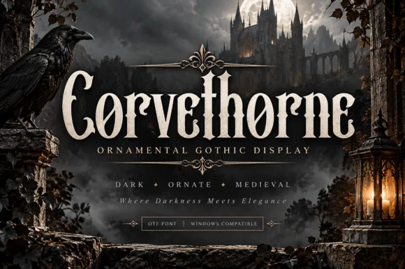
Virellore is an ornate display serif in weathered cream on a dark gothic scene: heavy bracketed serifs, split terminals, small thorns along the strokes, and rules with diamond finials between the lines, so the plate reads as a fantasy title card rather than as an editorial serif.
Ideas for this font
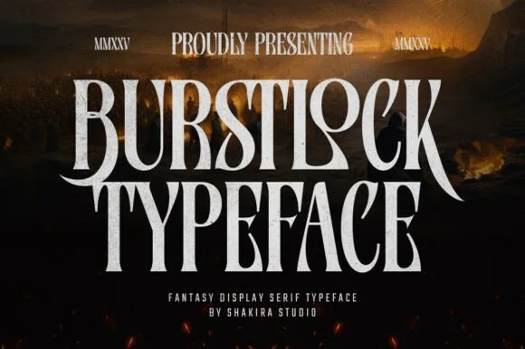
Tall condensed sword-winged dark-fantasy display serif
Burstlock is a dramatic, tall condensed fantasy serif whipping sweeping sword-blade legs off 'R' and 'K' for game titles and dark-fantasy covers!
Ideas for this font
Same independent foundry
Allow optional Google Analytics to measure visits and catalogue actions. Your search words and notes are not included. Privacy & storage