Neutral Sans Workhorse

Faerwyn + Olline
Lets Faerwyn own the focal silhouette while handling secondary copy, sizing and subheads cleanly.
Inspect Olline specimenDisclosure: MakerFileHub may earn a commission from qualifying purchases via paid links on this page. How our links work.
Elven-medieval dark-fantasy calligraphic blackletter
Faerwyn is a mystical dark-fantasy blackletter blending sharp medieval broad-nib calligraphy with sweeping elven ascender curls.
Paid link
Get this fontProject & layout blueprintsAt-a-glance maker compatibility
Sturdy stroke walls and open counters weed cleanly on adhesive vinyl, HTV apparel film, and cut cardstock.
Visual anatomy & craft review
Faerwyn is a dark-fantasy blackletter that mixes sharp medieval broad-nib calligraphy with elven ascender curls and tapered blade descenders, so a word reads as a name from a fantasy map rather than a gothic poster. The curls extend above the x-height and the blades taper below, which means the artwork box grows vertically, and the dense stems need size. It needs roughly 32 mm for the curls and blades to read, and it is best in tarnished gold on a dark ground or in one ink on parchment cream.
Dark-fantasy · Sword-tipped · Castle-lore
Two-font hierarchy recipes
Tested contrast partners — pairing Faerwyn with grounded secondary typography.
Faerwyn + Olline
Lets Faerwyn own the focal silhouette while handling secondary copy, sizing and subheads cleanly.
Inspect Olline specimen
Faerwyn + Medvilea Editorial
Grounds bold display lettering with classic typographic authority on posters, badges and apparel.
Inspect Medvilea Editorial specimenPractical applications
Concrete hierarchy, scale and production guidance tailored to Faerwyn’s stroke geometry.
Elven blackletter reads as an invented language title, which is what a fantasy series prints on a spine. The curls give the name its race and place without an illustration, and the dense stems hold at 56 pt on coated stock.
Hierarchy & layout recipe
Cover 152 x 229 mm, title 56 pt with 12 mm curl clearance, author 14 pt, 18 mm margins and 10 mm trim. Spread 420 x 297 mm, glossary 90 mm, body 10/15 pt. Map title 210 x 100 mm, word 40 mm, 15 mm margins.
Pre-production check
Curls rise above the cap line and get trimmed when the cover is fitted to a template. Declare the artwork box including the ascenders, and check one proof with trim marks before the run.
Bladed blackletter reads as a quest poster, which is what an immersive Halloween trail pins at the entrance. The tapered descenders give the sign a threat at 260 mm in one ink, and the gold on a dark ground suits a torch-lit path.
Hierarchy & layout recipe
Poster A2, word 260 mm with 15 mm curl clearance, times 22/28 pt, 30 mm margins and 20 mm trim. Card 105 x 148 mm, word 26 mm, details 8/11 pt. Label 90 x 140 mm, word 20 mm, 12 mm margins.
Pre-production check
A trail sign printed on plywood shows every flute and the fine blades read as poor registration. Print on a flat panel or vinyl, and check one mounted sign in torchlight before the trail opens.
Elven calligraphy reads as a fantasy studio's own mark, which is what a small game developer prints on a tin. The dense stems hold at 26 mm on a band, and the curls give a short studio name character without a crest.
Hierarchy & layout recipe
Tin 180 x 120 x 60 mm, name 26 mm with 8 mm curl clearance, 12 mm margins and 6 mm from the rolled seam. Key art 1200 x 800 mm, word 220 mm, 60 mm margins. Card 85 x 55 mm, name 9 mm, 5 mm margins.
Pre-production check
A rolled tin seam curves the front band and the curls bow with it, so the ends lift. Keep the name inside the flat 140 mm centre, and check one assembled tin before the print run.
Technical & licence verification
Confirm included OTF/TTF/WOFF formats, full glyph tables and licence coverage on the live store page before batch production.
Closest visual alternatives
Matched across letterform anatomy, stroke behaviour and craft applications.
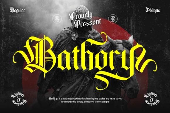
Ornate medieval blackletter family (Regular & Oblique)
Bathory is a lush, handmade medieval blackletter family (Regular & Oblique) featuring double-barred capitals and sweeping flame-curled descenders.
Ideas for this font
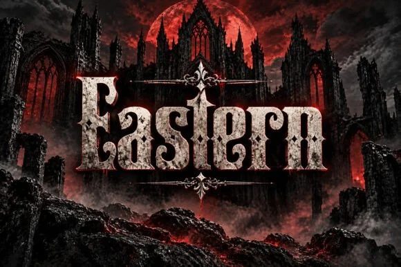
Weathered cathedral Fraktur blackletter display (OTF)
Eastern is a dramatic medieval Fraktur blackletter display font featuring bifurcated crown spurs and classic gothic lowercase (OTF).
Ideas for this font
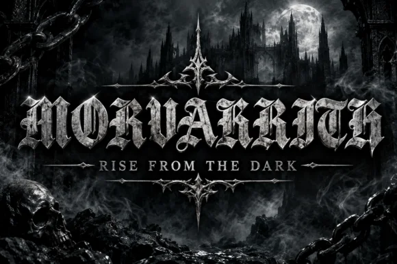
Blackletter with a metal bevel treatment
Morvakrith is a heavy blackletter shown with a metallic bevel: dense vertical strokes, sharp spurs and a narrow lowercase rhythm, rendered in polished silver over a moonlit castle scene with a skull, chains and a motto rule beneath.
Ideas for this font
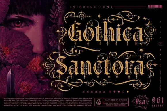
961-glyph cathedral-filigree & Victorian-scroll blackletter
Gothica Sanctora is an opulent 961-glyph gothic blackletter crowning Victorian-medieval letters with intricate filigree halos and scroll cages.
Ideas for this font
Same independent foundry
Allow optional Google Analytics to measure visits and catalogue actions. Your search words and notes are not included. Privacy & storage