Modern Grotesque Body

Gothic Medieval Dragon + Modern Limited
Creates crisp high-hierarchy contrast beneath Gothic Medieval Dragon headlines across menus, websites and labels.
Inspect Modern Limited specimenDisclosure: MakerFileHub may earn a commission from qualifying purchases via paid links on this page. How our links work.
Chunky fantasy serif with rounded wedge serifs and heavy lowercase bowls
Gothic Medieval Dragon is a chunky fantasy serif in which the serifs wedge out round, the lowercase bowls stay heavy and the contrast stays low, so a game-night title reads as friendly storybook lettering rather than as black-metal type.
Paid link
Get this fontProject & layout blueprintsAt-a-glance maker compatibility
Sturdy stroke walls and open counters weed cleanly on adhesive vinyl, HTV apparel film, and cut cardstock.
Visual anatomy & craft review
The G carries a rounded wedge foot, the o closes a fat bowl, the n turns two broad arches and the r keeps a short heavy arm, all at a display weight with soft serifs and barely any contrast between thick and thin. The low contrast is the character: it stays readable on a busy illustration, which is why the sample sets a two-word title over a scene. Because the strokes are fat, the face holds from 28 pt and cuts from three quarters of an inch of cap height without losing its wedges. The dragon, the parchment texture and the small caption are presentation; the heavy title words are the face.
Fantasy · Chunky · Friendly
Two-font hierarchy recipes
Tested contrast partners — pairing Gothic Medieval Dragon with grounded secondary typography.
Gothic Medieval Dragon + Modern Limited
Creates crisp high-hierarchy contrast beneath Gothic Medieval Dragon headlines across menus, websites and labels.
Inspect Modern Limited specimen
Gothic Medieval Dragon + Farmhouse
Adds a warm human signature touch for 1-to-3-word callouts without competing against structured serif capitals.
Inspect Farmhouse specimenPractical applications
Concrete hierarchy, scale and production guidance tailored to Gothic Medieval Dragon’s stroke geometry.
The chunky serif reads as storybook lettering, and the heavy bowls stay legible at 34 pt over an illustrated card in two inks.
Hierarchy & layout recipe
Print an A6 card: set the title at 34 pt across the upper third, keep 14 mm of clear ground beneath for the details, and keep the words off the busiest part of the illustration.
Pre-production check
A heavy low-contrast title printed over foliage loses its outline; check the card and keep the words on a plain or pale band.
The fantasy weight suits a game night, and the rounded wedges stay clear at 70 mm on a printed banner where a high-contrast serif would thin away at that size.
Hierarchy & layout recipe
Print an A3 banner: set the title at 70 mm on one row, keep 24 mm of border so the wedge serifs stay whole, and set the time in a 16 pt serif beneath.
Pre-production check
A banner hem eats the outer letters; check the finished piece and keep every serif 20 mm inside the eyelets.
The friendly weight suits a fiction section head, and the fat bowls keep a three-word title readable at 30 pt above the story text.
Hierarchy & layout recipe
Print a 130 mm column: set the section head at 30 pt, set the author line at 10 pt in a serif beneath, and keep 12 mm of clear ground between the head and the first paragraph.
Pre-production check
A chunky head set flush to a column looks heavier than the page can hold; check the spread and open the gap by 4 mm.
Technical & licence verification
Confirm included OTF/TTF/WOFF formats, full glyph tables and licence coverage on the live store page before batch production.
Closest visual alternatives
Matched across letterform anatomy, stroke behaviour and craft applications.
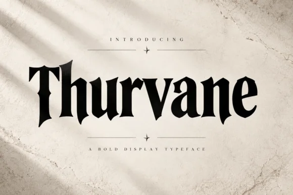
Heavy blade-spurred gothic wedge serif (OTF)
Thurvane is a bold hybrid gothic-wedge serif merging heavy Roman readability with sharp medieval diamond spurs and blade hooks (OTF).
Ideas for this font
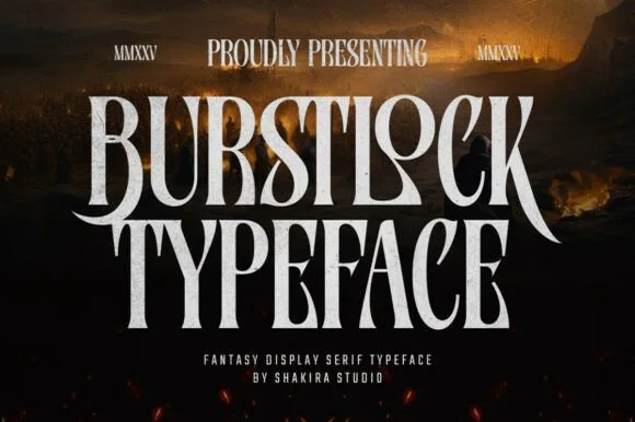
Tall condensed sword-winged dark-fantasy display serif
Burstlock is a dramatic, tall condensed fantasy serif whipping sweeping sword-blade legs off 'R' and 'K' for game titles and dark-fantasy covers!
Ideas for this font
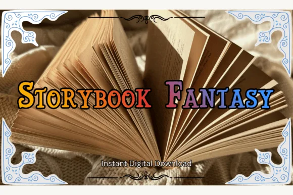
Swash-capped enchanted fairytale & medieval storybook serif
Storybook Fantasy is an ornate fairytale display serif featuring dramatic curled initial capitals alongside sturdy small-caps-style letters.
Ideas for this font
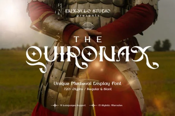
Swashed medieval & romantasy display serif (Regular & Slant)
The Quironax is a richly detailed medieval display serif equipped with 720+ glyphs, Regular and Slant cuts, and 15 stylistic alternate sets.
Ideas for this font
Same independent foundry
Allow optional Google Analytics to measure visits and catalogue actions. Your search words and notes are not included. Privacy & storage