Neutral Sans Workhorse

Aethrim + Nyxar
Lets Aethrim own the focal silhouette while handling secondary copy, sizing and subheads cleanly.
Inspect Nyxar specimenDisclosure: MakerFileHub may earn a commission from qualifying purchases via paid links on this page. How our links work.
Fantasy capitals with needle-like extensions
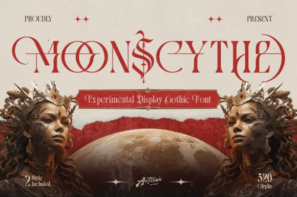
Aethrim has high-contrast upright capitals with fine pointed cross-strokes and sweeping crescent-like curves, and long horizontal extensions cut across the title near cap height while armoured figures and a dark castle frame the word.
Paid link
Get this fontProject & layout blueprintsAt-a-glance maker compatibility
Sturdy stroke walls and open counters weed cleanly on adhesive vinyl, HTV apparel film, and cut cardstock.
Visual anatomy & craft review
The uprights stay tall, the cross-strokes narrow to needles, the crescent curves sweep wide and the horizontal extensions run past the word. That overrun is the character: the title crosses its own line like a blade, which is why the sample frames it with armoured figures. The scene sets the cover mood rather than the package contents, so test the plain word on flat colour, allow 22 mm at each end for the extensions and keep 40 pt before the needles break up.
Fantasy capitals with needle-like extensions
Two-font hierarchy recipes
Tested contrast partners — pairing Aethrim with grounded secondary typography.
Aethrim + Nyxar
Lets Aethrim own the focal silhouette while handling secondary copy, sizing and subheads cleanly.
Inspect Nyxar specimen
Aethrim + Flowsky Editorial
Grounds bold display lettering with classic typographic authority on posters, badges and apparel.
Inspect Flowsky Editorial specimenPractical applications
Concrete hierarchy, scale and production guidance tailored to Aethrim’s stroke geometry.
The needle strokes set a dark poster, and the sweeping capitals hold a two-word title at 56 pt on an A2 sheet, where the extensions read as blades across the row.
Hierarchy & layout recipe
Print an A2 poster: set the title at 56 pt on one row, keep 24 mm of clear ground at each end for the extensions, keep 22 mm of margin, and keep the background dark and empty behind the letters.
Pre-production check
Needle-thin joins over a dark field vanish at distance; check the proof from two metres and thicken or drop the shadow.
The tall capitals carry a book title, and the crescent curves hold a three-word line at 48 pt on a jacket, where the extensions cross the subtitle space cleanly.
Hierarchy & layout recipe
Print a 135 by 216 mm jacket: set the title at 48 pt on one row, keep 26 mm of clear ground beneath before the author line at 12 pt, and keep the artwork behind the title above or below it, never through it.
Pre-production check
An extension crossing the author line looks like a printing fault; check the layout and move the line down.
The fantasy caps give a box presence, and the high contrast holds a short name at 30 pt on a 90 mm spine, where the needle points stay separated at shelf size.
Hierarchy & layout recipe
Print a 90 mm spine: set the name at 30 pt on one row, keep 14 mm of clear ground at each end for the extensions, and keep the rule beneath at 1 pt so it does not merge with the points.
Pre-production check
Spine printing at 30 pt can fill the needle joins; check the printer's proof and hold the name at 26 pt or above.
Technical & licence verification
Confirm included OTF/TTF/WOFF formats, full glyph tables and licence coverage on the live store page before batch production.
Closest visual alternatives
Matched across letterform anatomy, stroke behaviour and craft applications.
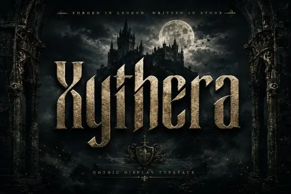
Textured gothic display
Xythera is a textured gothic display in gold on a dark scene: tall capitals with sharp spurs, a carved surface, and a stone-like speckle inside the strokes, framed by an arched stone border with a moonlit castle behind, so the plate reads as a fantasy title rather than a blackletter.
Ideas for this font
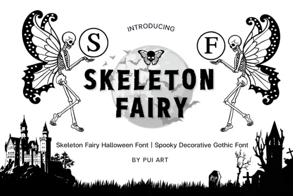
Skeleton-fairy monogram display
Skeleton Fairy is a display set on a white ground: two winged skeleton figures in black line, each raising a circled serif initial, framing a central word in heavy sans over a pale moon, with a graveyard silhouette along the foot and a plain credit line beneath.
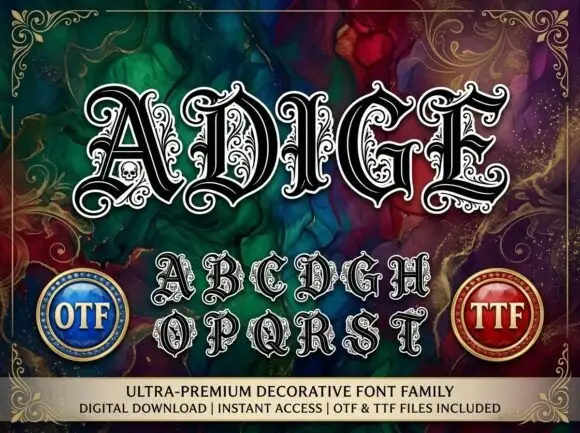
Heavy ornamental capitals with pale double contours, leaf curls and a small skull in A
Adige is an ornate decorative display face in which every letter carries a white inline, a black contour and a mass of curls inside the strokes, so a word looks like an engraved mirror.
Ideas for this font
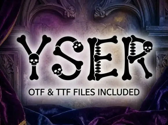
Bone-and-skull display
Yser is a display face on a gothic interior: capitals drawn as bone, with skull-shaped terminals at the ends of the strokes and short spine-like crosspieces, set as one word in black over a lit stone arch with velvet drapery at the sides and a plain format line beneath.
Same independent foundry
Allow optional Google Analytics to measure visits and catalogue actions. Your search words and notes are not included. Privacy & storage