Neutral Sans Workhorse

Jody + Olline
Lets Jody own the focal silhouette while handling secondary copy, sizing and subheads cleanly.
Inspect Olline specimenDisclosure: MakerFileHub may earn a commission from qualifying purchases via paid links on this page. How our links work.
Woodland fox-silhouette storybook caps
Jody embeds woodland fox silhouettes, bushy tails and foliate cutouts inside chunky capitals, so a short name reads as a forest storybook illustration while the bold outer silhouette keeps each letter recognisable.
Paid link
Get this fontProject & layout blueprintsAt-a-glance maker compatibility
Weld or Unite overlapping script joins into one continuous vector path before sending to the blade.
Visual anatomy & craft review
The outer shapes stay bold and simple, the interiors carry a fox with its tail, leaves and small cutouts, and the counters double as picture space. The interior cutout is the character: the letter is a frame for the animal, which is why the sample sets a short name for a nursery print. Because the cutouts are intricate, keep 30 mm of letter height before they survive, and check how the fox maps to each glyph instead of assuming every letter carries one. The busy interiors also mean the name should stay short.
Storybook · Fox motifs · Cutout
Two-font hierarchy recipes
Tested contrast partners — pairing Jody with grounded secondary typography.
Jody + Olline
Lets Jody own the focal silhouette while handling secondary copy, sizing and subheads cleanly.
Inspect Olline specimen
Jody + Gorga
Grounds bold display lettering with classic typographic authority on posters, badges and apparel.
Inspect Gorga specimenPractical applications
Concrete hierarchy, scale and production guidance tailored to Jody’s stroke geometry.
The fox cutouts suit a nursery print, and the chunky outer shapes keep a first name readable at 60 mm across a printed sheet. The short name also keeps each fox legible as a picture.
Hierarchy & layout recipe
Print a 300 by 400 mm sheet: set the name at 60 mm, keep every interior cutout at 3 mm minimum, and keep 30 mm of margin so the silhouettes sit clear of the frame. Keep the frame plain around the name.
Pre-production check
Cutouts under 2 mm fill in on a nursery print; check the film at full size and keep the letters at 50 mm or above.
The storybook caps suit a topic label, and the bold silhouettes stay clear at 20 pt on a 70 mm sticker. The bold silhouette also keeps a small label from turning to noise.
Hierarchy & layout recipe
Print a 70 by 30 mm label: set the topic word at 20 pt, keep the interior cutouts at 1 mm minimum, and set the class in a 7 pt sans beneath with 4 mm of clear ground. Keep the class line plain.
Pre-production check
Interior detail at 16 pt turns into a grey mass; check the proof and keep the word at 20 pt or above. Print one label before the batch.
The animal interiors make a themed card, and the chunky shapes hold two words at 34 pt on an A6 sheet in two inks. The cutouts also make the card readable from across a room.
Hierarchy & layout recipe
Print an A6 card: set the two words at 34 pt, keep 14 mm between them so the silhouettes stay separate, and set the details at 9 pt in a clean sans in the lower third. Keep the panel plain behind the two words.
Pre-production check
Two adjacent letters with cutouts merge visually; check the card and open the word spacing to 16 mm. Keep the two words on one row.
Technical & licence verification
Confirm included OTF/TTF/WOFF formats, full glyph tables and licence coverage on the live store page before batch production.
Closest visual alternatives
Matched across letterform anatomy, stroke behaviour and craft applications.
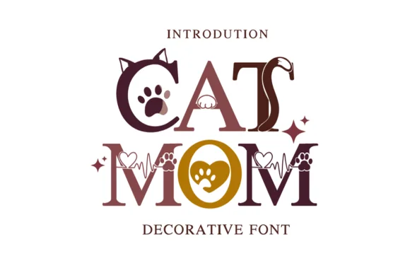
Cat-eared, paw-printed & heartbeat-lined pet-lover serif
Cat Mom is a charming pet-lover decorative serif embellished with pointy cat ears, curled tails, paw prints, and heart-shaped EKG lines.
Ideas for this font
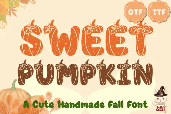
Pumpkin-segmented seasonal display
Sweet Pumpkin is a seasonal display in orange and brown on a cream ground: fat rounded capitals divided into pumpkin segments with a leaf and a stem at the top of each letter, filled with a speckled texture, set in two lines with two format badges at the shoulder and a plain caption along the foot.
Ideas for this font
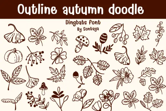
Autumn outline doodles
Outline Autumn Doodle is a dingbat sheet on a cream ground: brown outlines of fan leaves, ivy, small mushrooms, acorns, berry branches, pumpkins and open blossoms, arranged in rows beneath a solid title band with a lined note and a credit.
Ideas for this font
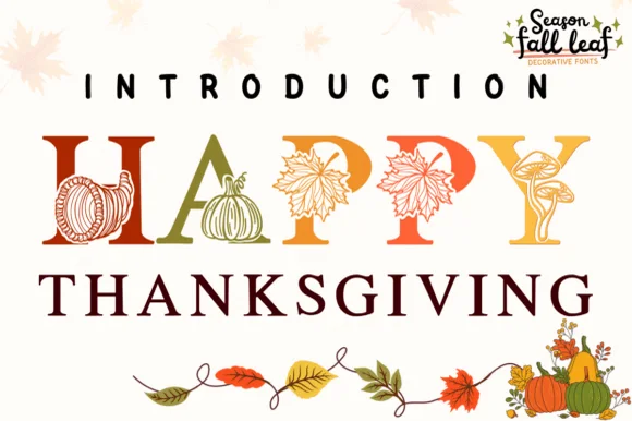
Botanical harvest serif illustrated with pumpkins, cornucopias & leaves
Happy Thanksgiving (by PraewDesigns / Season Fall Leaf) is an illustrated harvest display serif (NOT a script) wrapping pumpkins, maple leaves, mushrooms, and cornucopias around Roman capitals!
Ideas for this font
Same independent foundry
Allow optional Google Analytics to measure visits and catalogue actions. Your search words and notes are not included. Privacy & storage