Neutral Sans Workhorse

Groovy Autumn + One More
Lets Groovy Autumn own the focal silhouette while handling secondary copy, sizing and subheads cleanly.
Inspect One More specimenDisclosure: MakerFileHub may earn a commission from qualifying purchases via paid links on this page. How our links work.
Maple-leaf cutout 70s autumn display
Groovy Autumn blends plump 1970s retro letterforms with crisp maple-leaf cutouts set into the counters, so a fall banner reads as seasonal without a separate illustration beside it.
Paid link
Get this fontProject & layout blueprintsAt-a-glance maker compatibility
Sturdy stroke walls and open counters weed cleanly on adhesive vinyl, HTV apparel film, and cut cardstock.
Visual anatomy & craft review
The bodies stay plump and round, the leaf shapes cut cleanly through the middle of the letters and the curves carry the bell-bottom weight of the period. The inlaid leaf is the character: the season lives inside the letterform rather than behind it, which is why the sample needs no other artwork. Cutouts this fine need room, so check every leaf at the intended size and keep 34 pt before the vein details close up. The leaf veins are finer than the outline, so they close first: below about 34 pt the leaf reads as a plain blob, and on vinyl the inlay needs a 3 mm bridge to survive weeding.
Seasonal · Leaf-inlaid · Groovy
Two-font hierarchy recipes
Tested contrast partners — pairing Groovy Autumn with grounded secondary typography.
Groovy Autumn + One More
Lets Groovy Autumn own the focal silhouette while handling secondary copy, sizing and subheads cleanly.
Inspect One More specimen
Groovy Autumn + Marquis - Elegant Modern Serif
Grounds bold display lettering with classic typographic authority on posters, badges and apparel.
Inspect Marquis - Elegant Modern Serif specimenPractical applications
Concrete hierarchy, scale and production guidance tailored to Groovy Autumn’s stroke geometry.
The leaf cutouts make a market banner instantly seasonal, and the plump letters read at 60 pt across a printed board, where every leaf counter keeps its shape at distance.
Hierarchy & layout recipe
Print a 600 by 300 mm banner: set the market name at 60 pt on one row, keep 26 mm of clear ground beneath, and keep 22 mm of border so no leaf cutout touches the edge.
Pre-production check
Leaf counters printed at 30 pt close into blobs; check the proof and keep the name at 48 pt or above.
The leaf lettering suits a harvest card, and the round bodies hold a short greeting at 30 pt on an A6 sheet, so the season arrives without a separate illustration.
Hierarchy & layout recipe
Print an A6 card: set the greeting at 30 pt across the upper half, keep 16 mm of clear ground beneath before the date at 11 pt, and keep the leaves on a plain field.
Pre-production check
Leaves set over a photographed background disappear; check the card and keep the lettering on flat colour.
The seasonal lettering suits a school poster, and the heavy forms hold a two-word title at 46 pt on an A3 sheet, where the leaf shapes stay crisp from across a hall.
Hierarchy & layout recipe
Print an A3 poster: set the title at 46 pt on one row, keep 22 mm beneath before the details at 14 pt, and keep 20 mm of margin so the outer curves stay intact.
Pre-production check
Two leaf-filled rows stacked compete for attention; check the poster and keep the second line in a plain sans.
Technical & licence verification
Confirm included OTF/TTF/WOFF formats, full glyph tables and licence coverage on the live store page before batch production.
Closest visual alternatives
Matched across letterform anatomy, stroke behaviour and craft applications.
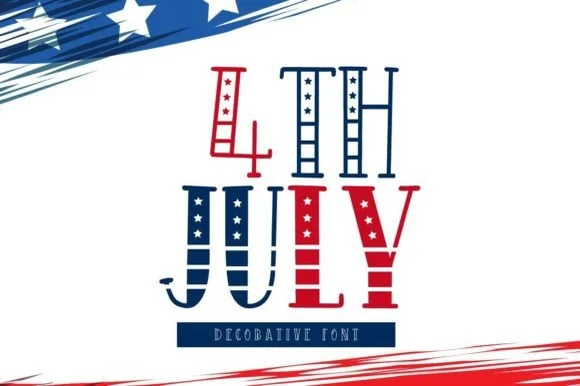
Tall hand-drawn Americana stars-and-stripes display
4th July is a tall, whimsical folk-art patriotic display font pairing star-filled vertical stems with striped crossbar ribs.
Ideas for this font
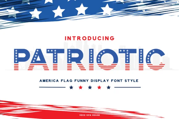
Flag-pattern display with star field
Patriotic is a display in which the letters are built from the American flag: the upper half of every capital is a blue field of white stars and the lower half is red and white stripes, set in a heavy wide skeleton over a pale cityscape.
Ideas for this font
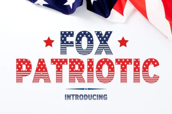
Bold stars-and-stripes American flag block alphabet
Fox Patriotic is a bold stars-and-stripes display font patterning stout block capitals with horizontal flag stripes and five-point star fields.
Ideas for this font
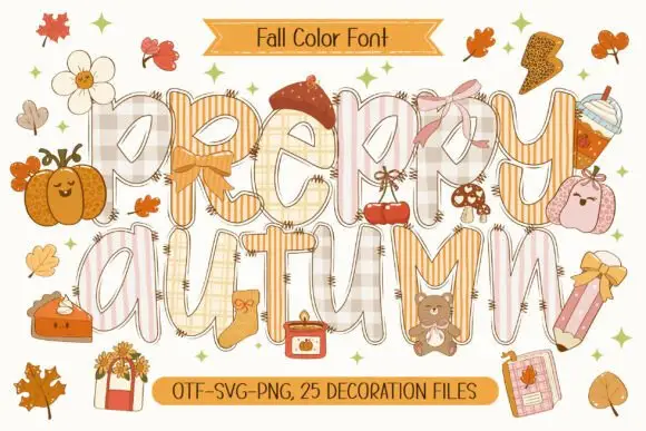
Patchwork colour display
Preppy Autumn is a tall patchwork display on a cream sheet: letters filled with checks, stripes and plaid in soft peach and cream tones, outlined in white with a warm shadow, surrounded by autumn accessories, with two ribbons that name the format list and the count of decoration files.
Same independent foundry
Allow optional Google Analytics to measure visits and catalogue actions. Your search words and notes are not included. Privacy & storage