Neutral Sans Workhorse

Cozy and Fall Doodle + Noar
Lets Cozy and Fall Doodle own the focal silhouette while handling secondary copy, sizing and subheads cleanly.
Inspect Noar specimenDisclosure: MakerFileHub may earn a commission from qualifying purchases via paid links on this page. How our links work.
Tall rustic autumn capitals with scratched faces and loose doubled contours
Cozy and Fall Doodle fills fat block letters with autumn textures, from leopard spots to plaid and deep green, and drapes seasonal doodles over the alphabet: a mug, a pie, apples, books and a scarf.
Paid link
Get this fontProject & layout blueprintsAt-a-glance maker compatibility
Fine grain and micro-texture excel in 300 DPI print, sublimation, and screen print rather than small vinyl weeding.
Visual anatomy & craft review
The cover shows the full alphabet across two rows plus a row of digits, each letter a different colour and fill, some spotted, some striped, some plain, with hand-drawn objects leaning against the strokes. Fills are printed textures rather than vector patterns, so the interiors read as fabric swatches. The decoration is what sells the set: six colourways and a large doodle library ship with the letters, and the pieces are meant to be combined. Because it is a colour font with heavy interiors, a word holds as a shape at poster size and shows the textures only when it is printed large.
Tall rustic autumn capitals with scratched faces and loose doubled contours
Two-font hierarchy recipes
Tested contrast partners — pairing Cozy and Fall Doodle with grounded secondary typography.
Cozy and Fall Doodle + Noar
Lets Cozy and Fall Doodle own the focal silhouette while handling secondary copy, sizing and subheads cleanly.
Inspect Noar specimen
Cozy and Fall Doodle + Augler
Grounds bold display lettering with classic typographic authority on posters, badges and apparel.
Inspect Augler specimenPractical applications
Concrete hierarchy, scale and production guidance tailored to Cozy and Fall Doodle’s stroke geometry.
The textures and the seasonal props say autumn without a photograph of leaves, and the fat letters read from a car pulling into the lot.
Hierarchy & layout recipe
Print a 900 by 400 mm board: set the stand name at 90 mm across two rows, keep 30 mm of clear ground beneath before the opening hours at 16 mm, and keep 34 mm of border so no prop is cut.
Pre-production check
Printed textures need resolution; check the file size before the board is produced. Have the printer send a physical sample first.
The hand-drawn mug and pie suit a table setting, and the block letters stay warm at place-card size where a script would be too formal.
Hierarchy & layout recipe
Print a 90 by 50 mm place card: set the greeting at 20 pt on one row, keep 6 mm of clear ground beneath before the name at 8 pt, and keep 5 mm of margin so the doodles stay inside the card.
Pre-production check
Small textures smear on cheap card; check a printed sample before the batch. Request a proof on the actual stock before signing off.
The letters carry a seasonal theme into a classroom, and the doodle library lets a teacher add one prop without designing anything.
Hierarchy & layout recipe
Print an A4 cover: set the subject at 36 pt across two rows, keep 16 mm of clear ground beneath before the pupil name at 12 pt, and keep 18 mm of margin from the trim on all sides.
Pre-production check
Heavy fills use a lot of ink; check a copy on the school printer before a class set. Order one sample before committing to the run.
Technical & licence verification
Confirm included OTF/TTF/WOFF formats, full glyph tables and licence coverage on the live store page before batch production.
Closest visual alternatives
Matched across letterform anatomy, stroke behaviour and craft applications.
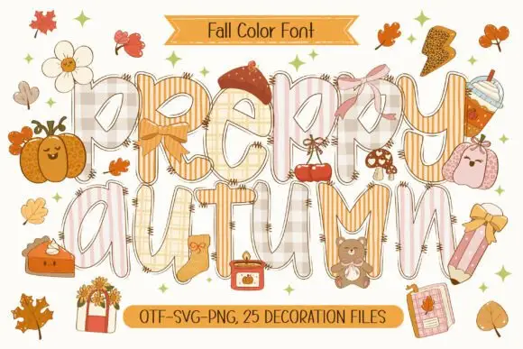
Patchwork colour display
Preppy Autumn is a tall patchwork display on a cream sheet: letters filled with checks, stripes and plaid in soft peach and cream tones, outlined in white with a warm shadow, surrounded by autumn accessories, with two ribbons that name the format list and the count of decoration files.
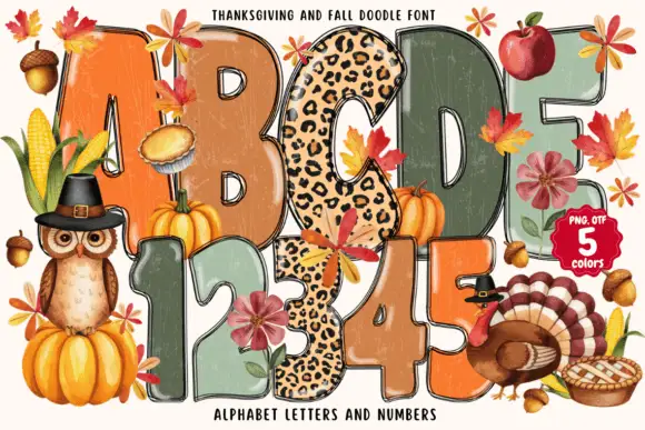
Tall rounded autumn blocks mixing weathered warm fills and spotted patterns
Thanksgiving and Fall Doodle draws fat autumn letters in five colours, fills them with knitted, plaid and leopard textures, and hangs leaves, pumpkins and a turkey around the shapes.
Ideas for this font
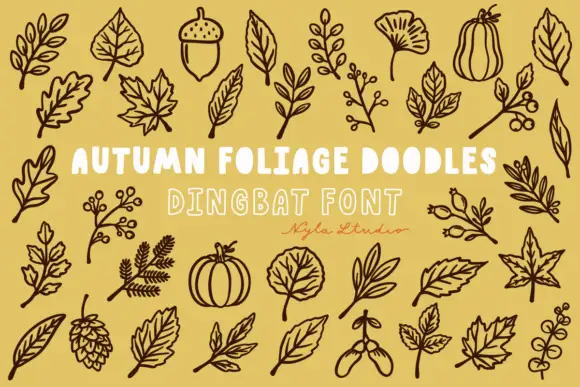
Brown autumn foliage outlines with veined leaves, acorns and a pinecone
Autumn Foliage Doodles is a typable set of botanical outlines — oak and maple leaves, a ginkgo, a sycamore, acorns, seed pods, berries, hops, a pumpkin and a squash — drawn as even outlines.
Ideas for this font
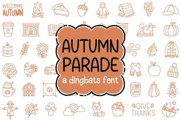
Thin autumn dingbat drawings of seasonal objects and short decorative phrases
Autumn Parade is a dingbat set of autumn objects — a campfire, a pumpkin, an acorn, a knitted scarf, a coffee cup, a jam jar, a scarecrow, a fox, a mushroom — drawn in a single rust-brown line.
Ideas for this font
Same independent foundry
Allow optional Google Analytics to measure visits and catalogue actions. Your search words and notes are not included. Privacy & storage