Editorial Serif Anchor

Autumn in Thanksgiving + Worldstar
Anchors Autumn in Thanksgiving's fluid strokes with crisp Roman proportions on wedding suites, headers and packaging.
Inspect Worldstar specimenDisclosure: MakerFileHub may earn a commission from qualifying purchases via paid links on this page. How our links work.
Warm thick marker print with upright letters and even stroke weight
Autumn in Thanksgiving is a warm thick marker print in which the letters stand upright, the stroke stays heavy and even and the counters remain open, so a word reads as something written large with a marker on a card.
Paid link
Get this fontProject & layout blueprintsAt-a-glance maker compatibility
Weld or Unite overlapping script joins into one continuous vector path before sending to the blade.
Visual anatomy & craft review
The capital A carries a low bar and splayed stems, the u holds a deep bowl, the t crosses with a fat bar, the m keeps three even arches and the n a full shoulder, all at a heavy even weight with rounded ends and a slight forward lean. Nothing connects, so the face behaves like a print rather than a script, and the open counters keep it legible at 18 pt on a label as well as at 60 mm on a sign. The round dot on the i and the simple forms are what make it read as marker rather than as a bold sans. The autumn leaves, the pumpkin, the turkey illustration, the orange ink are presentation; the lettering is the two words plus the small caption.
Marker · Upright · Warm
Two-font hierarchy recipes
Tested contrast partners — pairing Autumn in Thanksgiving with grounded secondary typography.
Autumn in Thanksgiving + Worldstar
Anchors Autumn in Thanksgiving's fluid strokes with crisp Roman proportions on wedding suites, headers and packaging.
Inspect Worldstar specimen
Autumn in Thanksgiving + Mango Dream
Keeps small-scale dates, URLs, nutrition facts and care instructions crisp and legible below script titles.
Inspect Mango Dream specimenPractical applications
Concrete hierarchy, scale and production guidance tailored to Autumn in Thanksgiving’s stroke geometry.
The marker weight reads at 10 cm on a board and looks written rather than printed, which is what a seasonal stand wants above its produce.
Hierarchy & layout recipe
Print a 700 by 400 mm board: set the stand name at 10 cm across the upper half, set the produce list in a 4 cm marker beneath, and leave 8 cm of border so the rounded ends stay clear of the frame.
Pre-production check
An even marker weight printed at 10 cm can look like a bold sans; check the board at distance and keep the slight lean so it still reads as written.
The warm weight carries a short thank-you at 20 pt, and the open counters keep the message legible on a small folded card.
Hierarchy & layout recipe
Print a 148 by 105 mm folded card: set the greeting at 20 pt across the upper third, set the message in an 11 pt serif at 15 pt leading, and keep 12 mm between the greeting and the first line of the message.
Pre-production check
A heavy greeting can overpower a printed message; check the card at final size and keep the greeting to three words.
The marker lettering reads at 12 pt on a small label and gives a home-made preserve a written rather than manufactured character.
Hierarchy & layout recipe
Print a 50 by 65 mm label: set the preserve at 12 pt, set the date in a 5 pt caps sans beneath, and keep 4 mm of margin so the thick strokes are not cut by the rounded corner of the die.
Pre-production check
A thick stroke under 1.2 mm at 12 pt fills on kraft; check a printed label on the actual stock and keep the face above 11 pt.
Technical & licence verification
Confirm included OTF/TTF/WOFF formats, full glyph tables and licence coverage on the live store page before batch production.
Closest visual alternatives
Matched across letterform anatomy, stroke behaviour and craft applications.
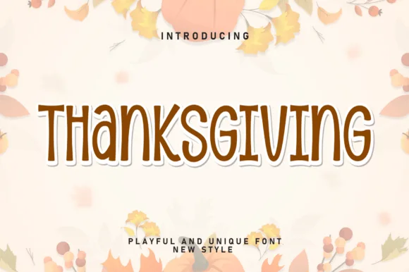
Tall slender organic autumn capitals
Thanksgiving is a tall slender capital set in cocoa brown: narrow organic letters with soft uneven edges, a small x-height, and a cream keyline that lifts the word off a pale ground of leaves.
Ideas for this font
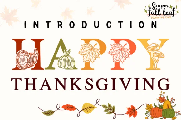
Botanical harvest serif illustrated with pumpkins, cornucopias & leaves
Happy Thanksgiving (by PraewDesigns / Season Fall Leaf) is an illustrated harvest display serif (NOT a script) wrapping pumpkins, maple leaves, mushrooms, and cornucopias around Roman capitals!
Ideas for this font
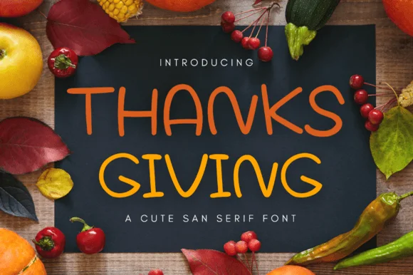
Rounded marker sans with an informal stem
Thanksgiving is a rounded marker sans in warm orange on a dark panel: capital letters with soft terminals, a slightly informal stem and a hand-drawn feel, framed by autumn produce on a wooden table.
Ideas for this font
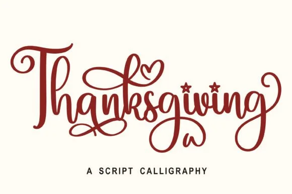
Calligraphic brush script
Thanksgiving is a calligraphic script in dark red on white: a heavy brush stroke with thick-to-thin modulation, tall looping ascenders, generous flourishes on the first and last letters, and heart-shaped details inside two bowls, so the word reads as a hand-lettered greeting.
Ideas for this font
Same independent foundry
Allow optional Google Analytics to measure visits and catalogue actions. Your search words and notes are not included. Privacy & storage