Editorial Serif Anchor

Autumn Moment + Augler
Anchors Autumn Moment's fluid strokes with crisp Roman proportions on wedding suites, headers and packaging.
Inspect Augler specimenDisclosure: MakerFileHub may earn a commission from qualifying purchases via paid links on this page. How our links work.
Broad connected script with tall initial letters and a heavy even stroke
Autumn Moment is a broad connected script in which the capitals rise well above the x-height, the stroke stays heavy and the joins cross at a consistent low point.
Paid link
Get this fontProject & layout blueprintsAt-a-glance maker compatibility
Weld or Unite overlapping script joins into one continuous vector path before sending to the blade.
Visual anatomy & craft review
The capital A opens as a tall looped form that climbs above the cap line before the word settles, and the capital M of the second word repeats that height. Between them the lowercase stays small and round: the u and the t close tight bowls, the m holds three even arches, the e loops back and the n keeps a wide shoulder. Weight is heavy and constant, joins carry the same weight as the stems and the terminals are rounded, so the phrase reads as a printed sign rather than a fine calligraphy. The ends finish in long flat tails on both sides, which lets a two-word phrase fill a wide panel. The pink stripes, the drawn flowers and the small banner caption are presentation; the script is the two words.
Broad · Connected · Heighted
Two-font hierarchy recipes
Tested contrast partners — pairing Autumn Moment with grounded secondary typography.
Autumn Moment + Augler
Anchors Autumn Moment's fluid strokes with crisp Roman proportions on wedding suites, headers and packaging.
Inspect Augler specimen
Autumn Moment + Clyne Sans
Keeps small-scale dates, URLs, nutrition facts and care instructions crisp and legible below script titles.
Inspect Clyne Sans specimenPractical applications
Concrete hierarchy, scale and production guidance tailored to Autumn Moment’s stroke geometry.
The broad weight reads from a road and the tall initials give a sign a clear first letter, which is what a seasonal stand needs to be found.
Hierarchy & layout recipe
Set the greeting at 22 cm on a 1.8 m board, set the produce line in a plain sans at 6 cm, and leave 15 cm of margin so the flat tails finish on the board.
Pre-production check
Painted flat tails drift at the end of a long word; mask the tail with tape and check the taper before the board is sealed.
The heavy connected script fills a landscape card with two words, and the tall initial gives the greeting a clear entry point at 30 pt.
Hierarchy & layout recipe
Set the greeting at 30 pt on a 148 by 105 mm card, set the sender in a 7 pt sans at the foot, and leave 18 mm at each end so the tails stay inside the trim.
Pre-production check
A heavy script at 30 pt closes its counters on textured card; print one card on the actual stock and open the o and e if they fill.
The weight holds up on a curved jar label where a fine script would disappear behind the contents, and the tall initials keep the name recognisable at 13 pt.
Hierarchy & layout recipe
Set the product at 13 pt on a 50 mm square jar label, keep the weight and date in a 6 pt sans, and leave 5 mm of margin so the tails stay inside the label edge.
Pre-production check
Labels on filled jars lift at the edge; check one applied label after a week and move the type away from the lid side.
Technical & licence verification
Confirm included OTF/TTF/WOFF formats, full glyph tables and licence coverage on the live store page before batch production.
Closest visual alternatives
Matched across letterform anatomy, stroke behaviour and craft applications.
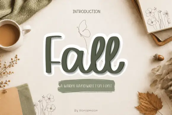
Rounded looping handwriting with soft joins and a light outline treatment
Fall is rounded looping handwriting in which the letters join through soft curves, the stroke stays an even medium weight and the word sits inside a light outline that separates it from a busy background.
Ideas for this font
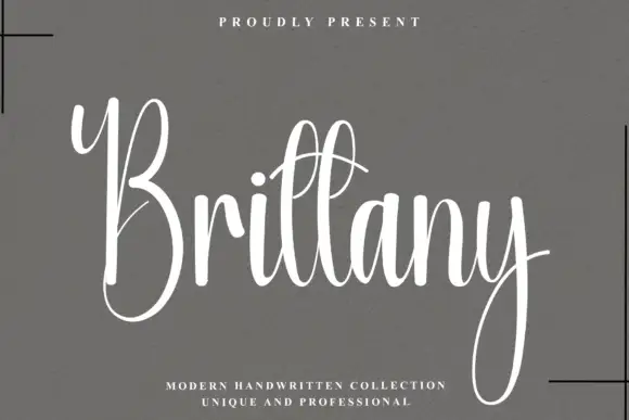
Narrow tall looping calligraphy with a light stroke and a long entry curve
Brittany is narrow tall calligraphy in which the ascenders loop high, the bodies stay slim and the entry stroke curves in from well below the baseline.
Ideas for this font
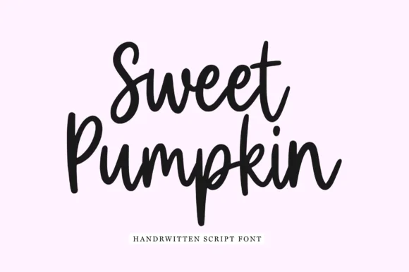
Chunky upright brush-pen script with a heavy even stroke and open counters
Sweet Pumpkin is a chunky upright brush-pen script in which the letters stay vertical, the stroke is heavy and even, and the counters remain open enough to read at small sizes.
Ideas for this font
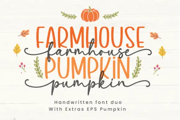
Farmhouse duo pairing irregular marker caps with a wavy script
Farmhouse Pumpkin is a two-cut family in which tall irregular marker capitals sit above a wavy script line, so a two-line design reads as a hand-painted autumn sign rather than as typeset text.
Ideas for this font
Same independent foundry
Allow optional Google Analytics to measure visits and catalogue actions. Your search words and notes are not included. Privacy & storage