Editorial Serif Anchor

Thanksgiving + The Simple Editorial
Anchors Thanksgiving's fluid strokes with crisp Roman proportions on wedding suites, headers and packaging.
Inspect The Simple Editorial specimenDisclosure: MakerFileHub may earn a commission from qualifying purchases via paid links on this page. How our links work.
Bold gothic-calligraphy brush script with diamond i-dots
Thanksgiving (by Inermedia Studio) is a heavy, structured brush-calligraphy script featuring diamond-shaped i-dots and chiseled broad-nib strokes.
Paid link
Get this fontProject & layout blueprintsAt-a-glance maker compatibility
Weld or Unite overlapping script joins into one continuous vector path before sending to the blade.
Visual anatomy & craft review
Thanksgiving is a bold gothic-calligraphy brush script with diamond i-dots: a wet loaded stroke, connected letters, a steep slant and small diamond-shaped dots that sit above the x-height. The brush edge gives the face its texture and the diamonds are the finest element, so they vanish first at small sizes. It needs roughly 26 mm for the brush edge and the diamond dot to read, and it is best in one deep ink on cream and kraft, or a single dark red on a buff sheet where the diamonds stay sharp.
Bold · Calligraphic · Crisp
Two-font hierarchy recipes
Tested contrast partners — pairing Thanksgiving with grounded secondary typography.
Thanksgiving + The Simple Editorial
Anchors Thanksgiving's fluid strokes with crisp Roman proportions on wedding suites, headers and packaging.
Inspect The Simple Editorial specimen
Thanksgiving + Godthem
Keeps small-scale dates, URLs, nutrition facts and care instructions crisp and legible below script titles.
Inspect Godthem specimenPractical applications
Concrete hierarchy, scale and production guidance tailored to Thanksgiving’s stroke geometry.
A bold gothic brush script reads as a hand-lettered invitation rather than a typeset one, which is what a Thanksgiving table wants. The diamond dots give the greeting its period detail at 26 mm, and one deep ink on cream prints the invite, the menu and the cards as one suite.
Hierarchy & layout recipe
Invite 130 x 180 mm, word 26 mm with 8 mm dot clearance, details 9/13 pt, 15 mm margins. Menu 120 x 210 mm, header 18 mm, courses 9/12 pt. Place card 90 x 50 mm, name 11 pt, 4 mm margins.
Pre-production check
At 11 pt on a place card the diamond dot becomes a speck and the brush edge fills, so the name reads as a plain bar. Set place cards at 15 pt, and proof one card before the set.
A heavy brush script gives a Christmas card a hand-painted look without an illustration. The loaded stroke holds at 22 mm on a card, and one deep ink prints the card, the tags and the menu on the same cream stock.
Hierarchy & layout recipe
Card 105 x 148 mm, greeting 22 mm with 8 mm dot clearance, message 8/11 pt, 12 mm margins. Tag 50 x 90 mm, word 12 mm with a 5 mm hole and 8 mm clear. Menu 105 x 250 mm, header 18 mm, courses 9/12 pt.
Pre-production check
A 50 x 90 mm tag at 12 mm closes the brush edge into a solid stroke and the greeting reads as a smear. Raise the tag word to 16 mm, and print one tag on the actual card stock.
A brush script gives a small roastery the look of a hand-painted bag rather than a printed label. The wet edge holds at 24 mm on a kraft bag, and one ink prints the bag, the cup and the card from a single separation.
Hierarchy & layout recipe
Bag stamp 90 x 50 mm, word 22 mm with 6 mm dot clearance, 6 mm margins. Cup print 70 x 50 mm, word 14 mm, 5 mm margins. Card 85 x 55 mm, word 14 mm, 5 mm margins.
Pre-production check
On unbleached kraft the brush edge wicks into the fibres and the diamond dots close at 14 mm on the cup. Raise the cup word to 20 mm, and check one printed cup and one bag on the production stock.
Technical & licence verification
Confirm included OTF/TTF/WOFF formats, full glyph tables and licence coverage on the live store page before batch production.
Closest visual alternatives
Matched across letterform anatomy, stroke behaviour and craft applications.
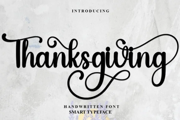
Calligraphic script with elaborate swashes
Thanksgiving is a calligraphic script in black on a textured sheet: thick-thin strokes, a swash that runs back over the word from the second letter, elaborate loops below the baseline and a long tail, with a tracked caption beneath.
Ideas for this font
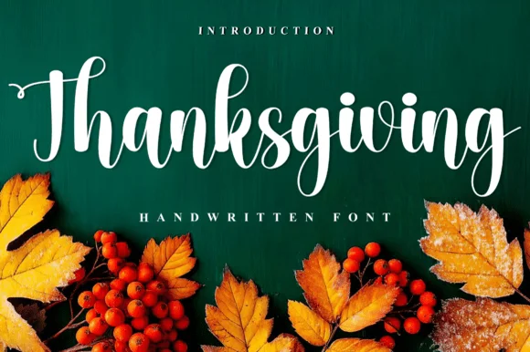
Handwritten calligraphic script with long descender
Thanksgiving is a handwritten calligraphic script in white on deep green: thick-thin strokes, tall looping ascenders, a wide entry on the T and a descender on the g that curls far below the word, with autumn leaves and berries along the foot.
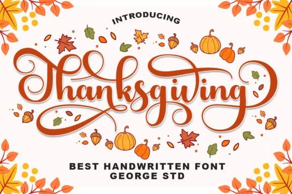
Warm bouncy brush calligraphy with spiraled terminal curls
Thanksgiving (by George Studio) is a medium-bold, bouncy brush calligraphy script accented by spiraled terminal curls and sweeping crossbar loops.
Ideas for this font

Bold retro-romance brush script with curled swashes
Vintage Melinda is a creamy, thick-stroke retro brush script with dramatic curled swash capitals and sweeping baseline loops.
Ideas for this font
Same independent foundry
Allow optional Google Analytics to measure visits and catalogue actions. Your search words and notes are not included. Privacy & storage