Neutral Sans Workhorse

Real Wavy Stacked + Monure
Lets Real Wavy Stacked own the focal silhouette while handling secondary copy, sizing and subheads cleanly.
Inspect Monure specimenDisclosure: MakerFileHub may earn a commission from qualifying purchases via paid links on this page. How our links work.
Wavy rounded stacked capitals
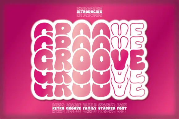
Real Wavy Stacked repeats a rounded uppercase word through six tightly stacked rows, where the letters rise and fall on undulating baselines, each row takes a different warm tone from brown through orange to pink, and the repeated S and D forms build a rippling outer edge.
Paid link
Get this fontProject & layout blueprintsAt-a-glance maker compatibility
Sturdy stroke walls and open counters weed cleanly on adhesive vinyl, HTV apparel film, and cut cardstock.
Visual anatomy & craft review
The bodies stay rounded and heavy, the baselines wave, the rows stack close and the colours shift down the column. That repetition is the character: the block works as a shape first and a word second, which is why the sample repeats one word instead of writing a phrase. Four star marks sit beside the outer edges. Keep 44 pt so the letters stay distinct, leave 6 mm between baselines for the wave and check the outer edge of the last letter, since the ripple is what will be trimmed first.
Wavy rounded stacked capitals
Two-font hierarchy recipes
Tested contrast partners — pairing Real Wavy Stacked with grounded secondary typography.
Real Wavy Stacked + Monure
Lets Real Wavy Stacked own the focal silhouette while handling secondary copy, sizing and subheads cleanly.
Inspect Monure specimen
Real Wavy Stacked + Evoire
Grounds bold display lettering with classic typographic authority on posters, badges and apparel.
Inspect Evoire specimenPractical applications
Concrete hierarchy, scale and production guidance tailored to Real Wavy Stacked’s stroke geometry.
The stacked block fills a wall and the colour fade carries the party palette, so one word does the work of a printed backdrop.
Hierarchy & layout recipe
Print a 1200 by 800 mm backdrop: set the repeated word at 90 mm over five rows with 18 mm between baselines, keep 60 mm of clear ground beneath before the date at 30 pt, and keep 50 mm of border all round.
Pre-production check
The wave pushes letters past the trim; check the artwork and inset the block 40 mm before producing.
The repeated word works as a window mark, where the ripple reads from the pavement and the stacked rows fill a tall pane.
Hierarchy & layout recipe
Cut a 500 by 900 mm window vinyl: set the word at 70 mm over four rows with 14 mm between baselines, keep 40 mm of clear ground at the base, and keep 30 mm of border so the edges stay intact.
Pre-production check
Vinyl needs joined shapes; check the cut file, add 2 mm bridges where letters float and proof one pane first.
The rounded stack suits a seaside menu board and the repeated word makes a short name read as a pattern rather than a label.
Hierarchy & layout recipe
Paint a 600 by 800 mm board: set the word at 60 mm over three rows with 16 mm between baselines, keep 40 mm of clear ground beneath before the hours at 18 pt, and keep 35 mm of border.
Pre-production check
Freehand repetition drifts off the wave; check the mask artwork before the board is painted.
Technical & licence verification
Confirm included OTF/TTF/WOFF formats, full glyph tables and licence coverage on the live store page before batch production.
Closest visual alternatives
Matched across letterform anatomy, stroke behaviour and craft applications.
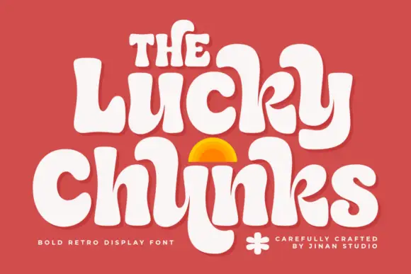
Bulging retro forms with curled joins
Lucky Chunks is a bold retro display face in cream on terracotta: very fat letters whose bowls bulge past the stems, curled joins between the letters of a word, and a half-sun arch drawn between the two lines.
Ideas for this font
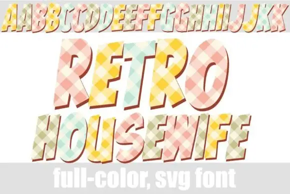
Checked pastel display with offsets
Retro Housewife is a display face on white with a full alphabet row at the top and two large lines beneath: forward-leaning capitals filled with pastel diagonal checks and given a red-brown offset, with a plain band along the foot that names the format.
Ideas for this font
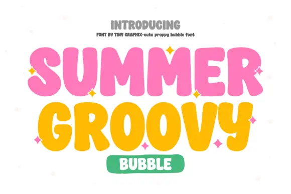
Chunky groovy bubble display
Summer Groovy is a chunky bubble display in pink and yellow on white: fat rounded letters with swelling strokes, alternating heights that wave across the line, sparkle accents between words, and a green pill badge beneath, so the plate reads as a seventies poster rather than a modern sans.
Ideas for this font
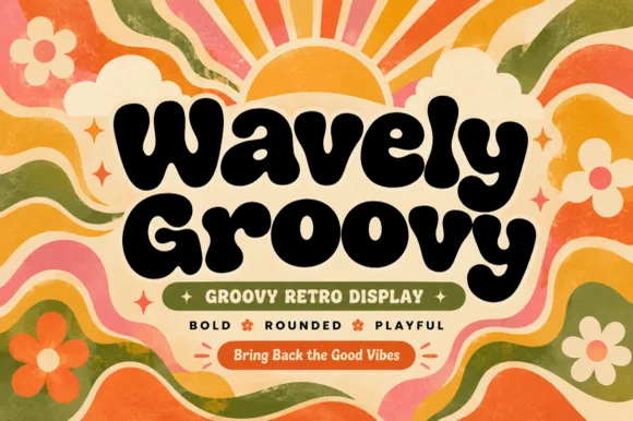
Fat bubbly display with rounded joins
Wavely Groovy is a fat bubbly display face in black on a cream panel: very heavy rounded letters with bulging sides and no contrast, set over a seventies ground of sun rays, waves and daisies in orange and olive.
Ideas for this font
Same independent foundry
Allow optional Google Analytics to measure visits and catalogue actions. Your search words and notes are not included. Privacy & storage