Modern Grotesque Body

Farmhouse Vintage + Bareum
Creates crisp high-hierarchy contrast beneath Farmhouse Vintage headlines across menus, websites and labels.
Inspect Bareum specimenDisclosure: MakerFileHub may earn a commission from qualifying purchases via paid links on this page. How our links work.
Moderate-weight rustic capitals with short softly bracketed feet
Farmhouse Vintage arcs black serif capitals over a small barn illustration, where the rounded bowls, short sturdy feet and gently irregular angles give the word a rustic sign character without heavy distress, and a thin line of small caps plus a cursive sentence sits beneath on white.
Paid link
Get this fontProject & layout blueprintsAt-a-glance maker compatibility
Fine grain and micro-texture excel in 300 DPI print, sublimation, and screen print rather than small vinyl weeding.
Visual anatomy & craft review
The bowls stay round, the feet stay short, the angles drift slightly off true and the whole row follows a shallow arc. That arc is the character: the sample reads as a painted farm sign rather than a straight cap row, which is why the cover leaves wide white space on both sides. The barn, the pines and the cursive sentence are separate art and typography. Keep 44 pt, check whether your app can arc a line naturally and keep the line short so the curve stays even.
Moderate-weight rustic capitals with short softly bracketed feet
Two-font hierarchy recipes
Tested contrast partners — pairing Farmhouse Vintage with grounded secondary typography.
Farmhouse Vintage + Bareum
Creates crisp high-hierarchy contrast beneath Farmhouse Vintage headlines across menus, websites and labels.
Inspect Bareum specimen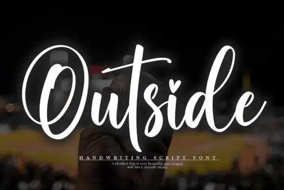
Farmhouse Vintage + Outside
Adds a warm human signature touch for 1-to-3-word callouts without competing against structured serif capitals.
Inspect Outside specimenPractical applications
Concrete hierarchy, scale and production guidance tailored to Farmhouse Vintage’s stroke geometry.
The rustic caps suit a farm shop sign, and the shallow arc lets a short name sit over a door without a straight-rule look.
Hierarchy & layout recipe
Paint a 600 by 300 mm board: set the shop name at 56 mm on an arc of 90 degrees, keep 24 mm of clear ground beneath before the hours at 14 pt, and keep 26 mm of border all round.
Pre-production check
Arcs built by hand drift off true; check the artwork against a jig before the board is cut.
The sturdy serif gives a jam jar a country register, and the short square feet print cleanly on a small uncoated label where finer serifs would clog.
Hierarchy & layout recipe
Print a 55 by 70 mm jar label: set the maker name at 20 pt on one row, keep 9 mm of clear ground beneath before the flavour at 7 pt, and keep 6 mm to the die edge.
Pre-production check
The barn and pine artwork is separate from the type; check the files before promising it with the letters.
The rusticity suits a printed note for a new home, where the lettering should look painted rather than designed on a screen.
Hierarchy & layout recipe
Print a 105 by 148 mm card: set the greeting at 26 pt on one row, keep 16 mm of clear ground beneath for the handwritten message, and keep 16 mm of margin at each side.
Pre-production check
Arced rows are hard to read at 20 pt; check the proof and keep the greeting flat if it shrinks.
Technical & licence verification
Confirm included OTF/TTF/WOFF formats, full glyph tables and licence coverage on the live store page before batch production.
Closest visual alternatives
Matched across letterform anatomy, stroke behaviour and craft applications.
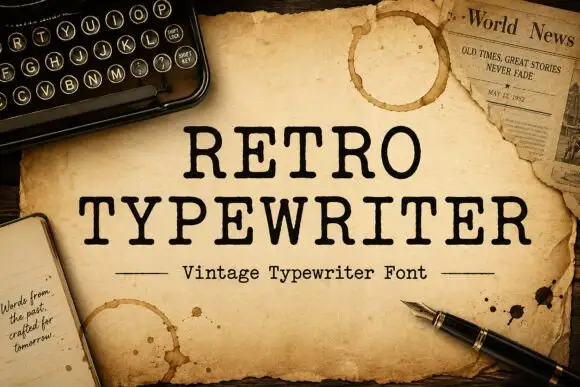
Typewriter serif with a soft worn edge
Retro Typewriter is a vintage typewriter serif in black on aged parchment: slab serifs, a moderate even stroke and a slightly uneven edge, set between two rules with a caption line beneath.
Ideas for this font
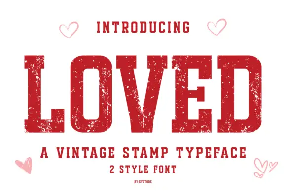
Vintage stamp slab
Loved is a vintage stamp slab in deep red on white: heavy caps with block serifs, a chipped, uneven outline that reads as a rubber stamp, and small open hearts in the corners, with a tracked line beneath naming the category and the two styles.
Ideas for this font
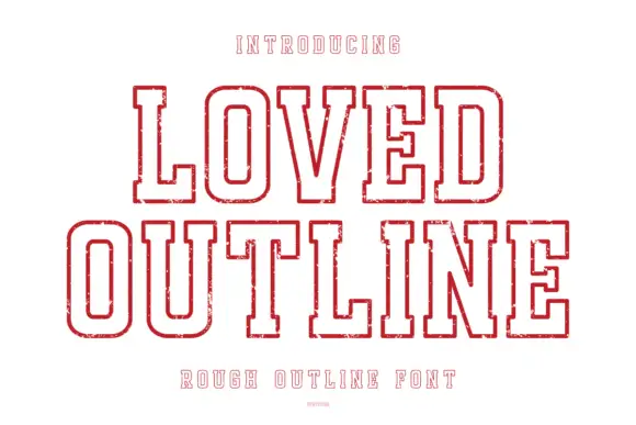
Rough outline collegiate display
Loved Outline is a rough collegiate outline in red on white: heavy caps drawn as a double contour with no fill, worn edges, block serifs and a small inner echo, with tracked caps above and below and a fine credit line at the foot.
Ideas for this font
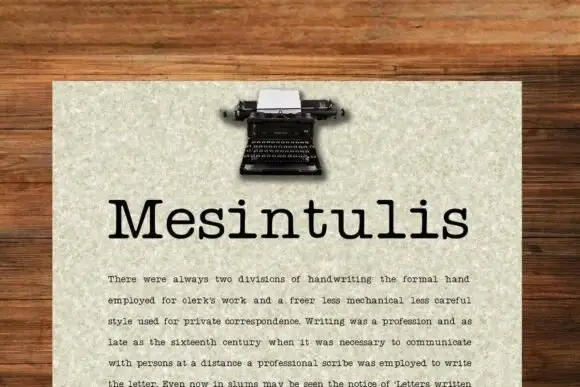
Typewriter slab with text setting
Mesintulis is a typewriter slab in black on flecked cream paper: mixed case with short rounded slab feet, a large x-height and generous sidebearings, set as a heading above a justified paragraph, with a small typewriter photograph at the top of the sheet.
Ideas for this font
Same independent foundry
Allow optional Google Analytics to measure visits and catalogue actions. Your search words and notes are not included. Privacy & storage