Editorial Serif Anchor

Farmhouse Font + Askinо
Anchors Farmhouse Font's fluid strokes with crisp Roman proportions on wedding suites, headers and packaging.
Inspect Askinо specimenDisclosure: MakerFileHub may earn a commission from qualifying purchases via paid links on this page. How our links work.
Bold bouncy shaded brush-calligraphy farmhouse script
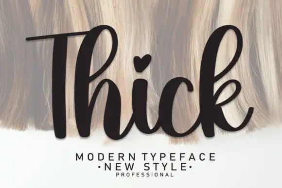
Farmhouse Font (by andikastudio) is a thick, welcoming brush-calligraphy script with shaded downstrokes and lively baseline bounce.
Paid link
Get this fontProject & layout blueprintsAt-a-glance maker compatibility
Weld or Unite overlapping script joins into one continuous vector path before sending to the blade.
Visual anatomy & craft review
Farmhouse Font is a bold brush-calligraphy script with shaded downstrokes, tall loops on the h and l, and a lively baseline bounce that lifts and drops the letters across a word. The pressure shading is built into the glyph rather than added, so the script keeps its warmth when printed in a single flat colour, and the thick connectors survive a vinyl cut and a garment transfer. It needs roughly 25 mm before the shading reads as brush pressure, and it is best in a warm dark ink on cream or reversed out of a deep green.
Warm-brush · Bouncy · Vinyl-sturdy
Two-font hierarchy recipes
Tested contrast partners — pairing Farmhouse Font with grounded secondary typography.
Farmhouse Font + Askinо
Anchors Farmhouse Font's fluid strokes with crisp Roman proportions on wedding suites, headers and packaging.
Inspect Askinо specimen
Farmhouse Font + Godthem
Keeps small-scale dates, URLs, nutrition facts and care instructions crisp and legible below script titles.
Inspect Godthem specimenPractical applications
Concrete hierarchy, scale and production guidance tailored to Farmhouse Font’s stroke geometry.
A shaded brush script reads as a hand-written note from a farm kitchen, which is what a hostess or market thank-you is imitating. The thick downstrokes hold up printed on kraft where a fine script would break, and the bounce keeps a short thank-you from looking formal.
Hierarchy & layout recipe
Card 120 x 170 mm, greeting 24 mm, message 8/12 pt, 14 mm margins. Sign 600 x 400 mm, word 120 mm, 40 mm margins and 20 mm frame clearance. Tag 50 x 90 mm, word 10 mm, hole 5 mm with 6 mm clear card.
Pre-production check
Kraft card at 300 gsm absorbs the shaded downstroke unevenly and the brush edge turns ragged under 12 mm. Keep tag words at 12 mm or above, and check one printed tag on the actual stock before the batch.
A warm brush script suggests made-by-hand rather than factory-packed, which is the claim a small farm shop is making. The shading survives white-ink printing on kraft cartons, and the bounce lets a long product name sit across a 90 mm label without a second line.
Hierarchy & layout recipe
Label 70 x 45 mm, name 10 mm, weight 4.5 pt, 4 mm die margin. Carton 200 x 150 x 80 mm, word 40 mm on the lid, 20 mm margins. Banner 1500 x 400 mm, word 240 mm, 100 mm margins with eyelets every 500 mm.
Pre-production check
A white-ink print on kraft traps a 0.4 mm connector and the word fills into a pale smear at 40 mm. Print the carton name on a coated label instead, and check one assembled carton under shop light before the order.
Brush lettering reads as a painted farm sign, which is what an autumn pick-your-own prints for a car-park audience. The heavy bounce holds at banner distance in one ink, and the shading gives the word weight without a drop shadow behind a photograph.
Hierarchy & layout recipe
Sign 900 x 600 mm, word 170 mm, 60 mm margins and 25 mm frame clearance. Banner 2000 x 600 mm, word 340 mm, 120 mm margins with eyelets every 500 mm. Label 70 x 95 mm, word 16 mm, 5 mm top arc.
Pre-production check
A banner strung between posts bows in the wind and a bouncing baseline reads as sagging letters. Use a flat board sign for the main word, and check one banner tensioned overnight before the season opens.
Technical & licence verification
Confirm included OTF/TTF/WOFF formats, full glyph tables and licence coverage on the live store page before batch production.
Closest visual alternatives
Matched across letterform anatomy, stroke behaviour and craft applications.
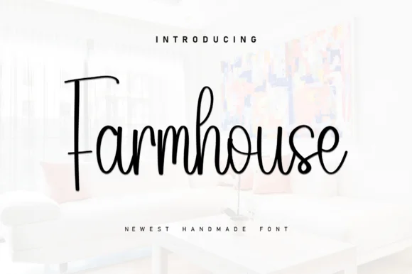
Tall slender modern-rustic farmhouse cursive script
Farmhouse (by KC Production) is a tall, slender monoline-brush farmhouse script pairing a towering straight 'F' stem with airy upright loops.
Ideas for this font
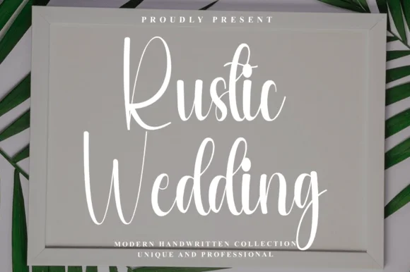
Tall condensed bouncy farmhouse sign script
Rustic Wedding (by Preketek texs) is a tall, narrow bouncy farmhouse script built to fill framed wood signs and vertical chalkboard easels.
Ideas for this font
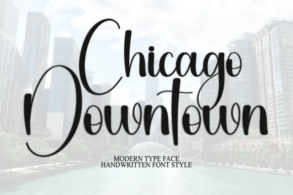
Tall narrow bouncy urban calligraphy script
Chicago Downtown is a tall, compressed modern calligraphy script featuring towering C/D/t/h stems and brisk year-round urban polish.
Ideas for this font
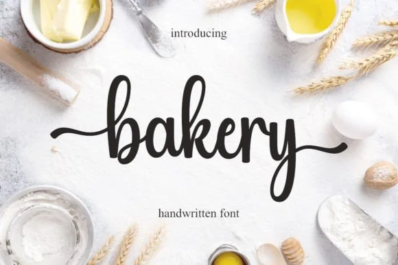
Bouncy medium-weight farmhouse brush script with side tails
Bakery is a warm, bouncy handwritten brush script with tall looped ascenders ('b', 'k') and smooth horizontal beginning and ending tails.
Ideas for this font
Same independent foundry
Allow optional Google Analytics to measure visits and catalogue actions. Your search words and notes are not included. Privacy & storage