Editorial Serif Anchor

Rustic Buffet + Mewah
Anchors Rustic Buffet's fluid strokes with crisp Roman proportions on wedding suites, headers and packaging.
Inspect Mewah specimenDisclosure: MakerFileHub may earn a commission from qualifying purchases via paid links on this page. How our links work.
Ultra-fine wispy dip-pen wine & dining script
Rustic Buffet is a whisper-thin, airy monoline dip-pen script with wide looped capitals and graceful hand-written restaurant menu poise.
Paid link
Get this fontProject & layout blueprintsAt-a-glance maker compatibility
Weld or Unite overlapping script joins into one continuous vector path before sending to the blade.
Visual anatomy & craft review
Rustic Buffet is an ultra-fine wispy dip-pen script with hairline strokes, tall loops and a light, dry pen texture along the edges, so a line reads as written with a nib that is nearly out of ink. The hairlines are the point, which makes it a print and menu face rather than a signage one, and the wisps mean the face needs size and smooth stock. It needs roughly 26 mm for the wisps to hold, and it is best in a warm sepia on cream or as a fine foil on matte board.
Delicate · Airy · Dining-table
Two-font hierarchy recipes
Tested contrast partners — pairing Rustic Buffet with grounded secondary typography.
Rustic Buffet + Mewah
Anchors Rustic Buffet's fluid strokes with crisp Roman proportions on wedding suites, headers and packaging.
Inspect Mewah specimen
Rustic Buffet + Cenura
Keeps small-scale dates, URLs, nutrition facts and care instructions crisp and legible below script titles.
Inspect Cenura specimenPractical applications
Concrete hierarchy, scale and production guidance tailored to Rustic Buffet’s stroke geometry.
A wispy dip-pen script reads as a written invitation on textured paper, which is what a barn wedding is imitating. The hairlines give a long couple name its elegance at 30 mm, and the loops stack an extra line without a second face.
Hierarchy & layout recipe
Invitation 130 x 180 mm, names 30 mm, details 9/13 pt, 15 mm margins. Menu 120 x 210 mm, header 16 mm, dishes 9/13 pt. Plan 420 x 297 mm, names 9 pt on a 12 pt leading, 15 mm margins.
Pre-production check
A 9 pt hairline on a seating plan fills on uncoated card and two similar surnames become one word. Keep guest names in a companion serif at 10 pt, and proof the list against the RSVPs twice.
Dry-pen wisps read as a menu written out by hand for the season, which is what a harvest dinner wants. The fine strokes print beautifully in sepia on cream, and the script holds a long dish name at 16 mm on a 120 mm menu.
Hierarchy & layout recipe
Menu 120 x 210 mm, header 20 mm, dishes 9/13 pt, 12 mm margins. Sign 600 x 400 mm, word 110 mm, 40 mm margins. Card 105 x 148 mm, word 20 mm, 12 mm margins.
Pre-production check
A 600 mm sign prints the wisps as a dotted line at 110 mm and the word looks like a printing fault. Keep this face for print under 200 mm, and use a heavier companion for signage, checking one panel first.
A fine dip-pen script reads as a wine that was named by hand, which is what a small producer prints on a front label. The hairlines hold on coated label stock at 14 mm, and the wisps give the label its vintage character without an ornament.
Hierarchy & layout recipe
Label 80 x 60 mm, name 14 mm, vintage 5.5 pt, 4 mm die margin. Card 105 x 148 mm, word 20 mm, notes 8/11 pt. Folder 120 x 220 mm, word 26 mm, 15 mm margins.
Pre-production check
A 14 mm wispy name on a curved label closes in flexo and the script reads as a solid stroke. Print labels digitally or specify a 0.25 mm minimum stroke, and check one applied label on a bottle.
Technical & licence verification
Confirm included OTF/TTF/WOFF formats, full glyph tables and licence coverage on the live store page before batch production.
Closest visual alternatives
Matched across letterform anatomy, stroke behaviour and craft applications.
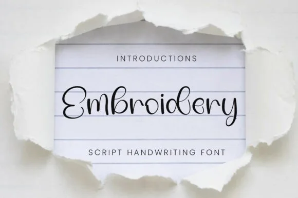
Delicate hairline sewing-thread monoline script
Embroidery (by YanStudio) is a whisper-fine monoline script mimicking a single continuous strand of black sewing thread across ruled paper.
Ideas for this font
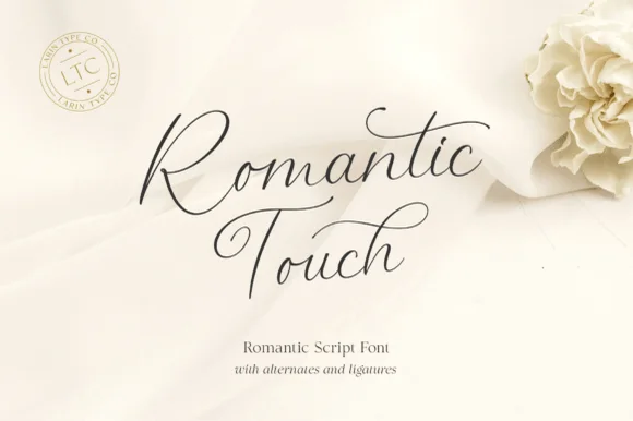
Ultra-fine airy fountain-pen calligraphy script
Romantic Touch is a feather-light, fluid handwritten script featuring wide looped capitals, flying t-crossbars, and delicate nib movement.
Ideas for this font
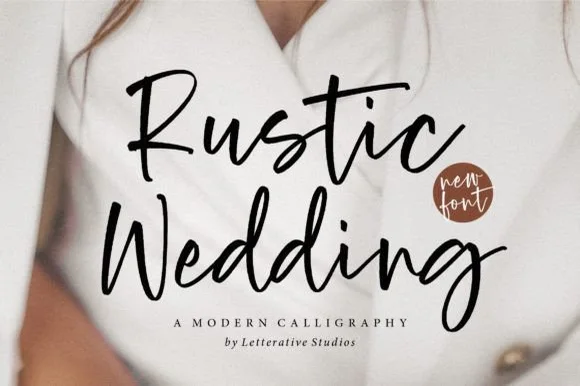
Bouncy upright modern brush calligraphy script
Rustic Wedding (by letterativestudio) is an approachable, medium-weight modern brush script with dancing baselines and sturdy cutter-friendly strokes.
Ideas for this font
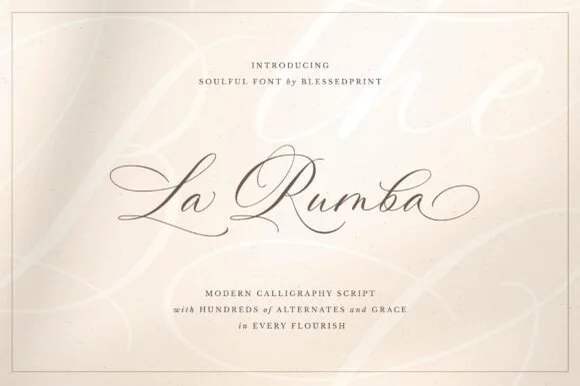
Fine-pointed copperplate wedding calligraphy with hundreds of alternates
La Rumba is a delicate, slanted copperplate calligraphy script featuring sweeping hairline entry loops, shaded downstrokes, and hundreds of alternates.
Ideas for this font
Same independent foundry
Allow optional Google Analytics to measure visits and catalogue actions. Your search words and notes are not included. Privacy & storage