Editorial Serif Anchor

Looks Scratchy + Evoire
Anchors Looks Scratchy's fluid strokes with crisp Roman proportions on wedding suites, headers and packaging.
Inspect Evoire specimenDisclosure: MakerFileHub may earn a commission from qualifying purchases via paid links on this page. How our links work.
Multi-pass ballpoint & oil-pastel scribble script
Looks Scratchy mimics urgent, multi-pass sketchbook handwriting where traced double and triple pen lines overlap each letterform.
Paid link
Get this fontProject & layout blueprintsAt-a-glance maker compatibility
Weld or Unite overlapping script joins into one continuous vector path before sending to the blade.
Visual anatomy & craft review
Looks Scratchy is a scribble script drawn with a ballpoint and an oil pastel in several passes: each letter is a loose looping stroke, the passes overlap so the line doubles back on itself, and the pastel adds a soft wider halo under the pen. The scribble reads as energy rather than as typography, so the word shape matters more than the letter shapes. It needs roughly 30 mm for the double pass and the pastel halo to read, and it is best in one ballpoint blue or black on white, with the halo left as a soft second colour that must not turn muddy.
Raw · Sketchbook · Rebellious
Two-font hierarchy recipes
Tested contrast partners — pairing Looks Scratchy with grounded secondary typography.
Looks Scratchy + Evoire
Anchors Looks Scratchy's fluid strokes with crisp Roman proportions on wedding suites, headers and packaging.
Inspect Evoire specimen
Looks Scratchy + Cenura
Keeps small-scale dates, URLs, nutrition facts and care instructions crisp and legible below script titles.
Inspect Cenura specimenPractical applications
Concrete hierarchy, scale and production guidance tailored to Looks Scratchy’s stroke geometry.
A multi-pass scribble reads as a note written while listening rather than a typeset headline, which is what a music feature wants at the top. The overlapping passes give the opener energy at 60 pt, and the ballpoint line holds on uncoated stock where a fine script would break.
Hierarchy & layout recipe
Opener 210 x 297 mm, title 60 pt with 10 mm scribble clearance, standfirst 11/15 pt, body 9/13 pt, 18 mm margins. Pull quote 36 pt, 12 mm margins. Margin note 9 pt.
Pre-production check
At 9 pt the margin note collapses into a grey scribble and reads as a printing fault. Set margin notes in a plain hand and keep the face at 40 pt and above, then proof one spread at 1:1.
A scribble script makes a designer's mark look like a working note rather than a finished logo, which is what a small studio wants on a sketchbook. The pastel halo gives the mark weight at 40 mm, and one ink plus a soft second pass prints the cover and the tape from the same artwork.
Hierarchy & layout recipe
Sketchbook cover 210 x 297 mm, word 60 mm with 12 mm halo clearance, 18 mm margins. Tape 50 mm wide, word 18 mm along the run. Card 85 x 55 mm, word 20 mm, 5 mm margins.
Pre-production check
On an 85 x 55 mm card the two passes merge into one dirty stroke and the mark looks smudged rather than drawn. Keep the card word at 24 mm or print the single-pass variant, and check one card before the order.
A ballpoint scribble reads as a quick note jotted after a purchase, which is the tone a small maker wants rather than a printed acknowledgement. The overlapping pass gives the greeting movement at 24 mm, and one blue ink prints the card, the note and the sticker in a single pass.
Hierarchy & layout recipe
Card A6, greeting 24 mm with 8 mm scribble clearance, note 8/11 pt, 12 mm margins. Folded note 148 x 105 mm, word 40 mm, 15 mm margins. Sticker 60 mm round, word 12 mm, 4 mm die margin.
Pre-production check
A 60 mm round sticker at 12 mm fuses the ballpoint pass into a solid bead and the greeting is unreadable. Raise the sticker word to 18 mm or use a single-loop variant, and print one sheet before the batch.
Technical & licence verification
Confirm included OTF/TTF/WOFF formats, full glyph tables and licence coverage on the live store page before batch production.
Closest visual alternatives
Matched across letterform anatomy, stroke behaviour and craft applications.
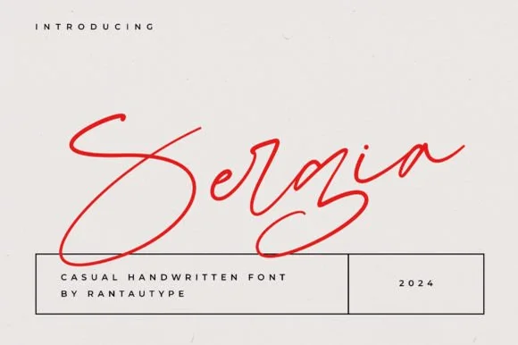
Fast slanted ballpoint signature cursive
Sergia is an expressive, fast-moving handwritten signature script with oversized sweeping initials and airy, minimalist pen curves.
Ideas for this font
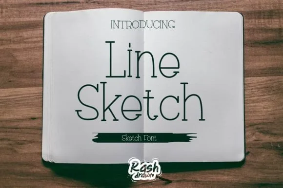
Thin monoline sketch serif
Line Sketch is a thin monoline serif in black on paper: tall narrow letterforms, hairlines of even weight, slab-ish serifs drawn with a slight wobble, and a hand-ruled feel that makes the two words look drawn with a fine pen rather than set from a font.
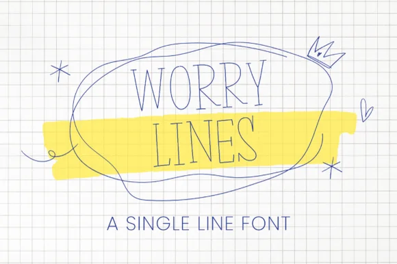
Minimalist architectural hairline serifed pen print
Worry Line is a neat, ultra-thin architectural pen font featuring tall narrow uppercase letters with tiny subtle serif ticks.
Ideas for this font
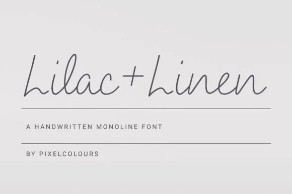
Airy fine-pen architectural monoline handwritten font
Lilac and Linen is an ultra-clean, slender monoline handwritten font blending tall open capitals with airy semi-connected pen lowercase.
Ideas for this font
Same independent foundry
Allow optional Google Analytics to measure visits and catalogue actions. Your search words and notes are not included. Privacy & storage