Neutral Sans Workhorse

Rok-a-zine + Noar
Lets Rok-a-zine own the focal silhouette while handling secondary copy, sizing and subheads cleanly.
Inspect Noar specimenDisclosure: MakerFileHub may earn a commission from qualifying purchases via paid links on this page. How our links work.
Zany hand-drawn display with multiple weights
Rok-a-Zine is a zany hand-drawn display in yellow with a black outline on blue: irregular caps with zigzag arms and slanted strokes, letters that tilt at different angles, and a wavy ribbon border that frames the page top and bottom.
Paid link
Get this fontProject & layout blueprintsAt-a-glance maker compatibility
Fine grain and micro-texture excel in 300 DPI print, sublimation, and screen print rather than small vinyl weeding.
Visual anatomy & craft review
The word is set across the middle and the drawing is deliberately unstable: the R leans right, the k drops below the baseline, the a is a round blob with a tail, and the strokes vary in width from letter to letter, so the line looks like a marker tag rather than a typeface. A heavy black outline wraps each letter and the outline is as thick as the strokes in places, which is what keeps the yellow readable on the blue field. The characters are wide and closely spaced, so the word reads as a single wobbling shape, and the counters stay open enough to keep it legible. The frame is a wavy ribbon in white and yellow that repeats the same hand, and the two caption lines are set in a scrawled caps cut, so the whole page is one visual voice.
Zany, hand-drawn, playful, loud
Two-font hierarchy recipes
Tested contrast partners — pairing Rok-a-zine with grounded secondary typography.
Rok-a-zine + Noar
Lets Rok-a-zine own the focal silhouette while handling secondary copy, sizing and subheads cleanly.
Inspect Noar specimen
Rok-a-zine + Amor Hadena
Grounds bold display lettering with classic typographic authority on posters, badges and apparel.
Inspect Amor Hadena specimenPractical applications
Concrete hierarchy, scale and production guidance tailored to Rok-a-zine’s stroke geometry.
A zany hand-drawn face reads as a handmade flyer, which suits a children's event better than a polished poster, and the thick outline keeps it legible from a distance.
Hierarchy & layout recipe
A3 print: the name at 130 mm wide, the line-up in a 16 mm scrawled cut, and a 6 mm wavy border at 20 mm. Keep the palette to two colours plus the outline so the wobble stays the only texture.
Pre-production check
Check the outline at 6 mm on the printed poster, where it must stay even around the zigzags; inspect the sharpest angle. Confirm the 16 mm line-up reads at three metres and that the border does not cross the lettering.
A hand-drawn zany face signals a workshop about making things by hand, and the outline construction means a photocopied notice still looks intentional.
Hierarchy & layout recipe
A4 print: the title at 70 mm, the details in a 12 mm scrawled cut, and a wavy rule above and below. Keep the design to two inks so a school copier reproduces the black outline without filling it in.
Pre-production check
Check the copy on a school machine, where a thick outline can close the counters of the a and the o; test one sheet. Confirm the 12 mm details read from two metres and that the wavy rules stay inside the margins.
A zany display gives a youth zine a cover that looks made rather than designed, and the single ink keeps a short run affordable.
Hierarchy & layout recipe
Set the title at 110 mm wide on an A5 cover, the issue number in a 9 pt grotesque, and a wavy rule at the foot. Print one ink on a coloured stock so the outline reads as the paper showing through.
Pre-production check
Check the title at 110 mm after photocopying, where zigzag arms can break; print from a laser original. Confirm the 9 pt issue number survives the copy and that the cover still reads at thumbnail size in a listing.
Technical & licence verification
Confirm included OTF/TTF/WOFF formats, full glyph tables and licence coverage on the live store page before batch production.
Closest visual alternatives
Matched across letterform anatomy, stroke behaviour and craft applications.
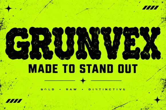
Rounded puffy street-grunge block display (OTF)
Grunvex is an ultra-heavy, puffy street-block display font combining rounded graffiti-slab silhouettes with subtle worn-ink texture.
Ideas for this font
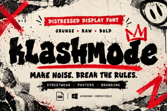
Chaotic punk-street & ransom-tilted grunge display (OTF)
Klashmode is a raw, rebellious street-grunge display font mixing chunky tilted uppercase and lowercase blocks with rough ink-stamp edges.
Ideas for this font
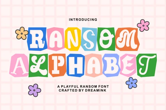
Cute pastel scrapbook & groovy ransom-tile font
Ransom Alphabet is a cheerful, kid-friendly ransom-cutout font pairing groovy 70s, serif, and bubble letters inside colorful rounded paper tiles.
Ideas for this font
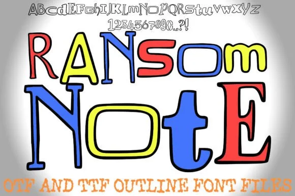
Colorable hand-drawn outline mixed-style ransom alphabet
Ransom Note (by squeebcreative) is an installable hand-drawn outline ransom font mixing mismatched serif, slab, and block letters ready to color.
Ideas for this font
Allow optional Google Analytics to measure visits and catalogue actions. Your search words and notes are not included. Privacy & storage