Neutral Sans Workhorse

Alphabet Riot + Lemon Milk Pro FTR
Lets Alphabet Riot own the focal silhouette while handling secondary copy, sizing and subheads cleanly.
Inspect Lemon Milk Pro FTR specimenDisclosure: MakerFileHub may earn a commission from qualifying purchases via paid links on this page. How our links work.
Rebellious mixed-case collage & street-poster ransom font
Alphabet Riot is a bold, gritty street-collage ransom font mixing solid hand-cut block letters with tilted cutout boxes and exclamation energy.
Paid link
Get this fontProject & layout blueprintsAt-a-glance maker compatibility
Fine grain and micro-texture excel in 300 DPI print, sublimation, and screen print rather than small vinyl weeding.
Visual anatomy & craft review
Alphabet Riot is a mixed-case collage display that blends solid hand-cut block letters with tilted cutout boxes, giving the ransom-note instability of a pasted street poster. Tilt and size vary deliberately between glyphs, so a word looks assembled, and the solid blocks keep it legible despite the chaos. It needs roughly 20 mm for the tilt to read as style rather than error, and it is a flyer, sticker and zine face. Setting a long sentence is futile: the face works on two or three words with a graphic payoff.
Rebellious · Collage · Experimental
Two-font hierarchy recipes
Tested contrast partners — pairing Alphabet Riot with grounded secondary typography.
Alphabet Riot + Lemon Milk Pro FTR
Lets Alphabet Riot own the focal silhouette while handling secondary copy, sizing and subheads cleanly.
Inspect Lemon Milk Pro FTR specimen
Alphabet Riot + Brenco
Grounds bold display lettering with classic typographic authority on posters, badges and apparel.
Inspect Brenco specimenPractical applications
Concrete hierarchy, scale and production guidance tailored to Alphabet Riot’s stroke geometry.
Cutout tilt reads as a pasted poster, which is the register a gig flyer wants, and solid blocks stay legible on a photocopy. Short words make the chaos look designed.
Hierarchy & layout recipe
Flyer A5 on 120 gsm, word 90 mm, lineup 10/13 pt, 12 mm margins. Zine cover A5, header 50 mm. Listing 148 x 210 mm, headings 24 mm, entries 8.5/12 pt.
Pre-production check
Photocopies thicken thin joins and the cutout gaps close, so the word becomes a slab. Print one test copy on the actual machine, and remove the smallest cutout boxes if the gaps seal.
Collage letters read as a hand-pasted shop identity, which is what a skate shop or punk label wants. Solid blocks survive a die-cut sticker where a distressed face would tear.
Hierarchy & layout recipe
Sticker 70 x 45 mm, word 14 mm, 2 mm die margin and 3 mm clear of the cut. Tote panel 260 x 260 mm, word 60 mm, 25 mm to the seam. Window decal 500 x 300 mm, word 120 mm, 15 mm cut margin with rounded corners.
Pre-production check
A die-cut sticker around tilted blocks has narrow shoulders at the glyph corners. Use a rounded-rectangle die, keep 3 mm clearance, and pull one sticker before printing the pack.
A ransom collage reads as a hand-pasted street event rather than a sponsored festival, which suits a small summer fair. Heavy blocks survive on cheap flyer stock.
Hierarchy & layout recipe
Flyer A5, word 100 mm, times 10/13 pt in two columns, 12 mm margins. Poster A3, word 240 mm, details 18/24 pt, 30 mm margins. Badge 80 x 110 mm, name 12 mm, clip slot 10 mm with 8 mm of solid card around it.
Pre-production check
Badges are laminated and worn on a lanyard, and a corner-heavy collage design scuffs first at the edge. Round the card corners to 5 mm, laminate both faces, and check one badge after a day of wear.
Technical & licence verification
Confirm included OTF/TTF/WOFF formats, full glyph tables and licence coverage on the live store page before batch production.
Closest visual alternatives
Matched across letterform anatomy, stroke behaviour and craft applications.
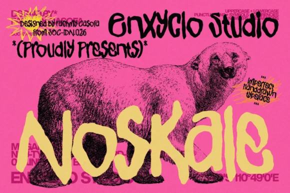
Imperfect hand-drawn marker display
Noskale is an imperfect hand-drawn display in yellow on hot pink: wobbly thick marker letters with uneven widths and heights, drawn over a vintage engraving of a polar bear, with printed corner notes in a scrawled hand.
Ideas for this font
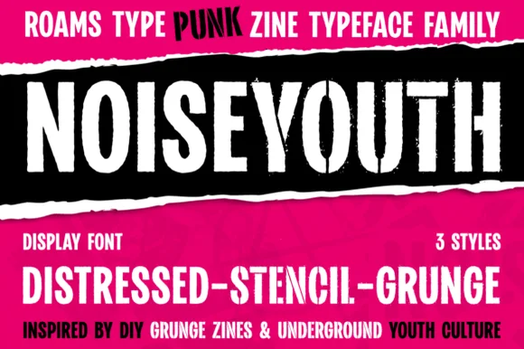
Punk zine display in three distressed styles
Noise Youth is a punk zine typeface family in white and black on magenta: tall condensed capitals shown in distressed, stencil and grunge styles, with ink bands and a caption line about DIY zines.
Ideas for this font
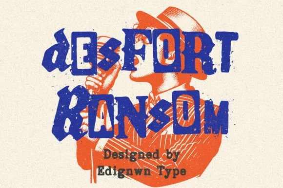
Gritty stamp-distressed mixed-typeface ransom-note font
Desfort Ransom is a rugged, ink-stamped ransom-note typeface mixing serif, sans, and reverse-tile characters with weathered woodblock grit!
Ideas for this font
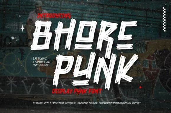
Slashed stencil-cut punk & streetwear display
Bhore Punk is a fierce, slanted punk-rock display typeface sliced through with diagonal razor-cut stencil splits and jagged dry-brush spurs.
Ideas for this font
Same independent foundry
Allow optional Google Analytics to measure visits and catalogue actions. Your search words and notes are not included. Privacy & storage